KYD Buro
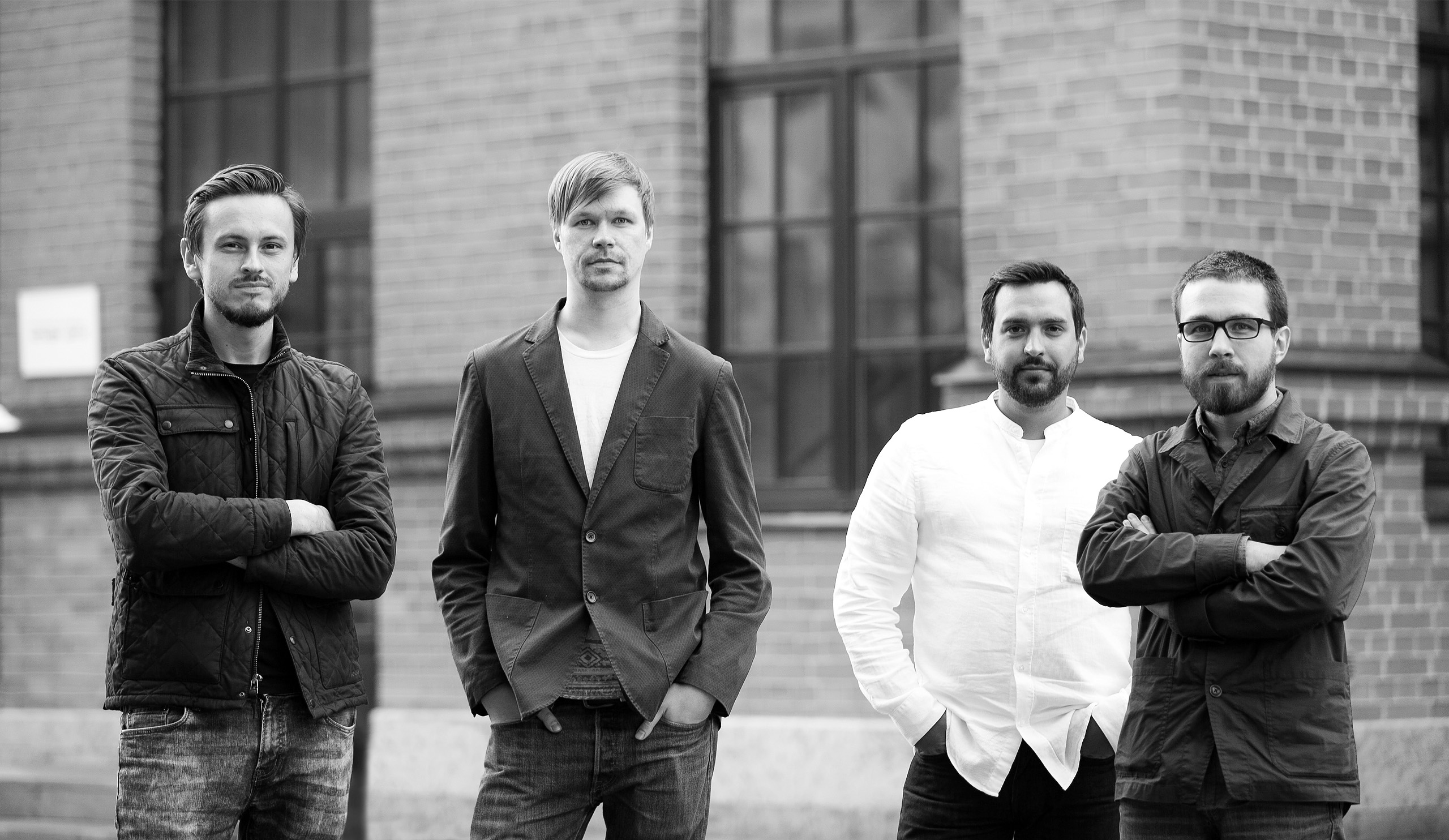
Brand identityKYD is a bureau operating in the field of interior architecture. Name is formed from the first letters of the founders: Pavel Kobets, Andrei Yankovskiy, Dmitry Dubrovskiy. Company's services include architecture, complex projection, design and projects support.
Teamwork is based on the following values: mathematics, logic, contemporaneity, openness, structuredness, consistency, simplicity and flexibility. They needed identity that would meet all of these requirements to create exact image of the company.
|
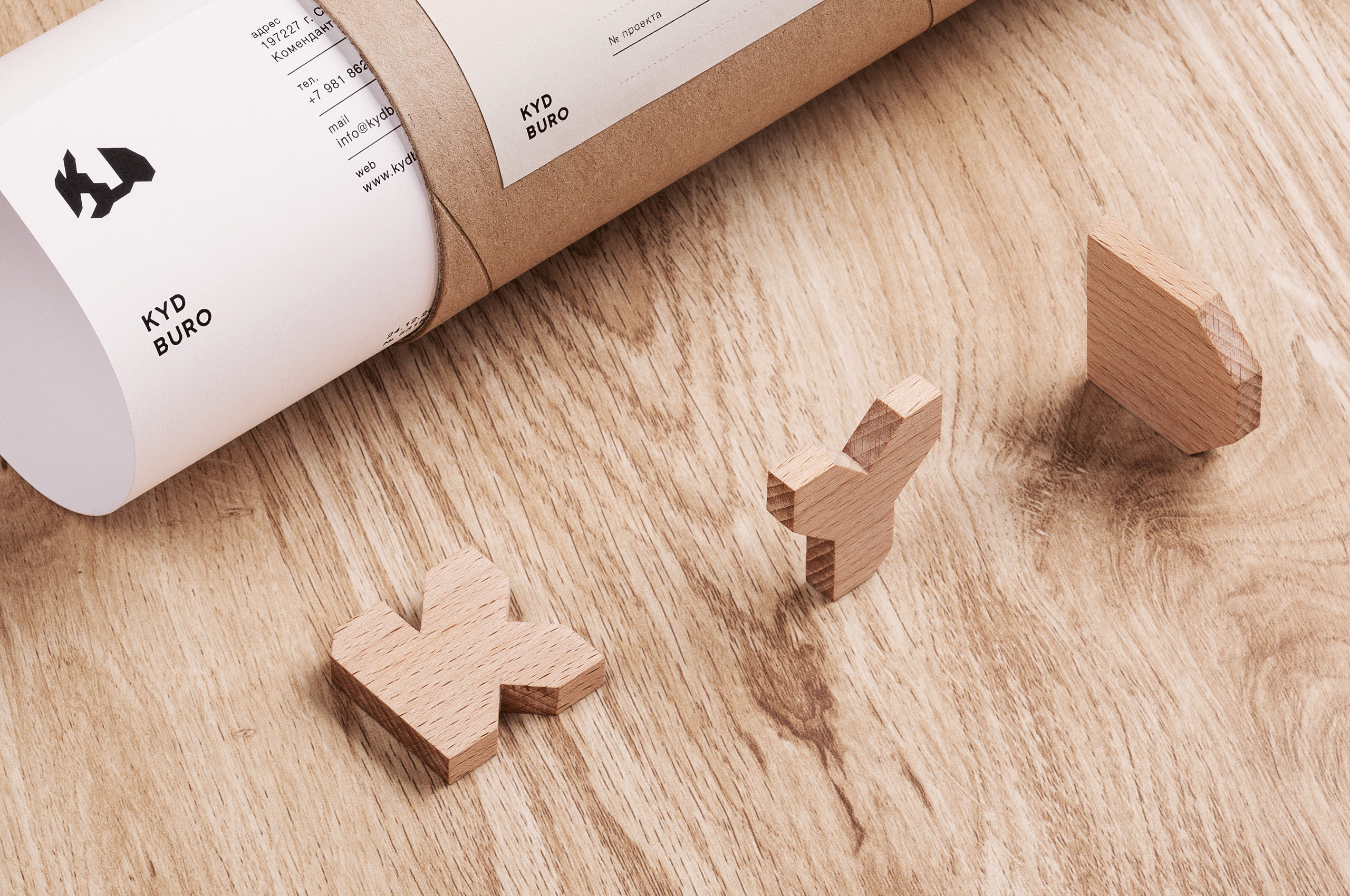
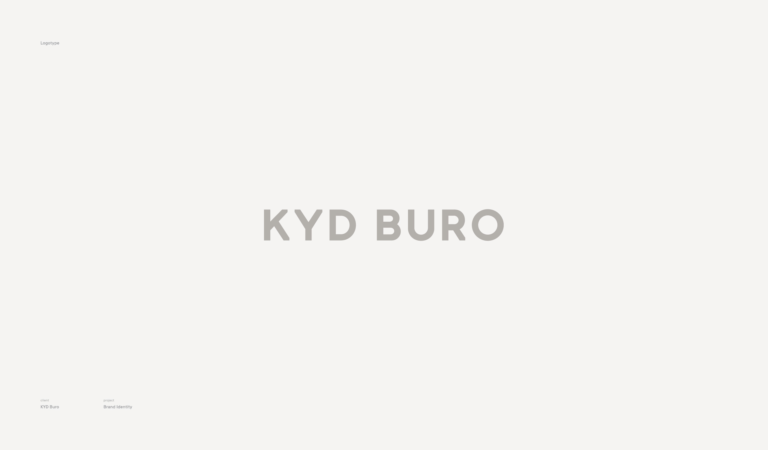
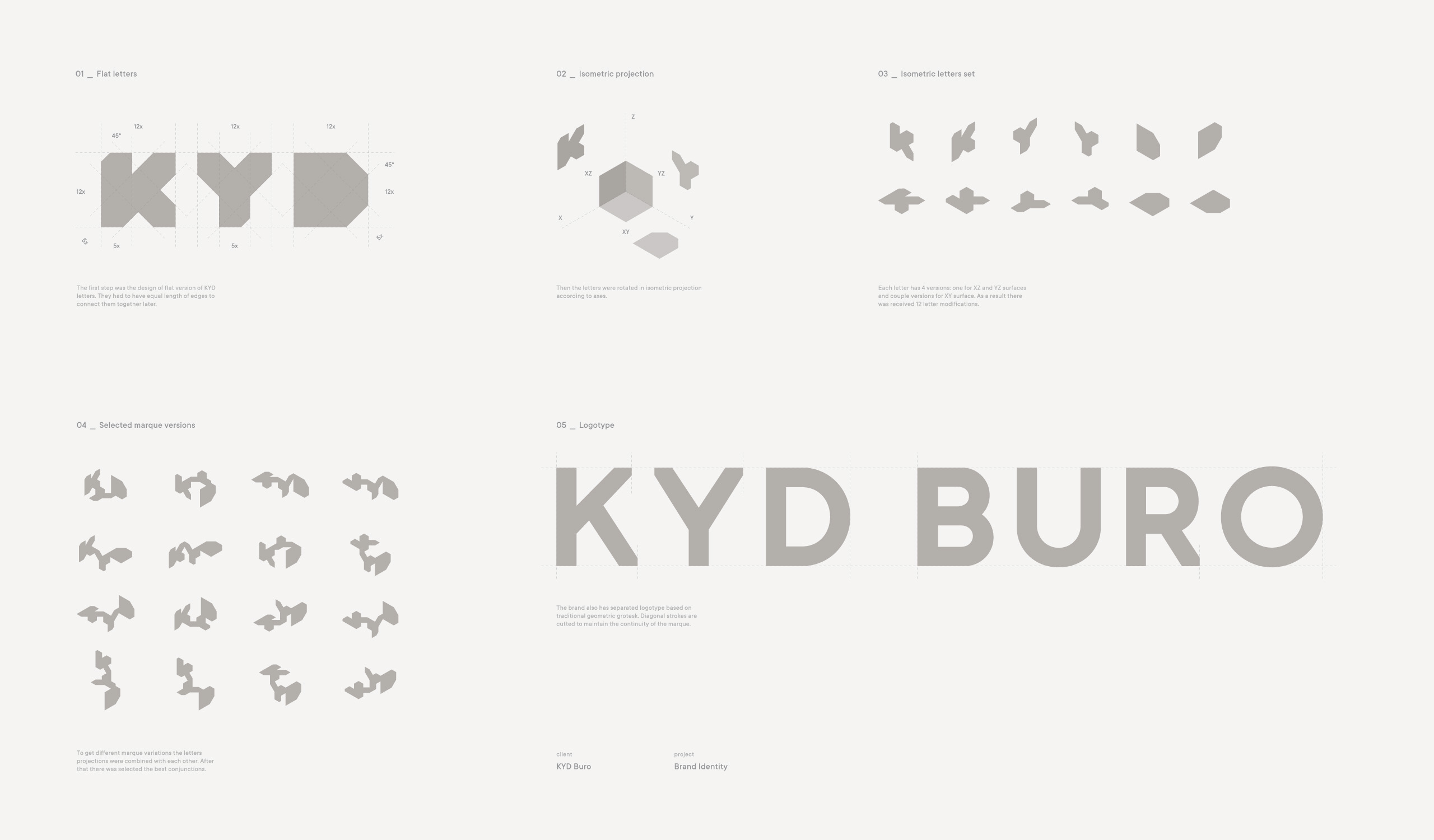
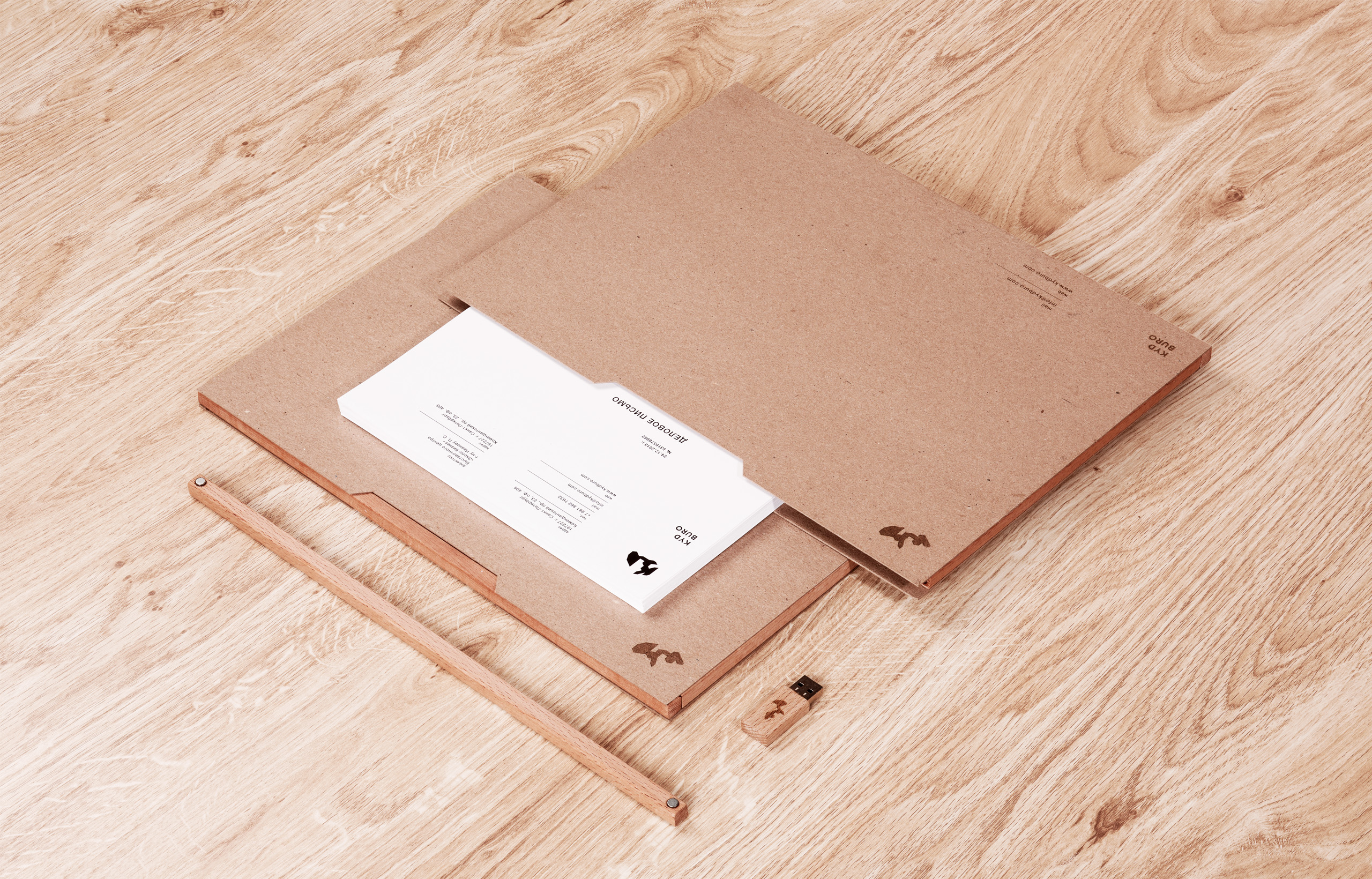
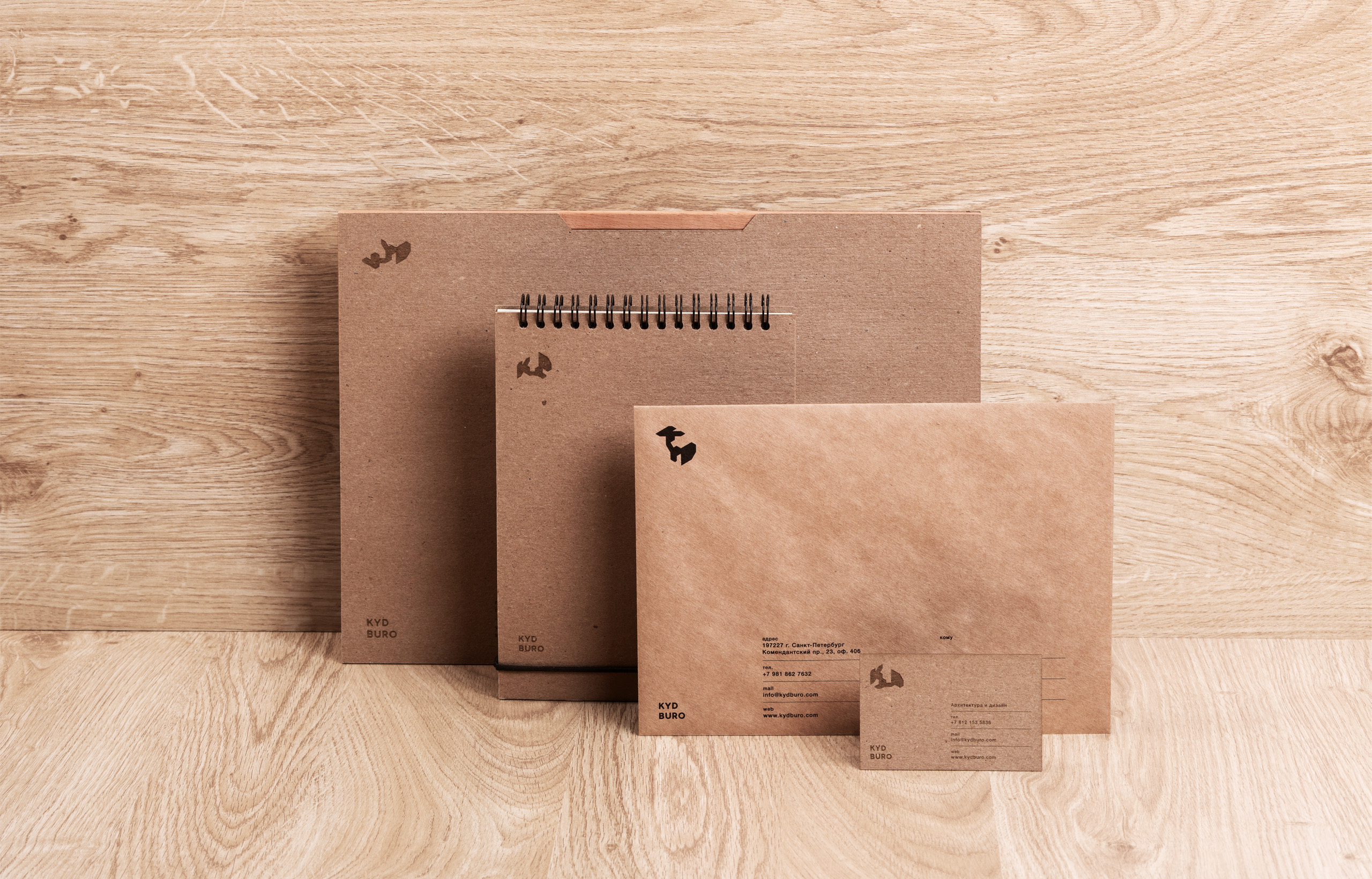
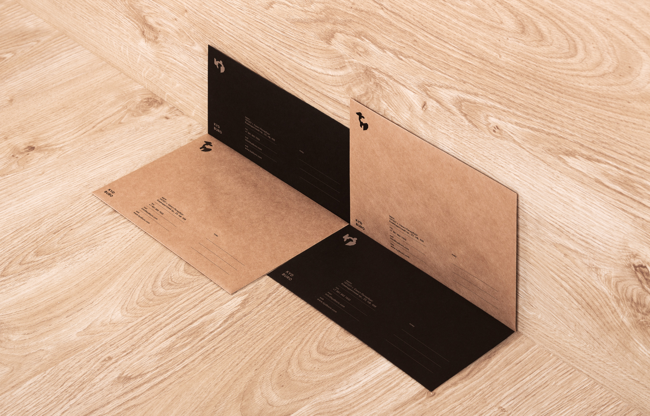
The first step was establishing of relationships between brand values and their graphic expression. It helped to understand the direction for logo design. The decision was found in transformable marque, consisting of three caps letters. Each letter is built with the unified grid and has the same dimensions. Letters' ends have similar edges for various connections with each other. The letters were redesigned to isometric projection to reflect idea of working plan and three-dimensional object. Every letter may have 4 positions by axes. Combining these positions we've got different variations of the marque. Three partners, three dimensions, geometric forms, teamwork, mathematics, adaptibility — all properties are in one simple sign. Logotype also contains full name (KYD BURO) in the style of modern grotesk. |

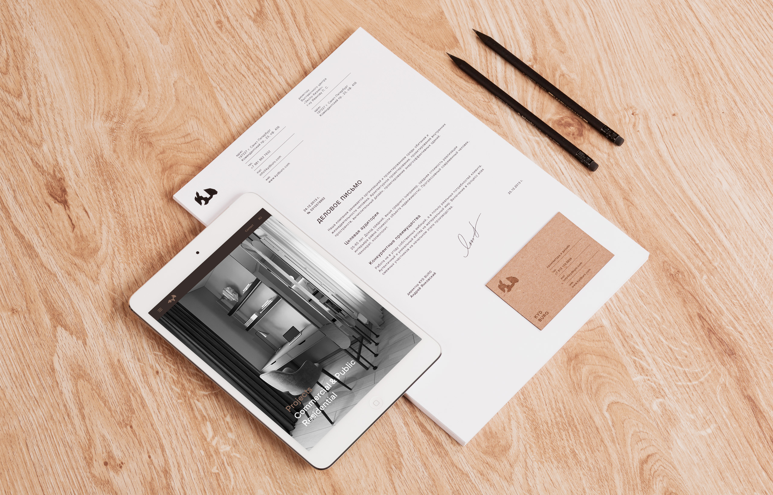
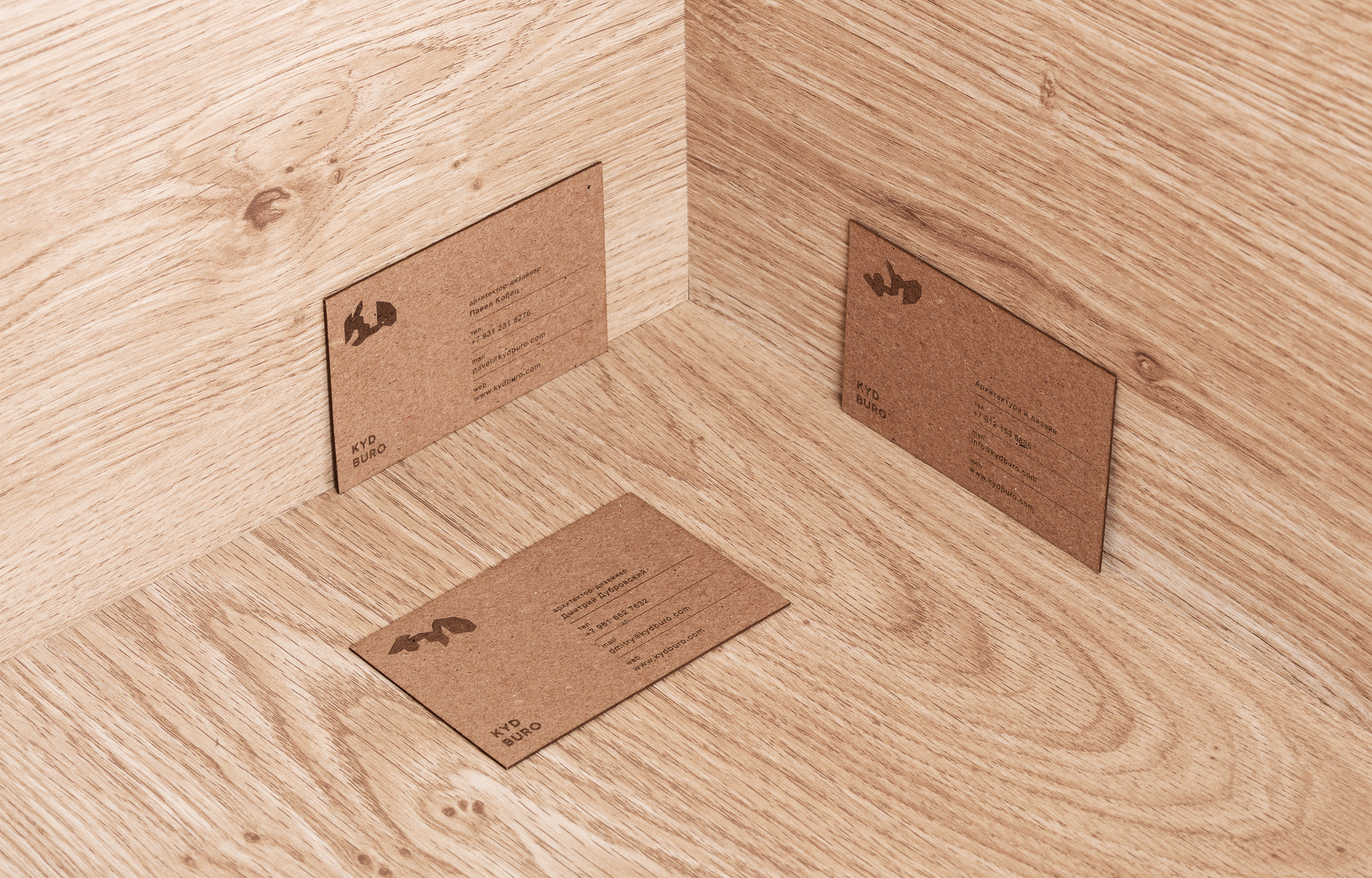
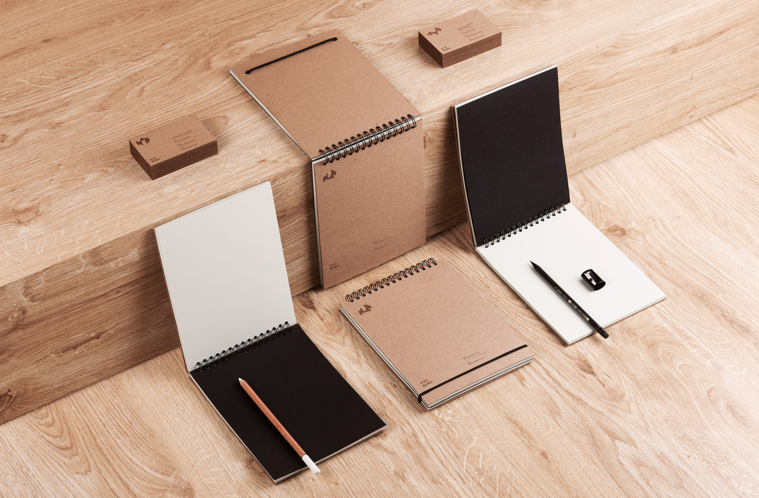
|
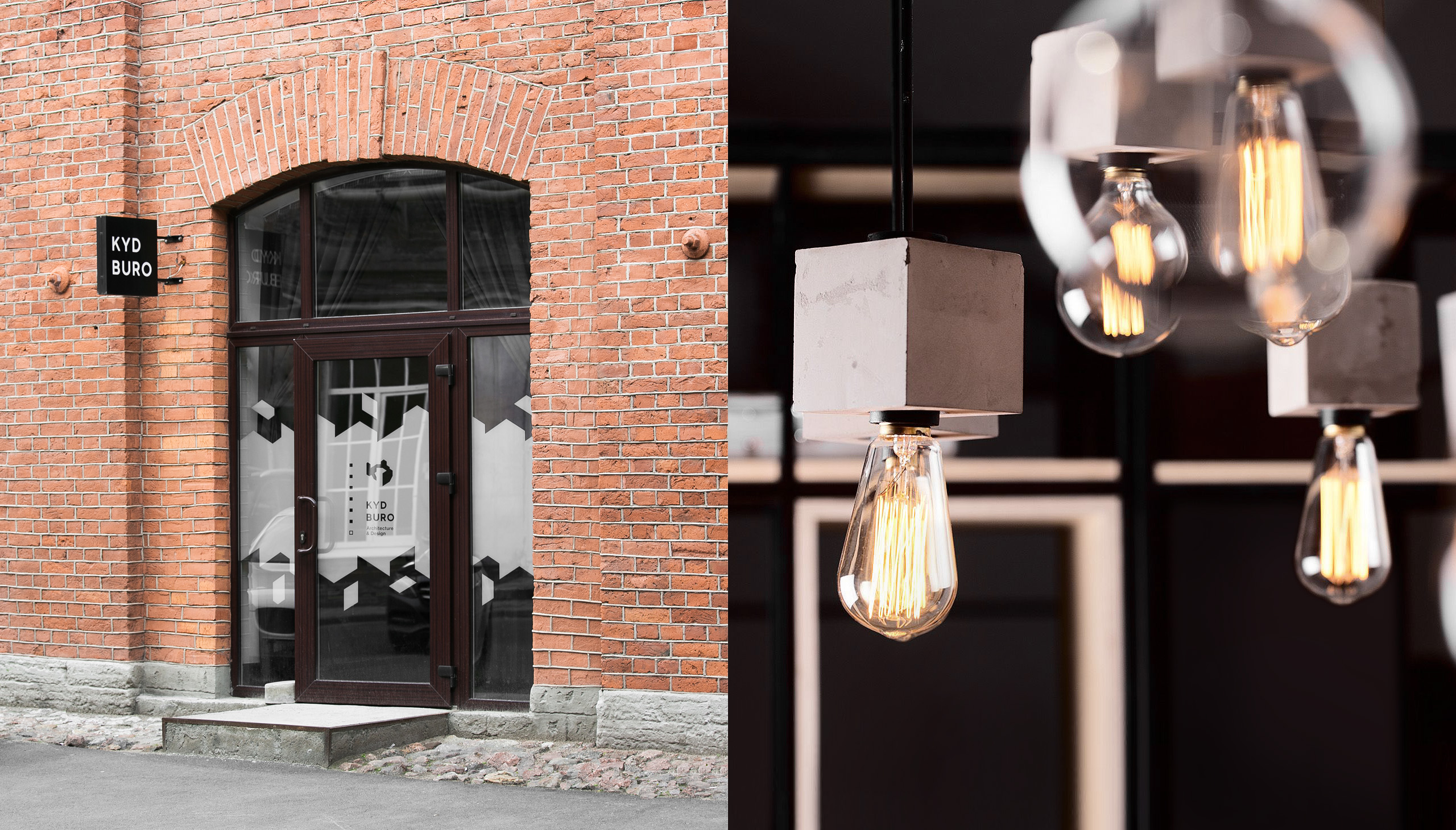
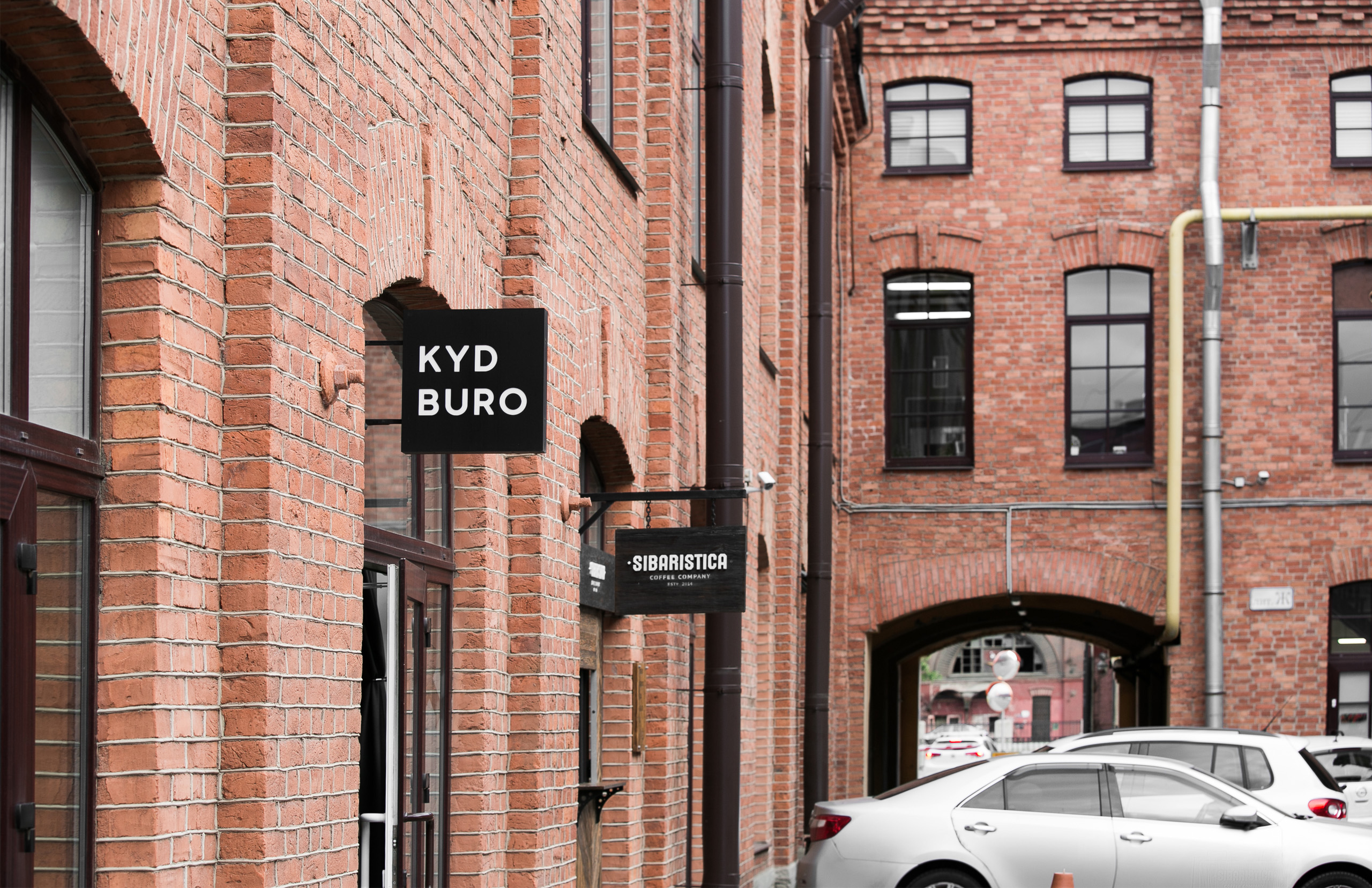
KYD Buro office Company office is located in The Obvodny Dvor Business Centre in the centre of Saint Petersburg. Historically it was the territory of Fourth State Wine Warehouse, built of red brick. As a part of branding work we completed the design of the office entrance, using the geometric applique on the glass. Logotype is placed on the protruding console. |
next project
Typografiya Website
