Duga
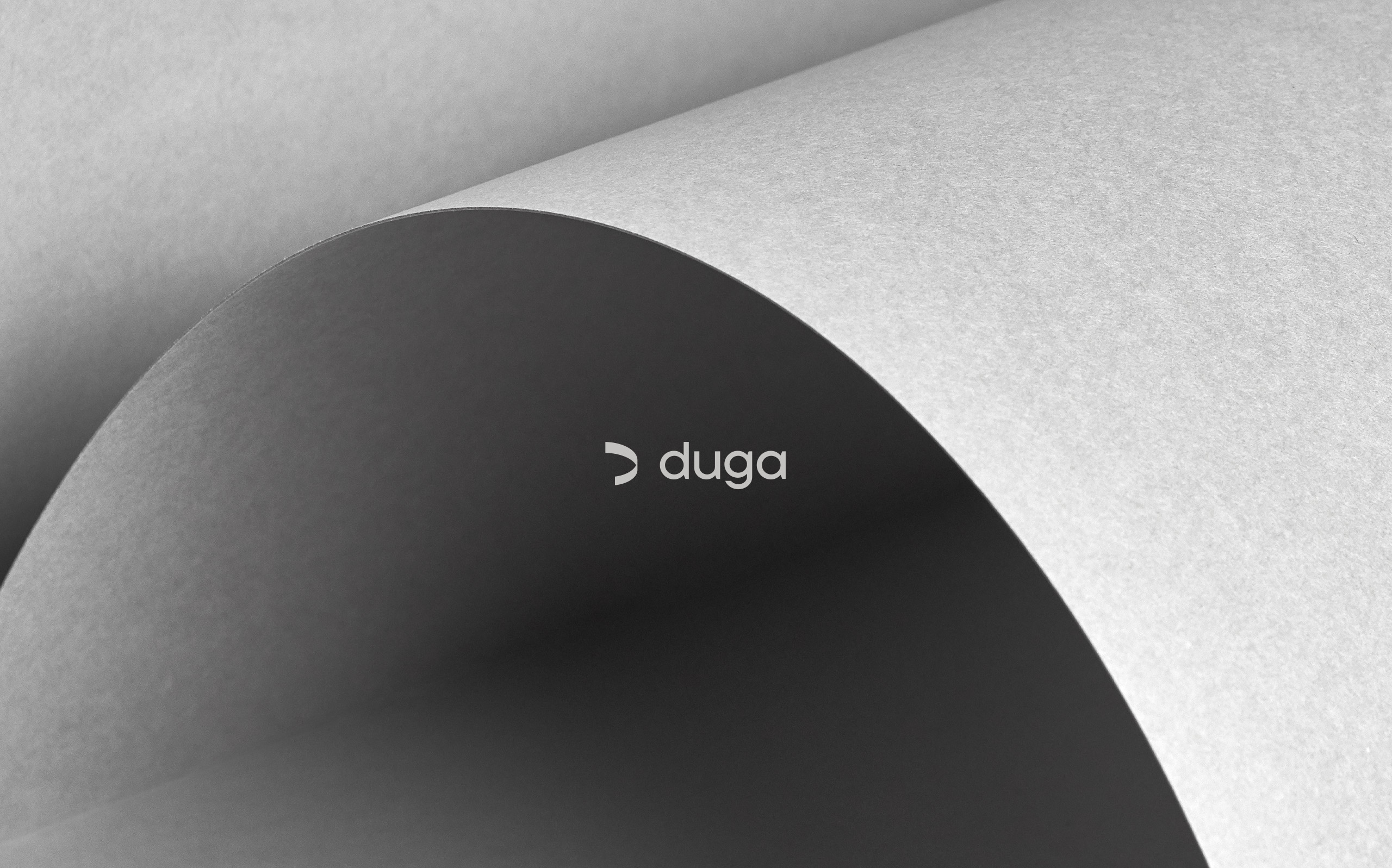
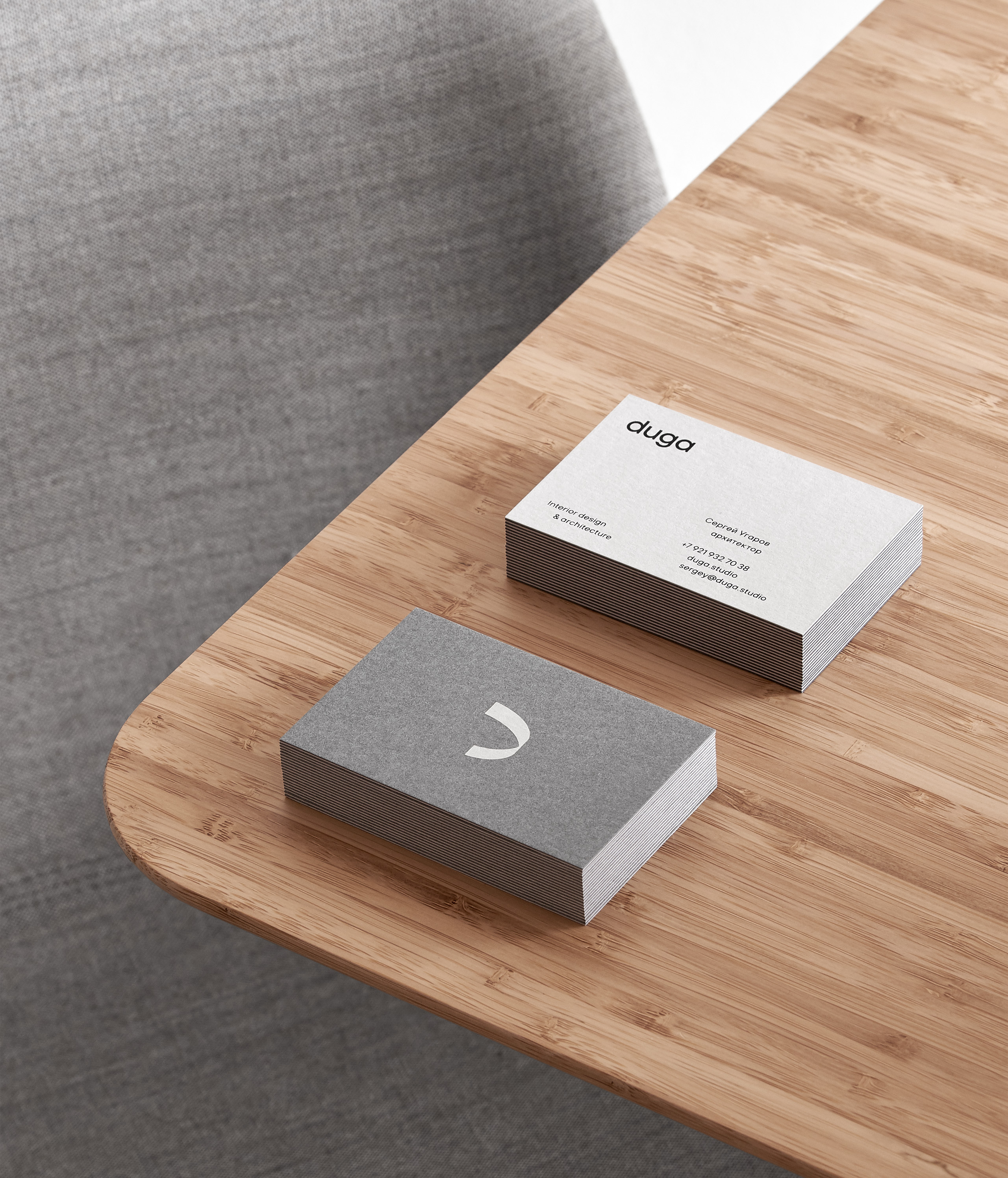
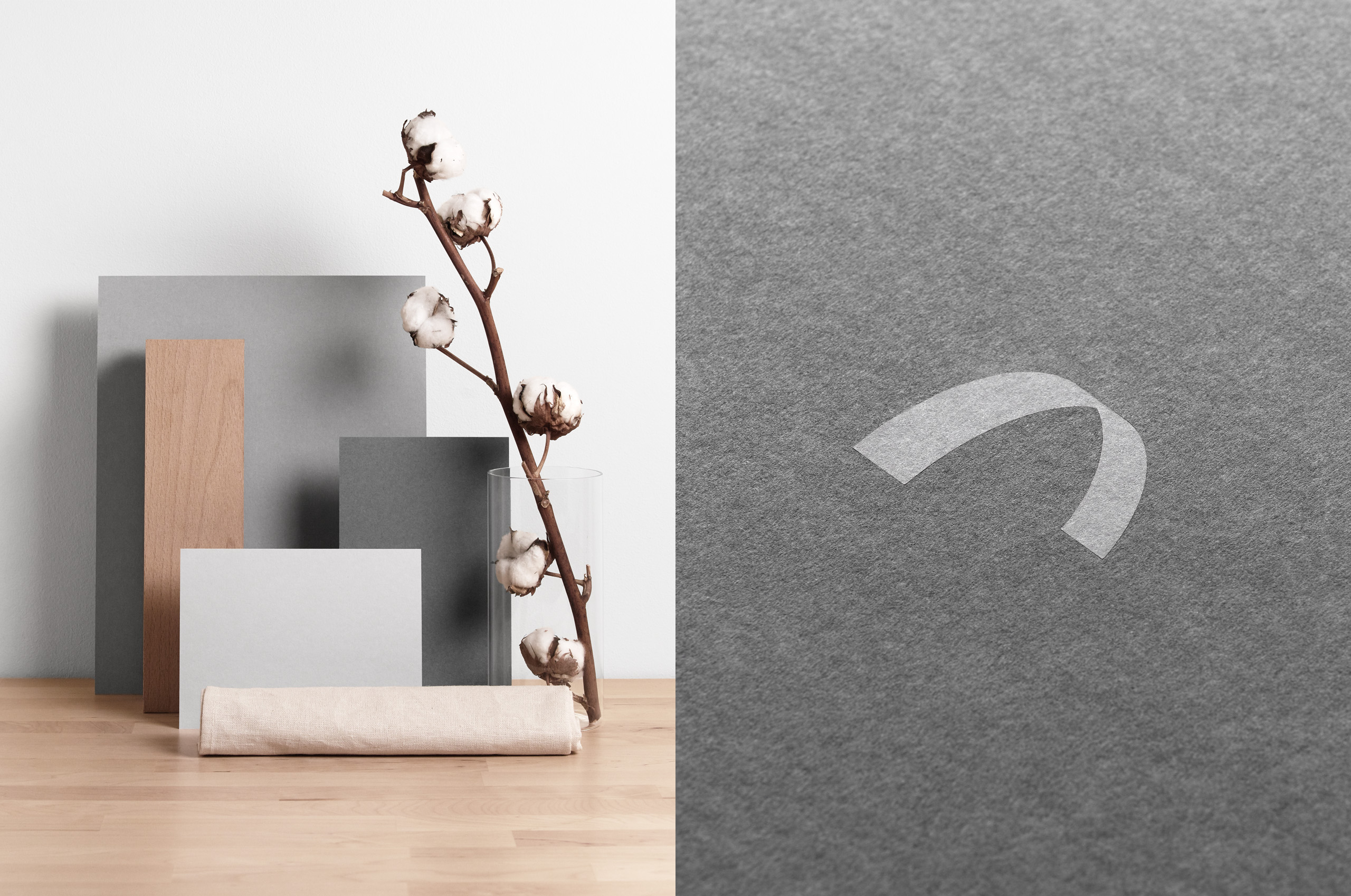
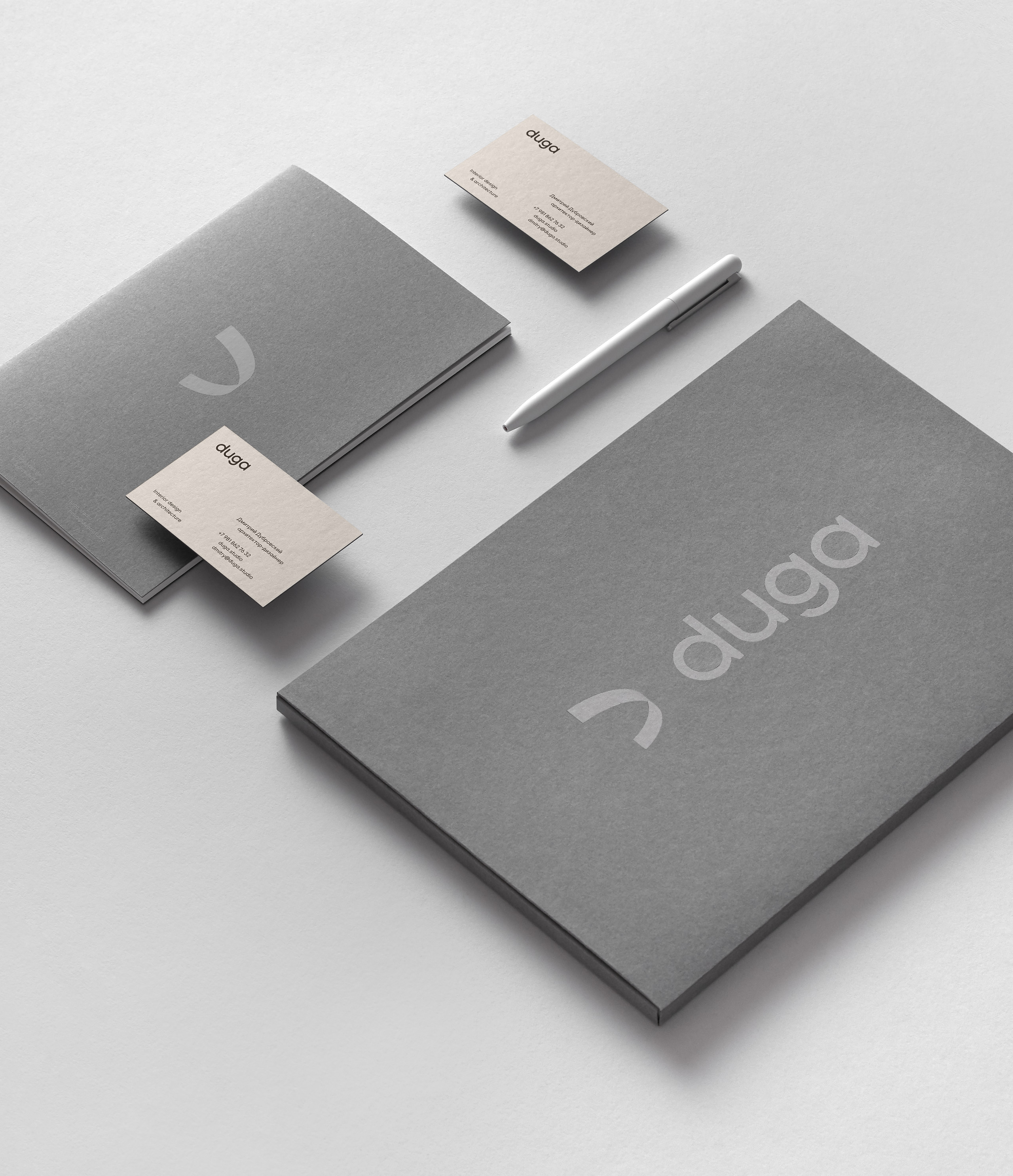
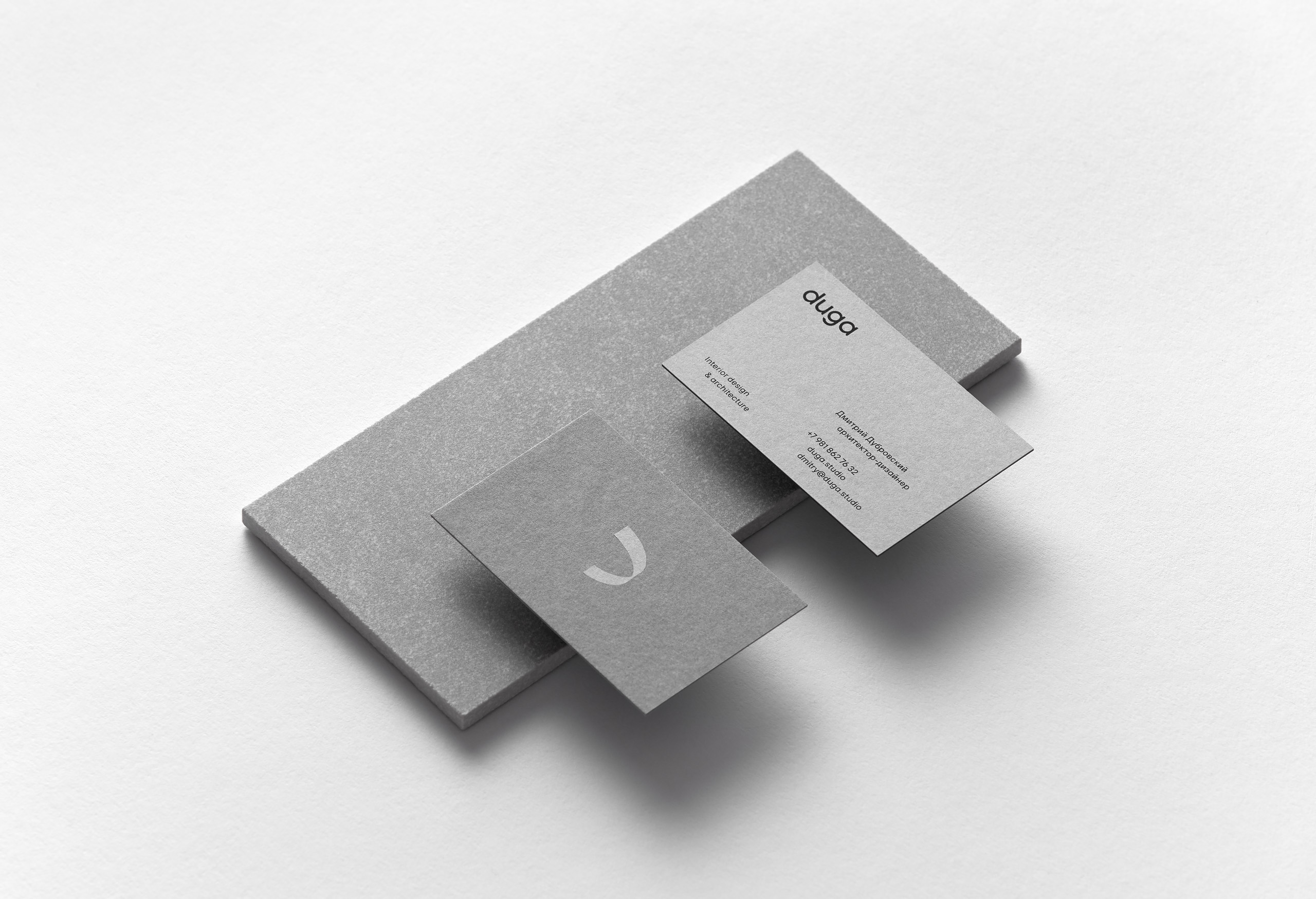
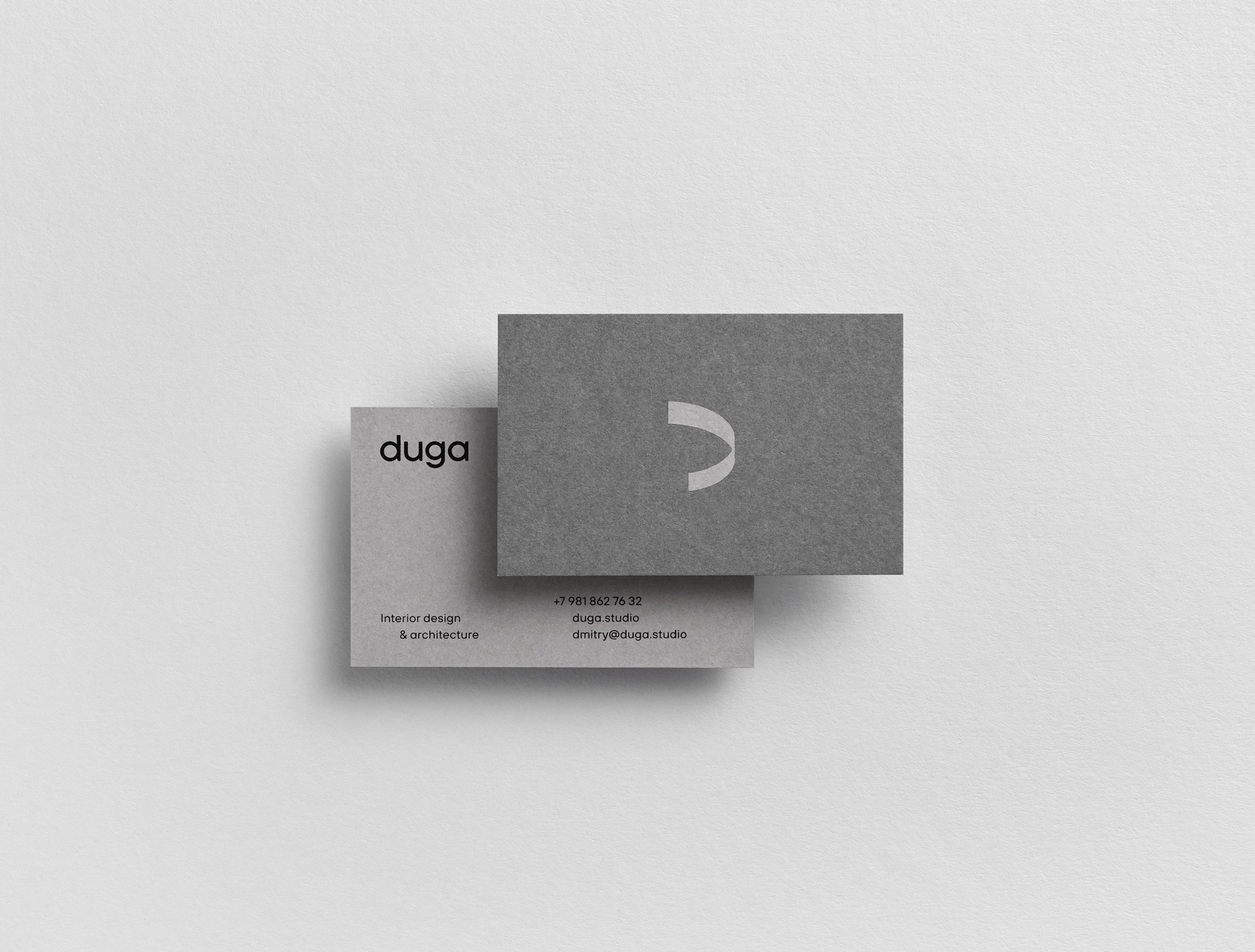
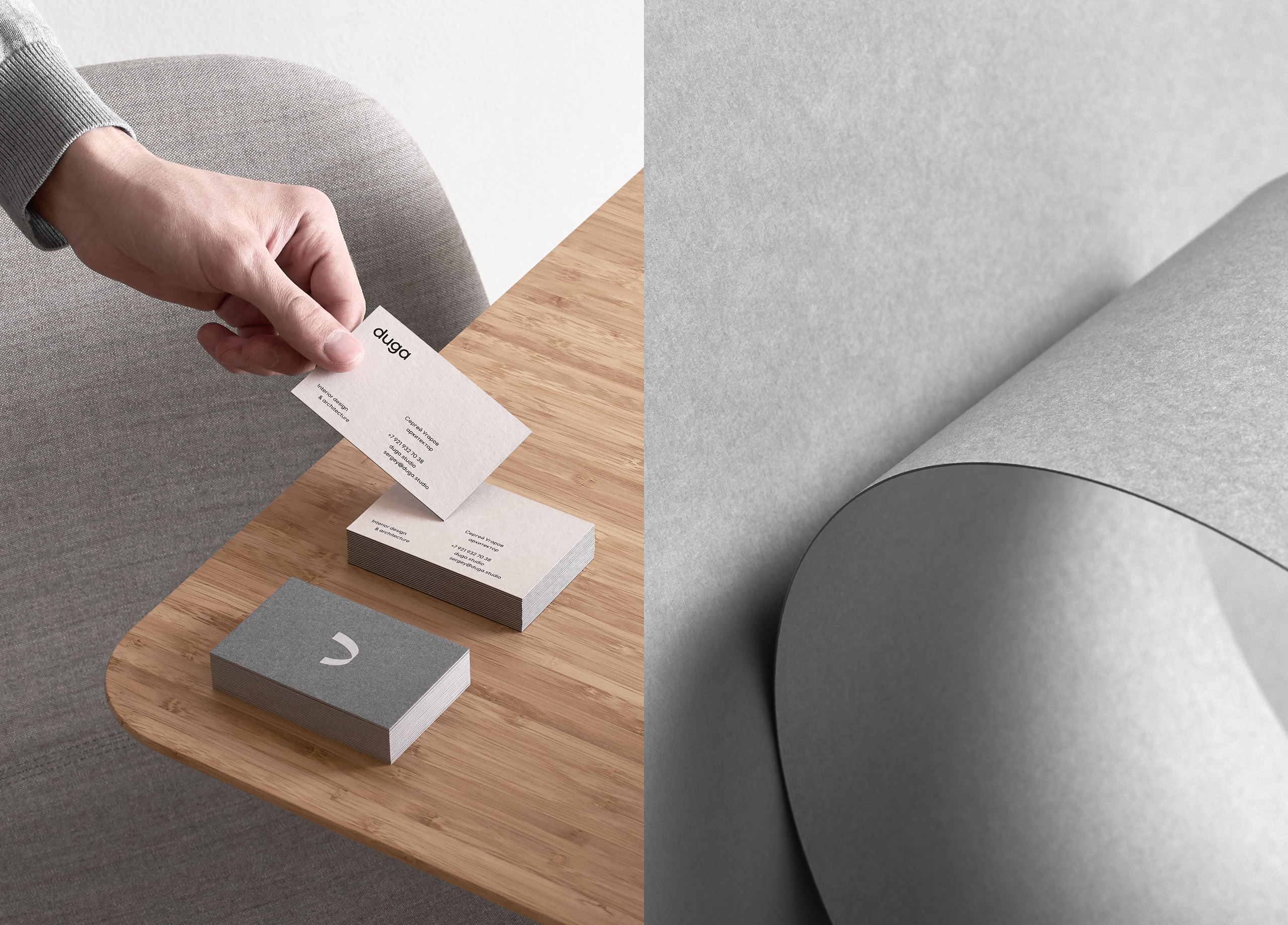
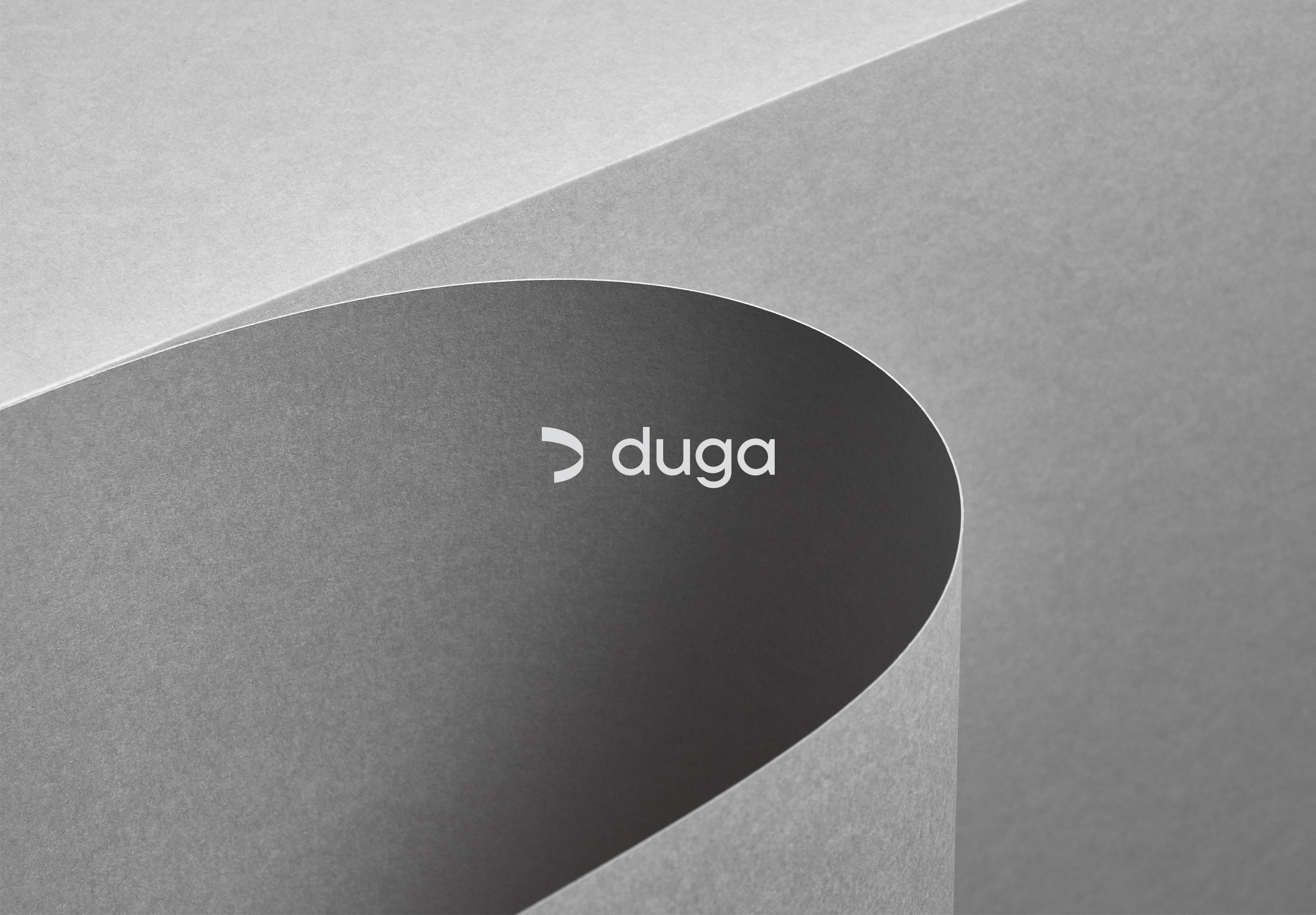
Brand identityDuga is an interior design and architecture studio based in St. Petersburg. ‘Duga’ in Russian means arc (a segment of circle). The logo mark is a metaphor of paper canvas, letter ‘D’ & arc itself.
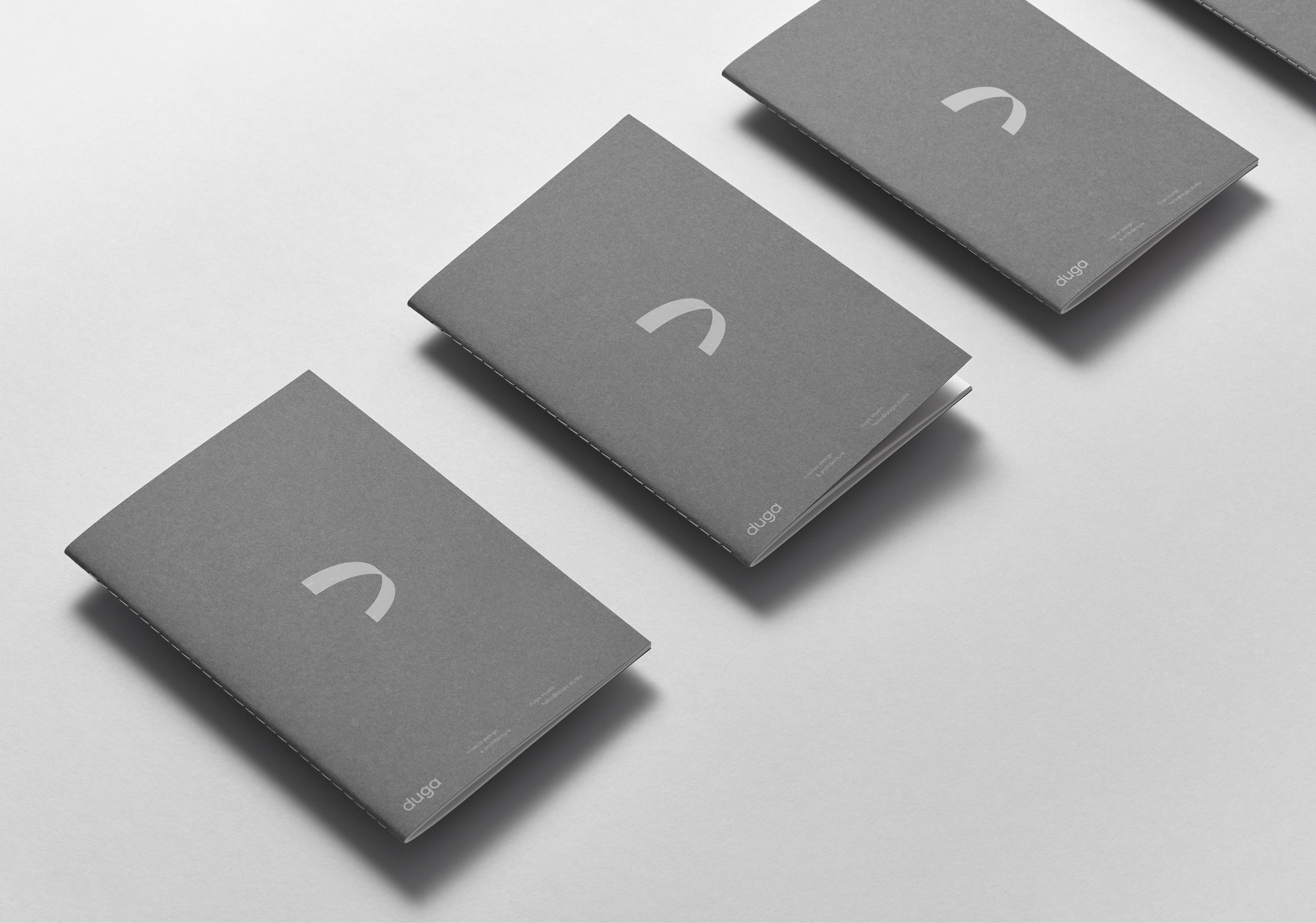
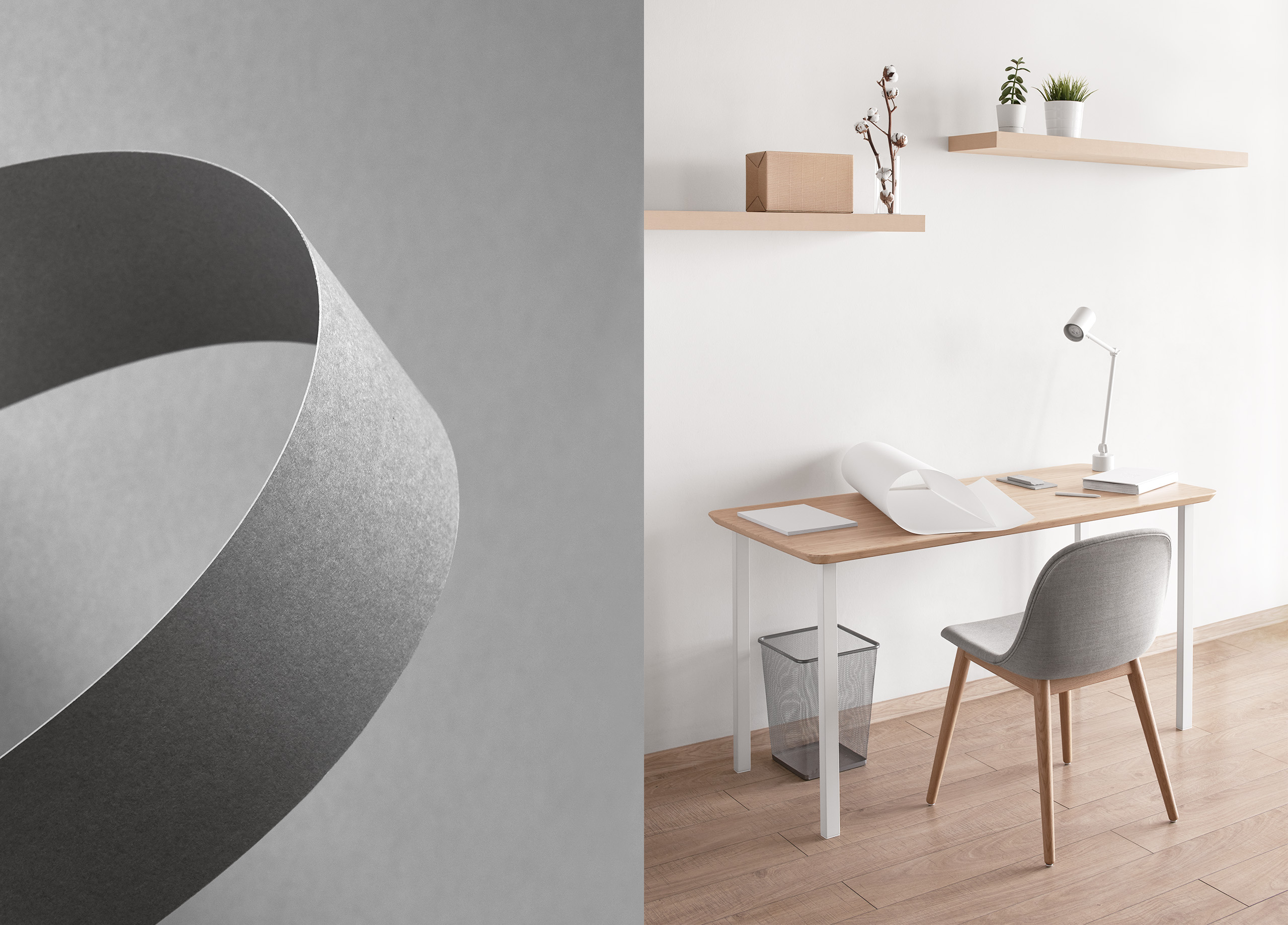
Studio process is based on two core principles: relevance to the context of time and the environment. Versatility and flexibility of working process allow to release projects varying degrees of complexity with a consistently high level of quality. Curved lines in brand identity reflects logo mark design and adaptivity of Duga’s work process.
Photography: Daniil Zherdev
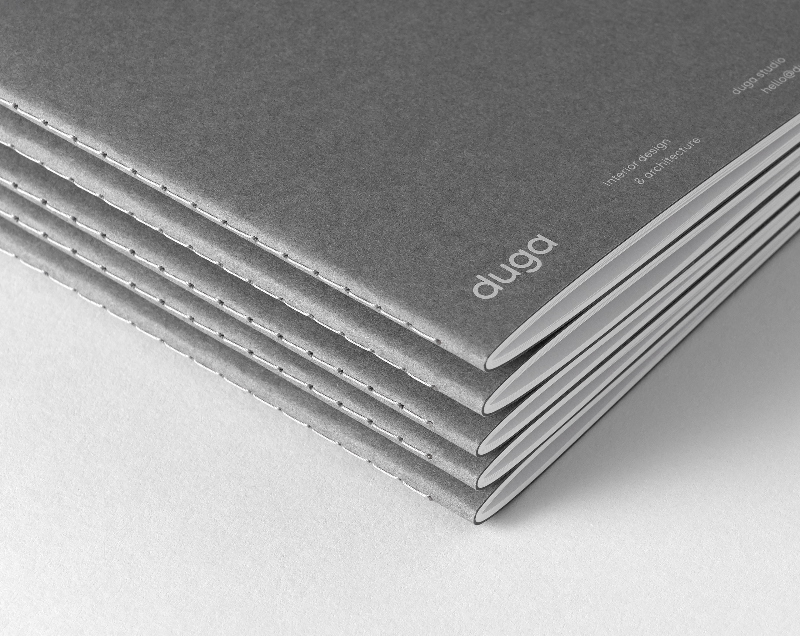
Paper: Gmund Colors Matt 23, 85 & 93








next project
Novaroom

