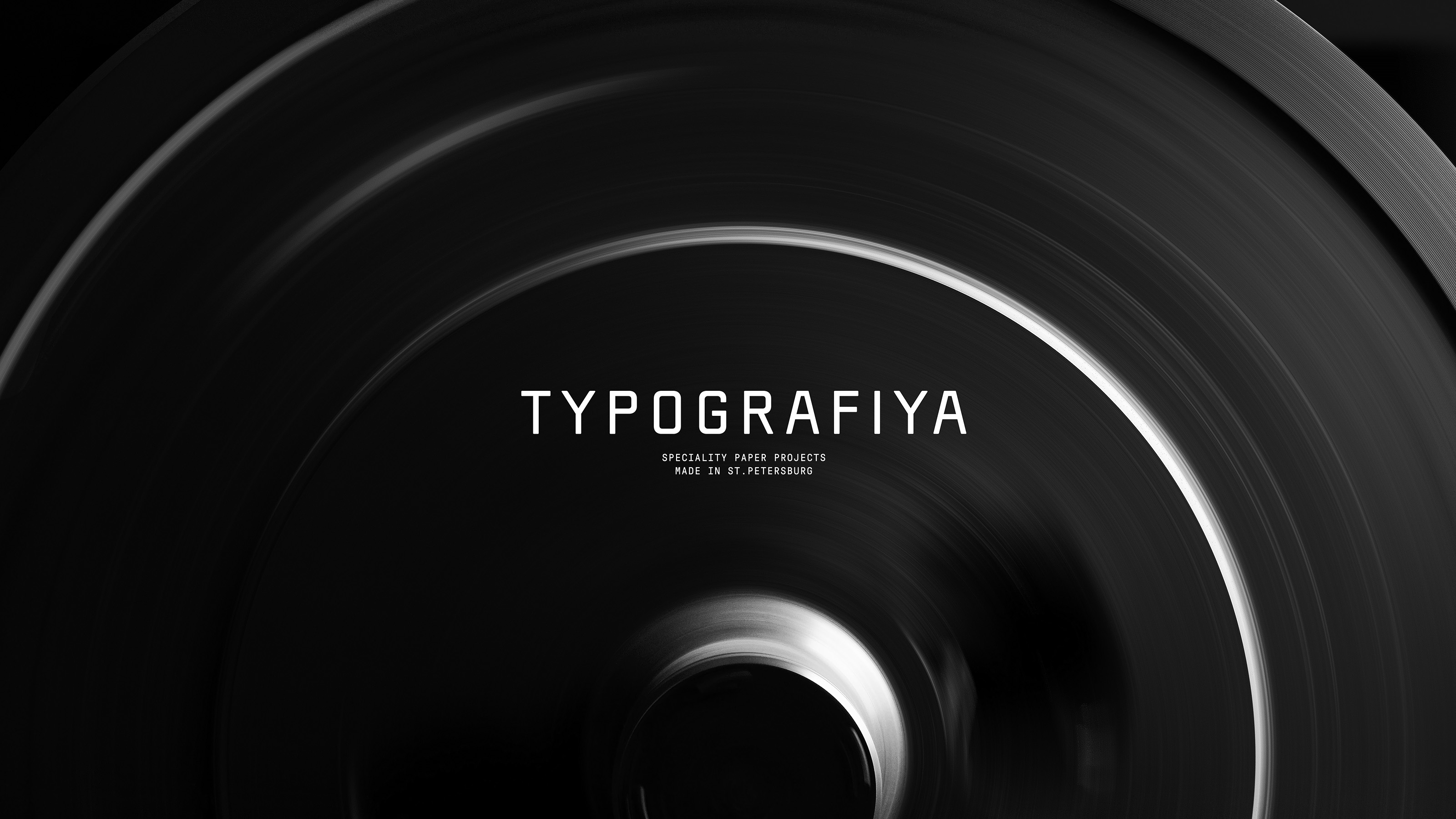
Typografiya
Branding, Art Direction, Print DesignTypografiya is a Saint Petersburg based printing house. They believe in the aesthetics of printing — the transfer of ink to paper, and the operation of mechanisms under human control. Constructive, technical approach combined with high professional skills and functional design are the key features of their process.
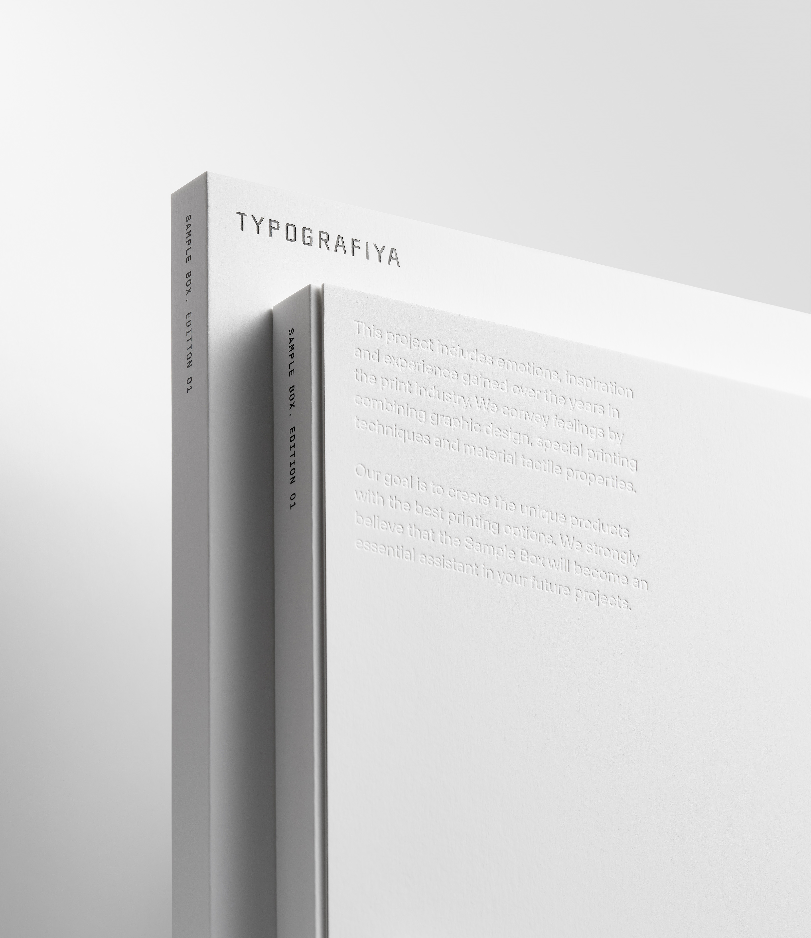
The main objective of the project was to create a blank brand identity in conjunction with the technical aesthetics of printing machines of the mid-20th century.
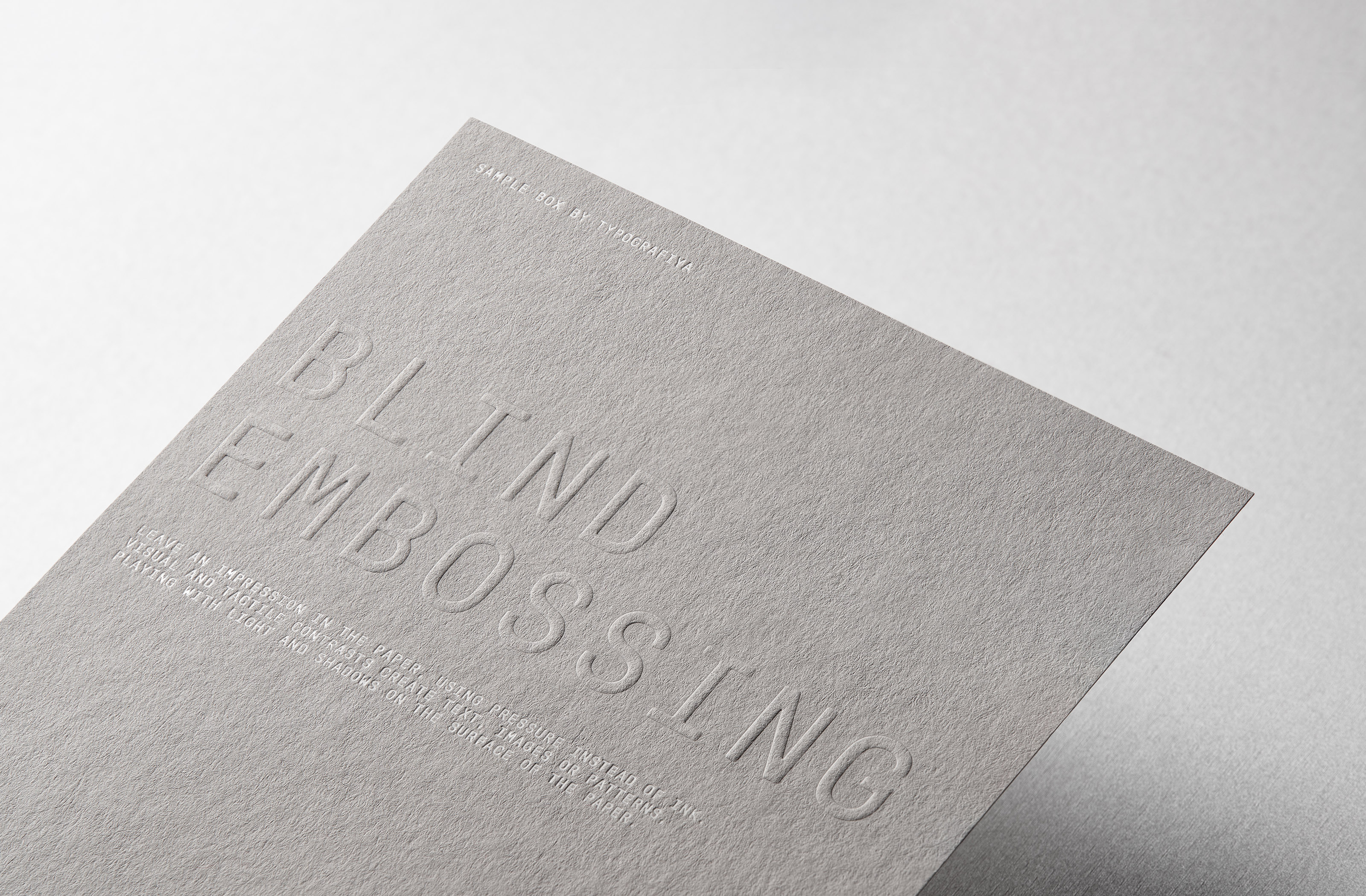
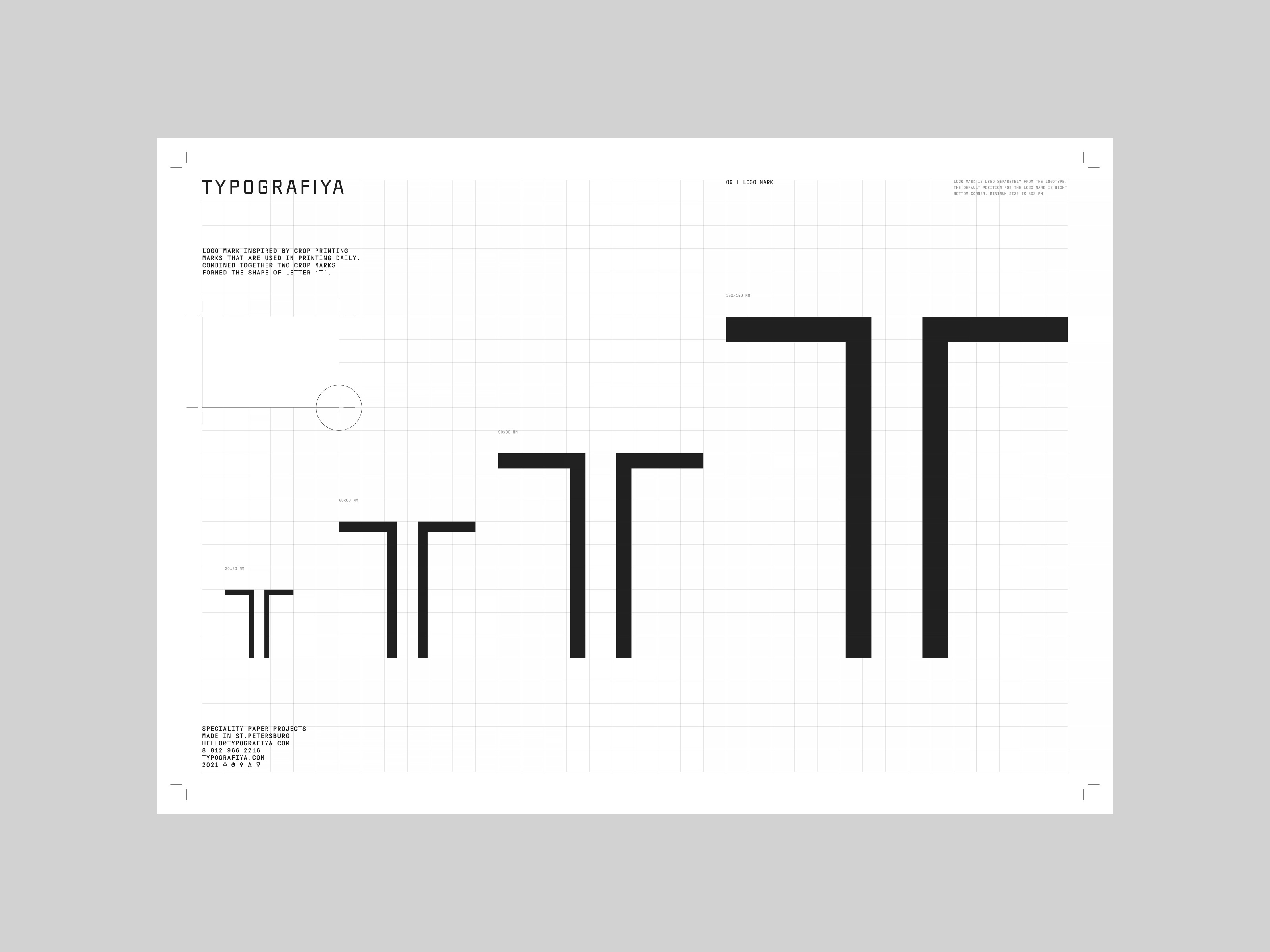
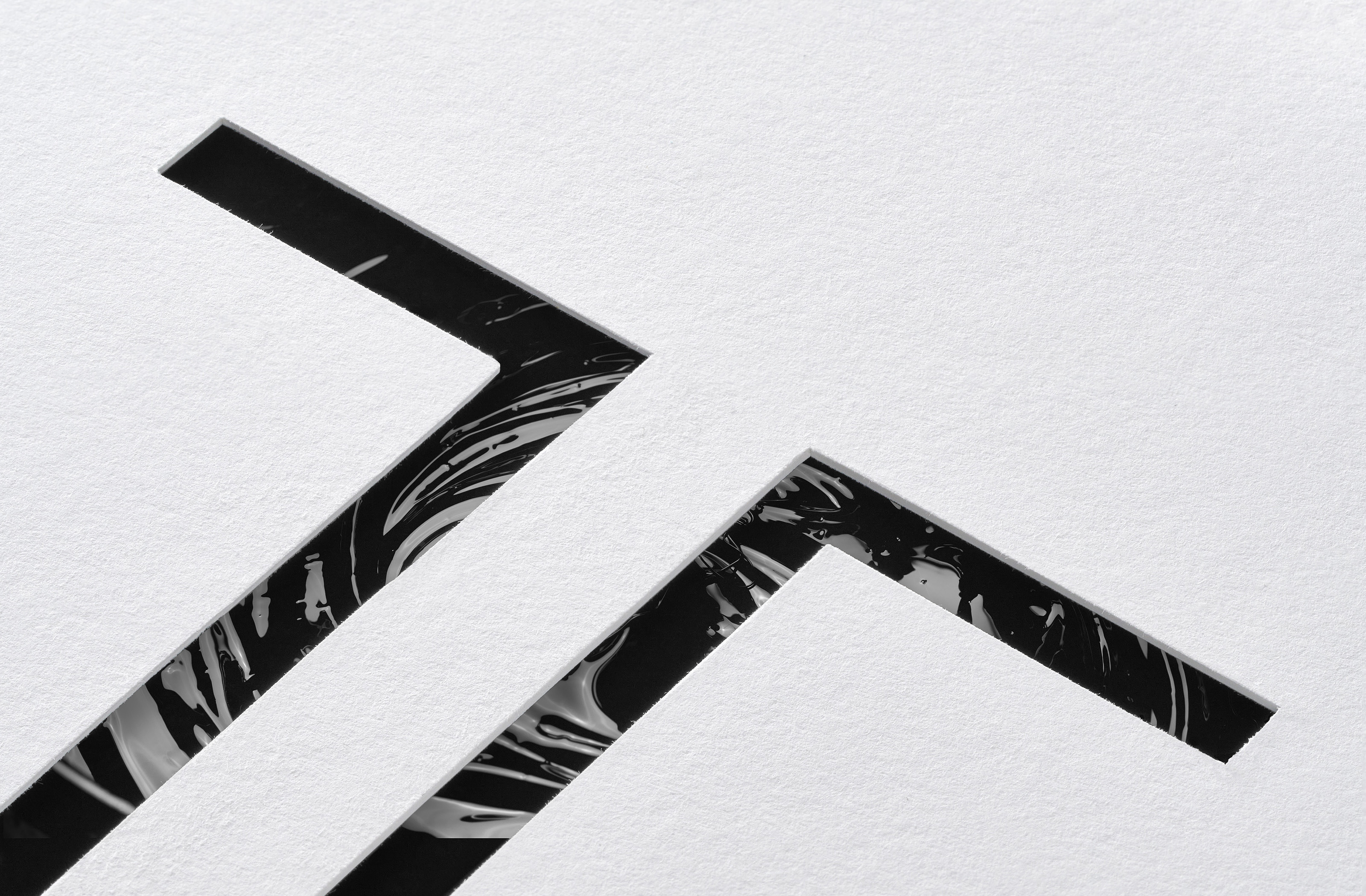
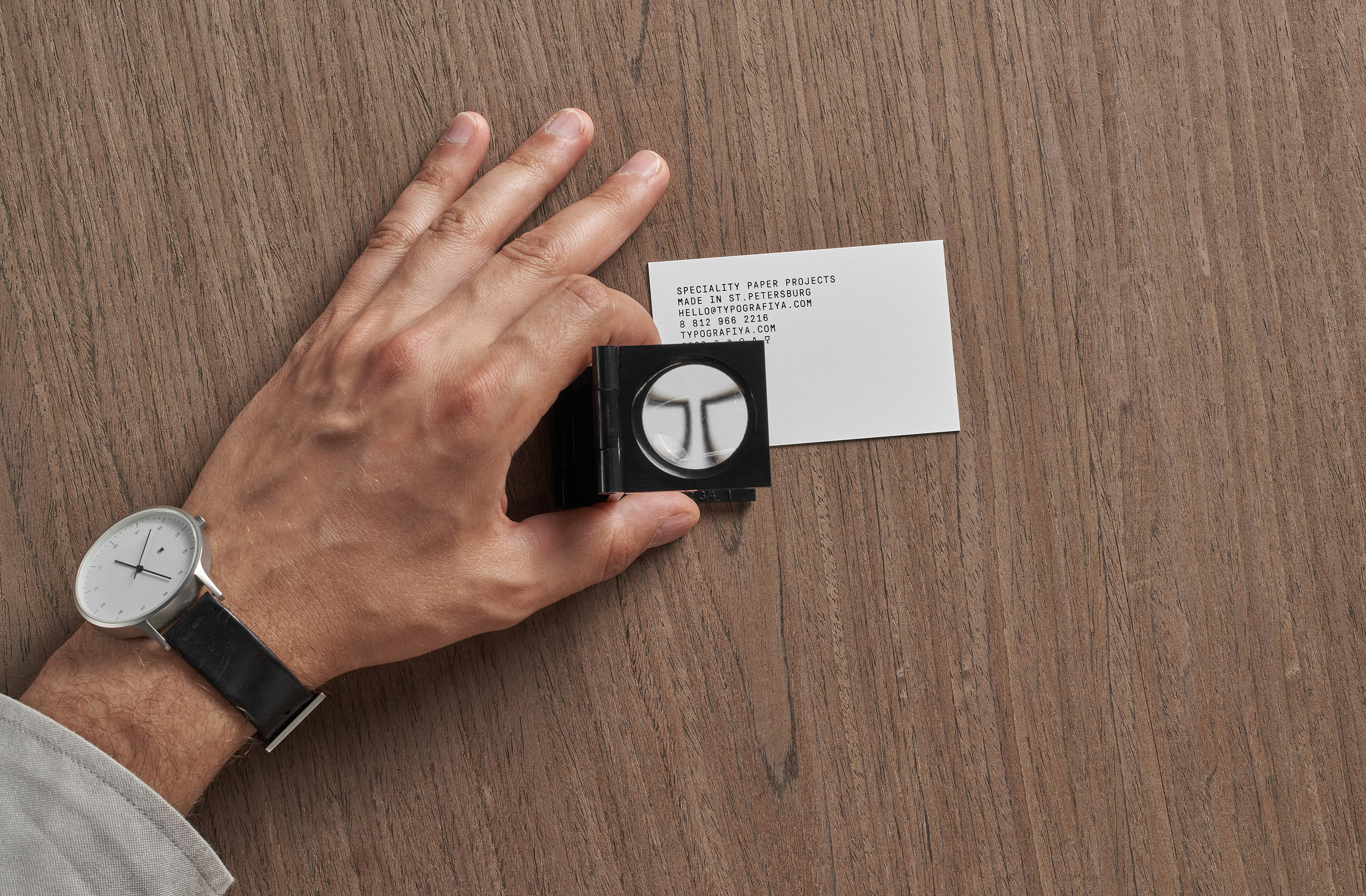
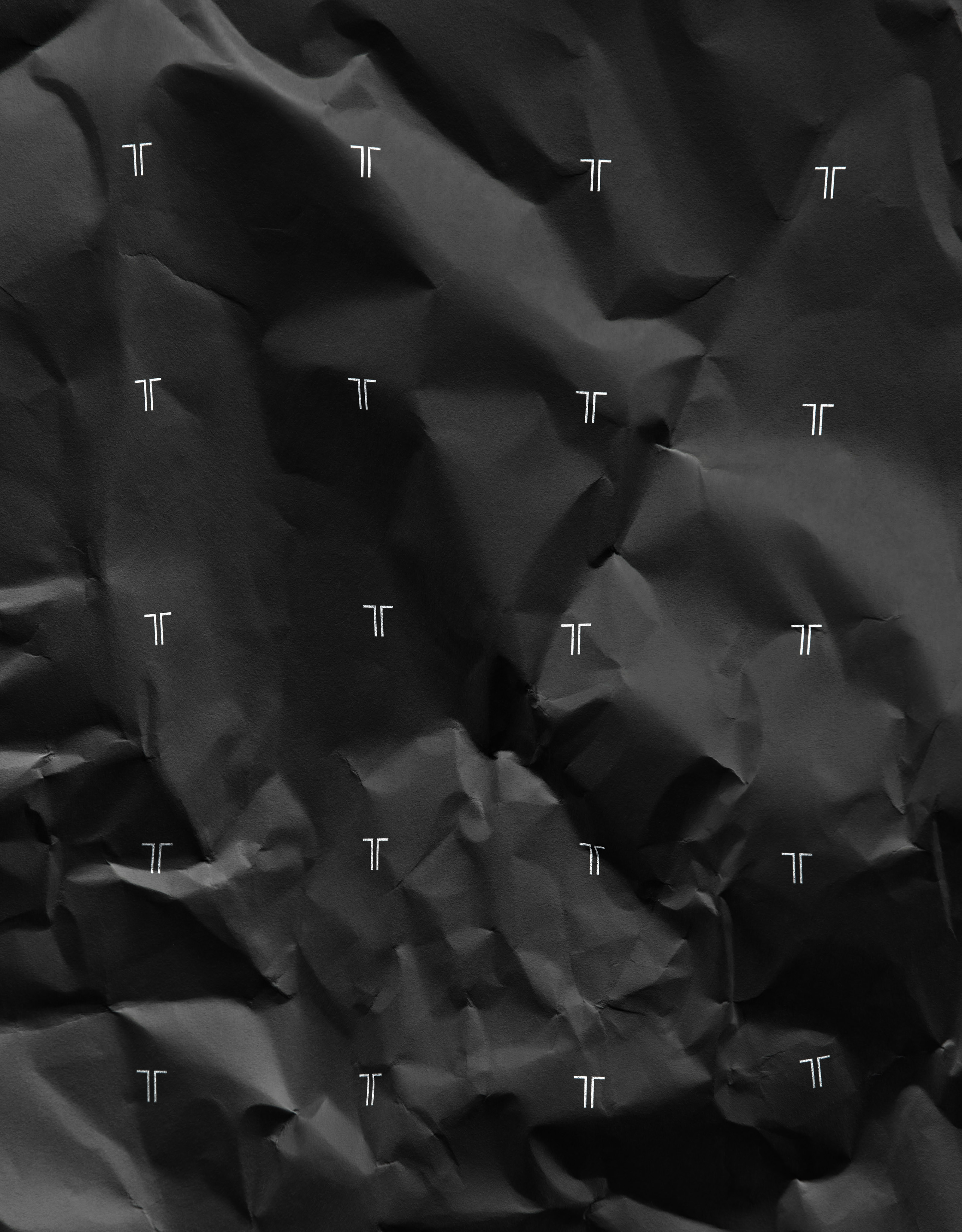
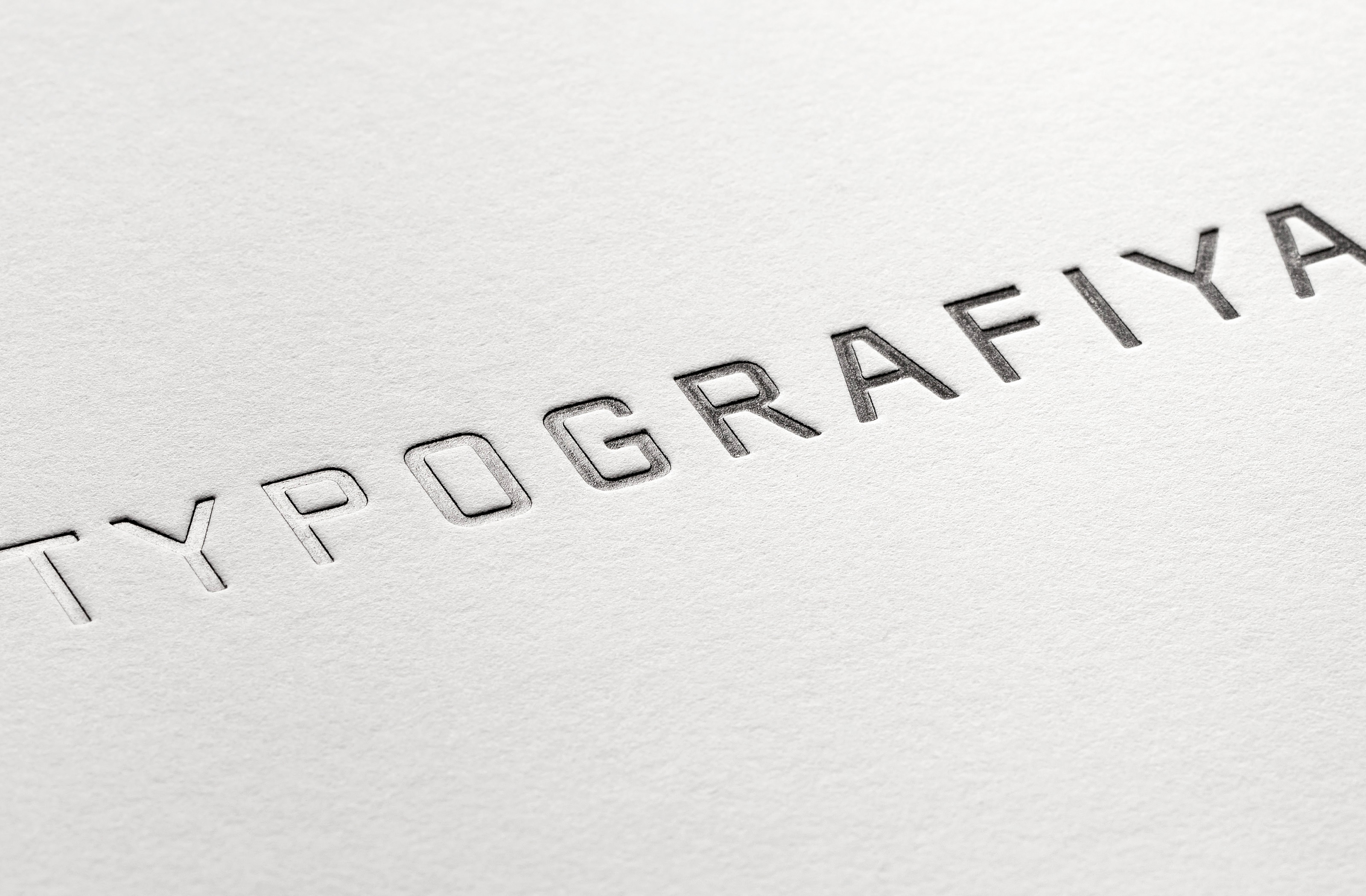
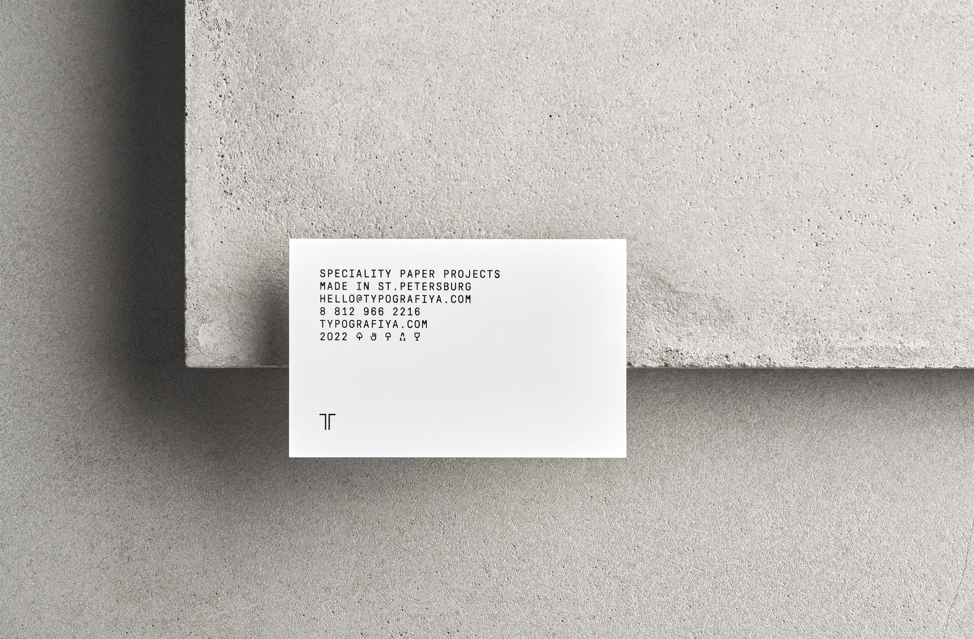
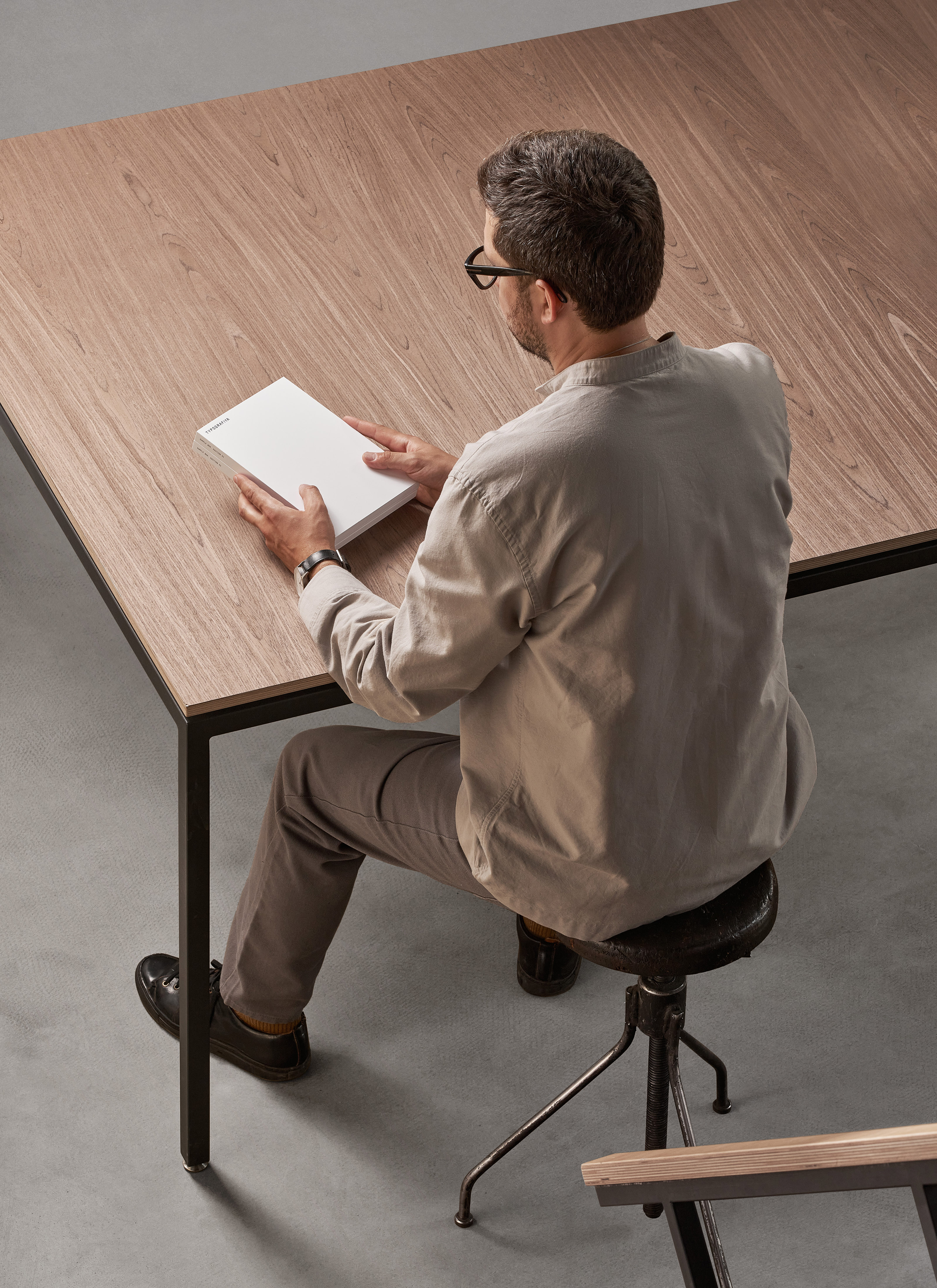
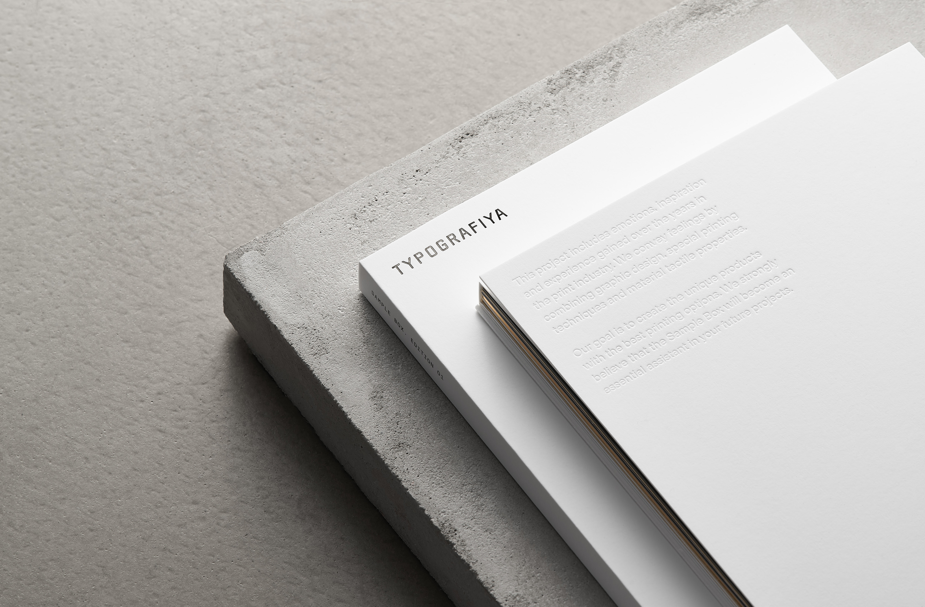
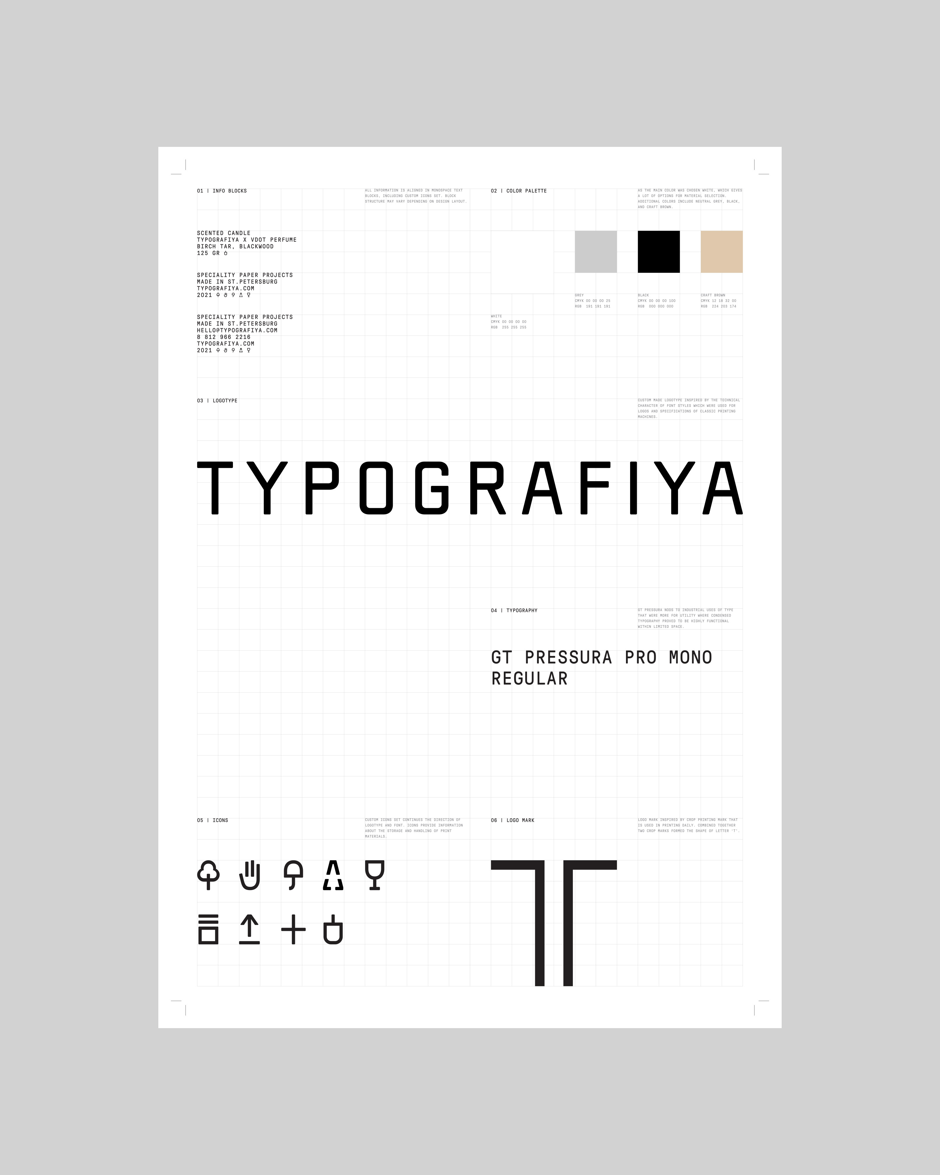
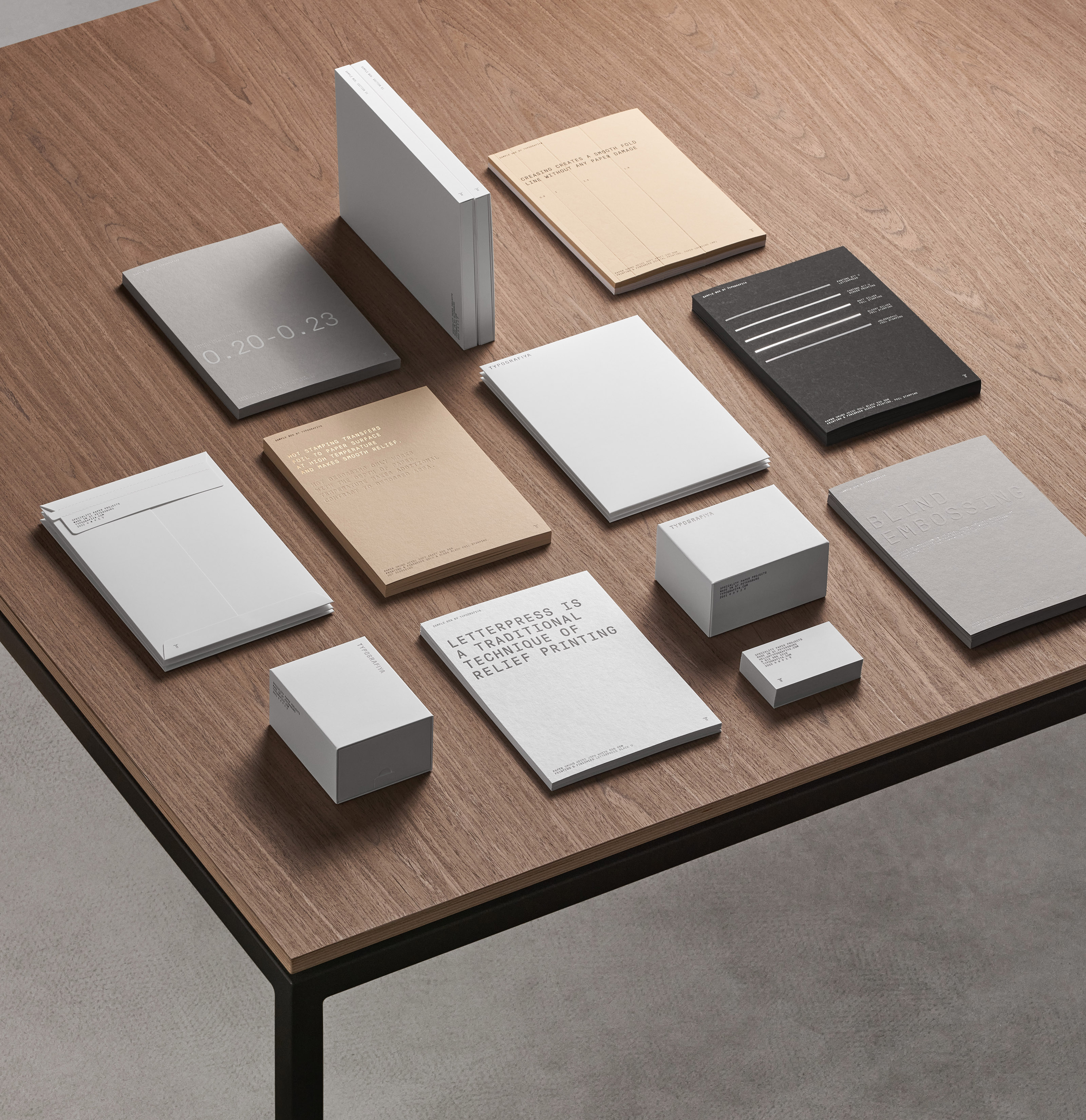
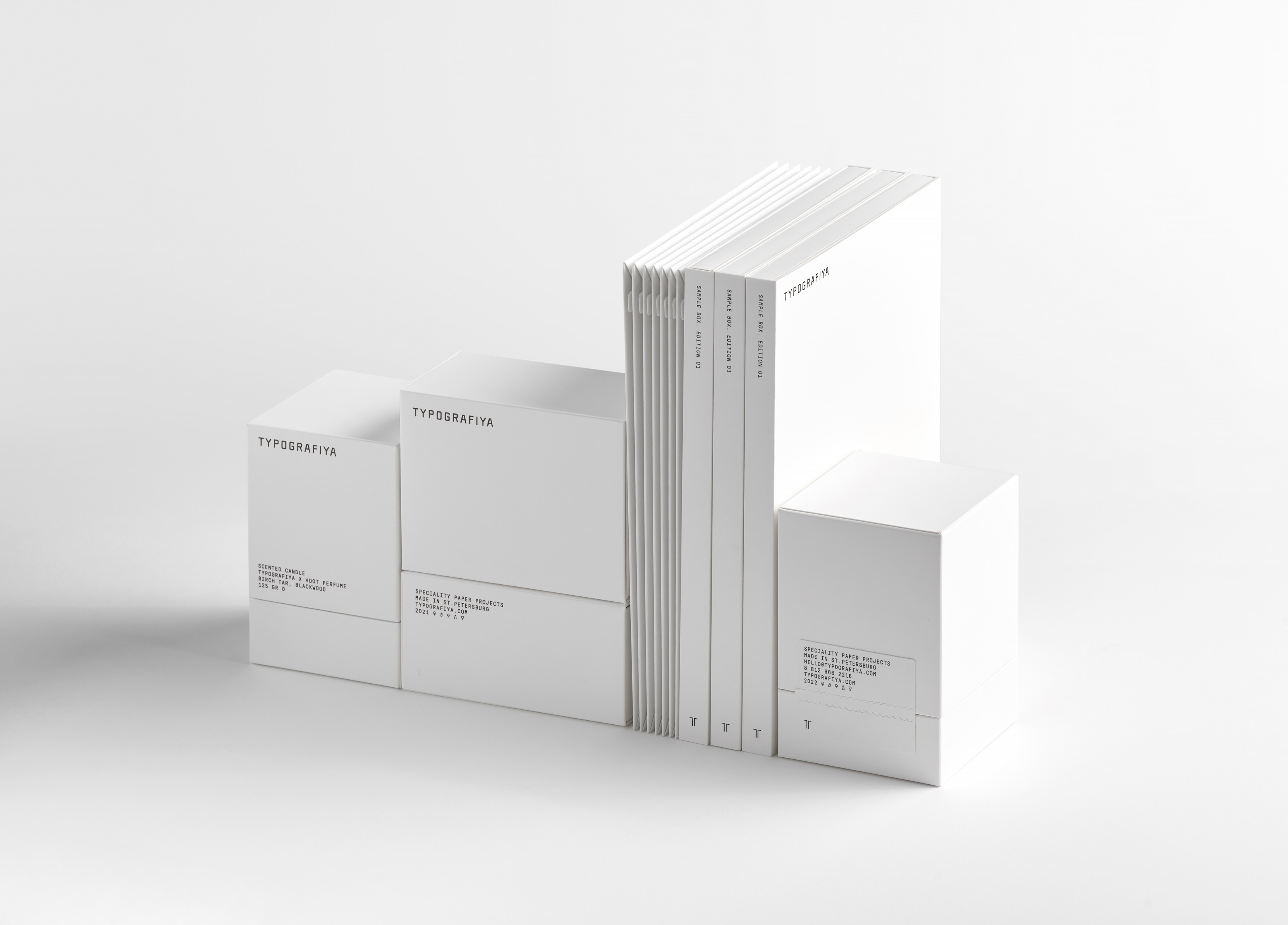
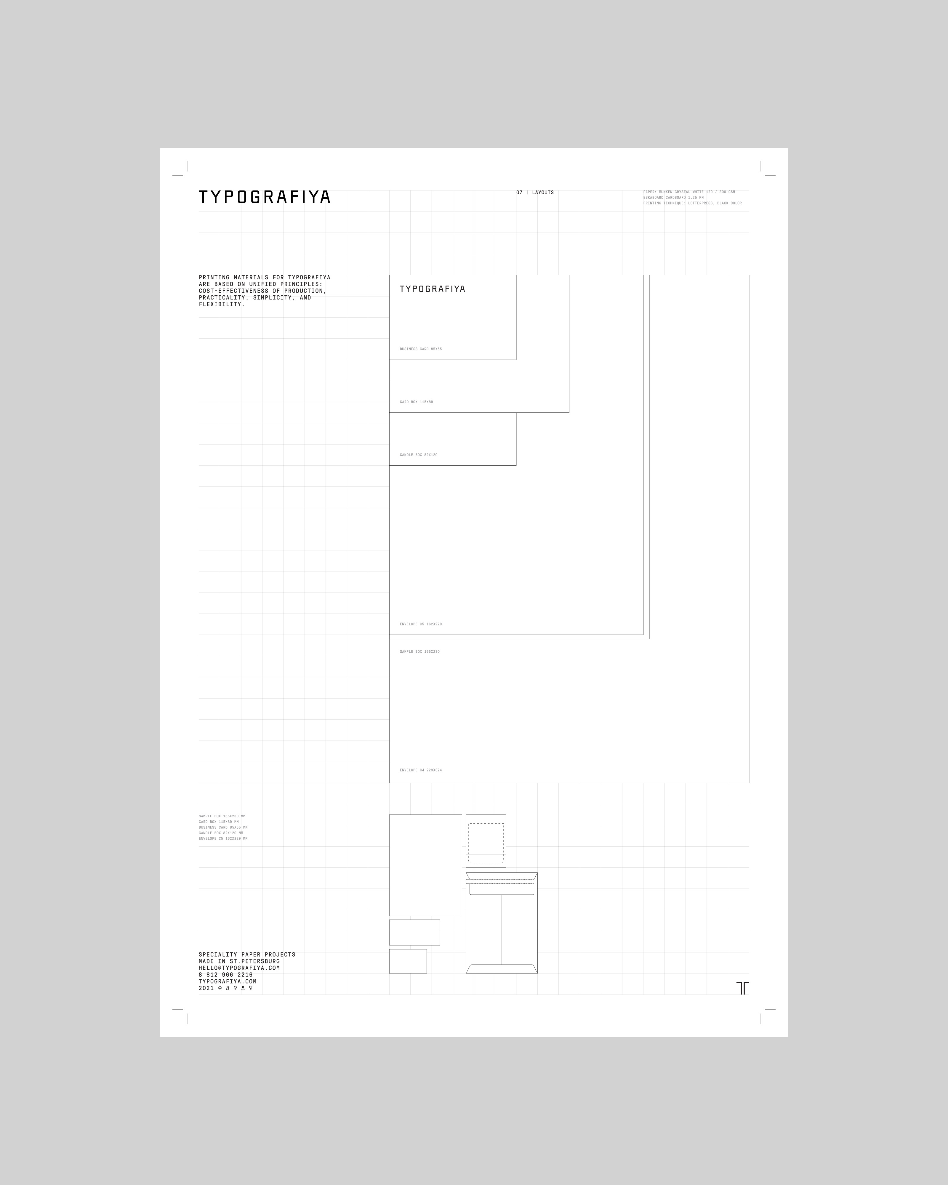
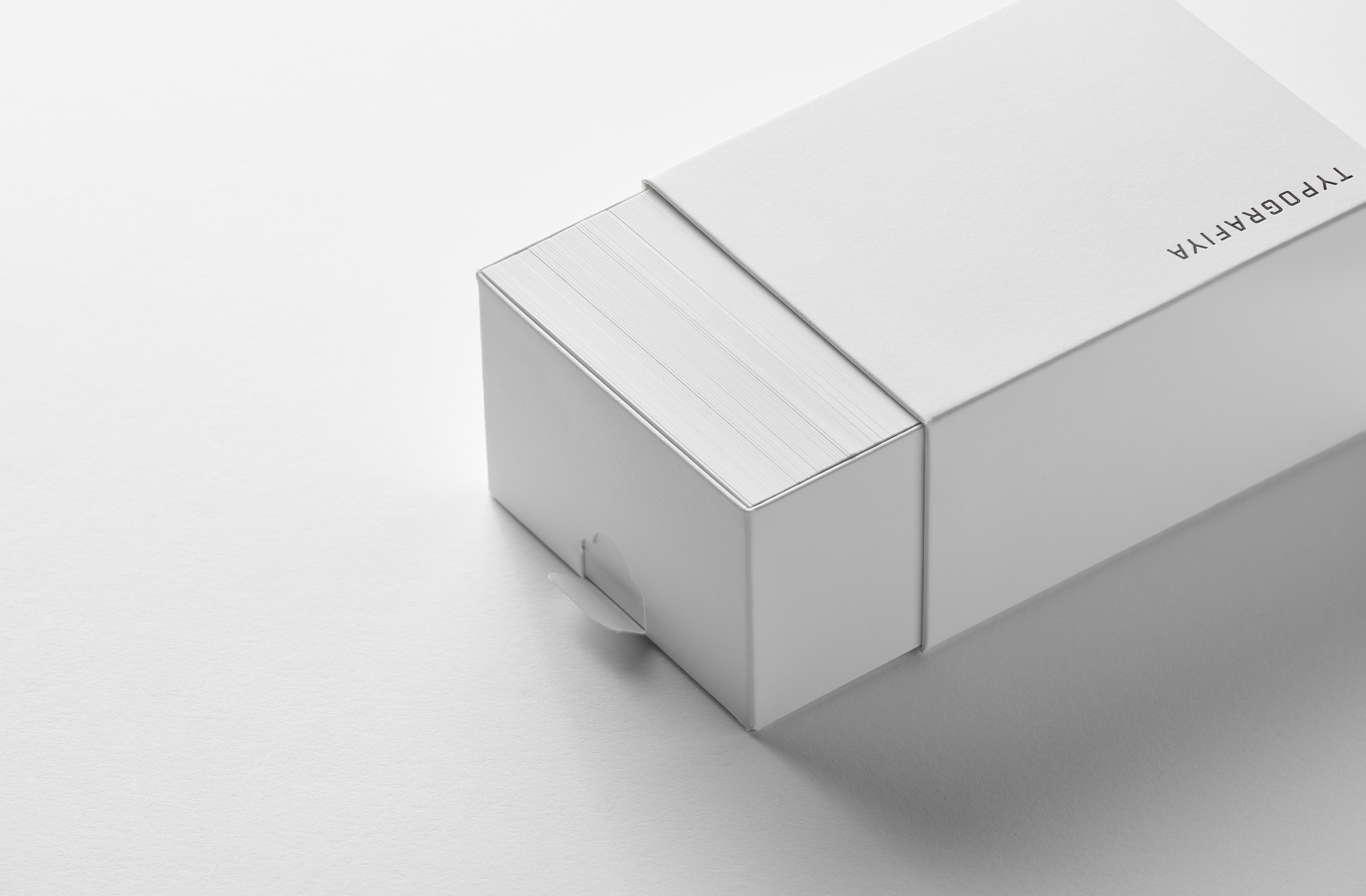
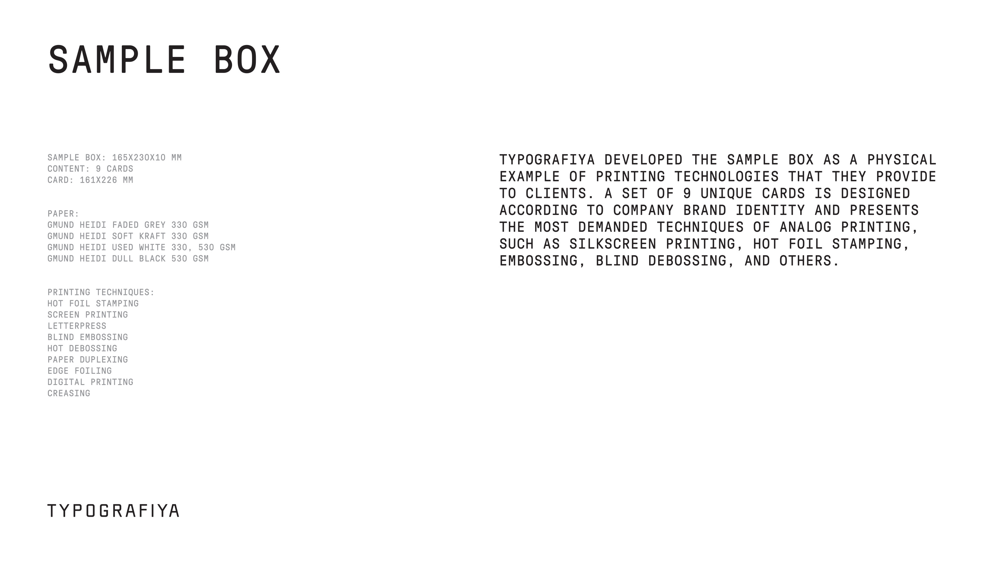
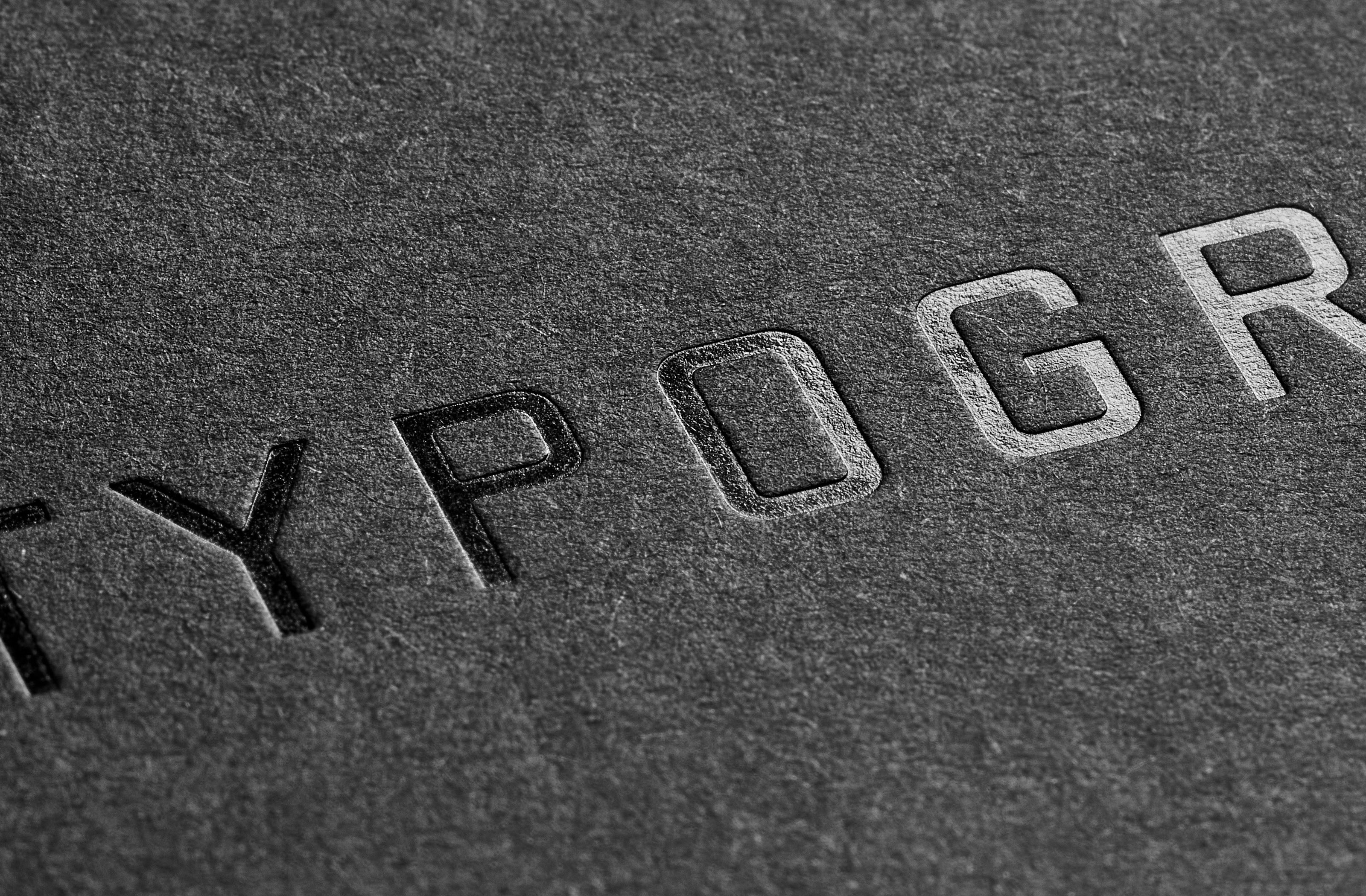
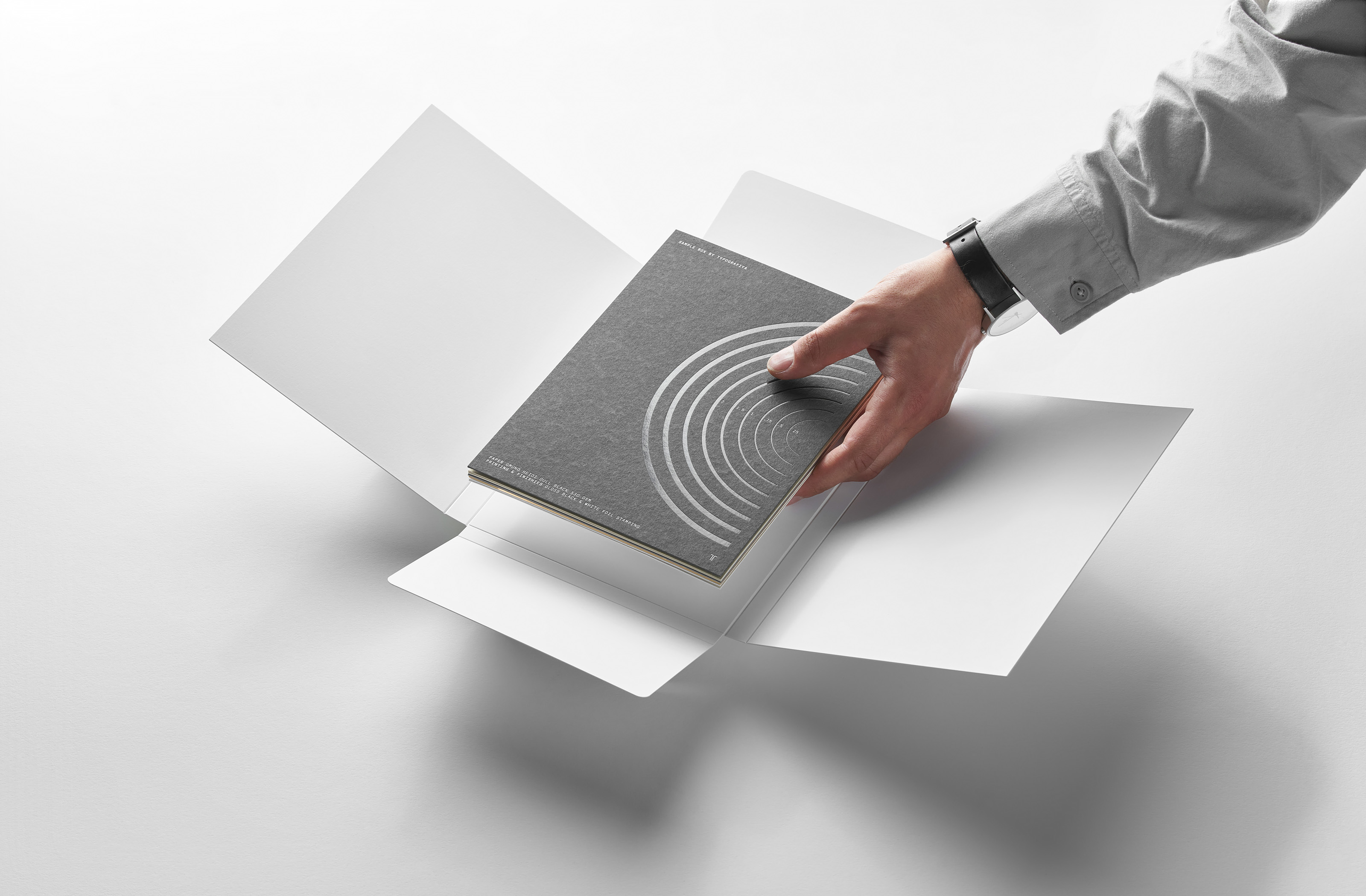
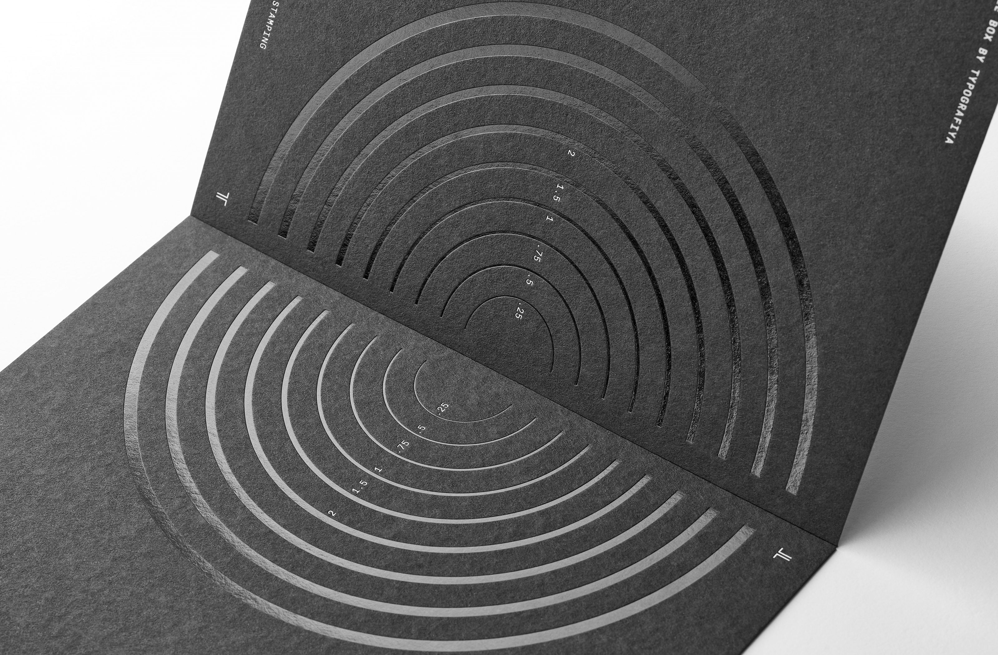
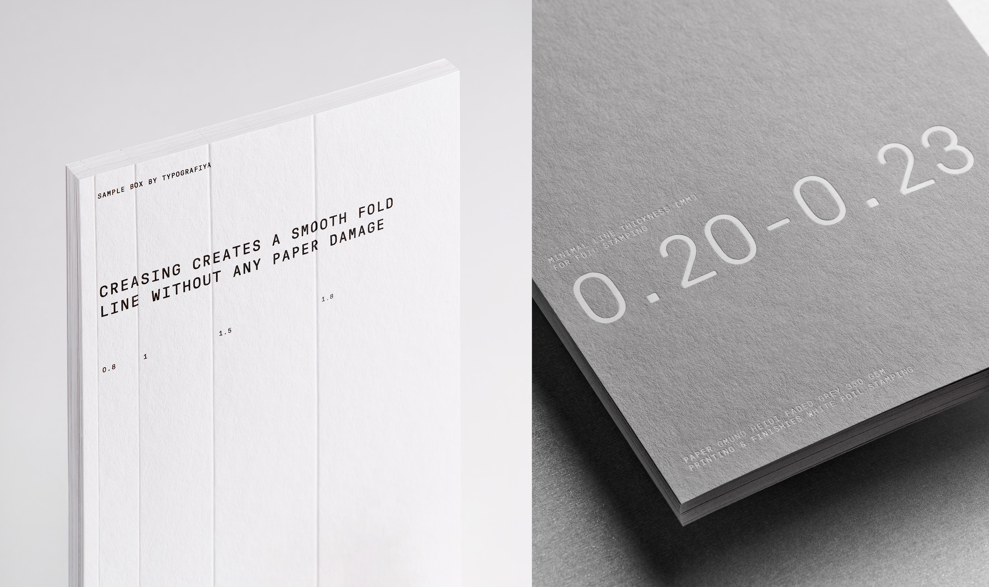
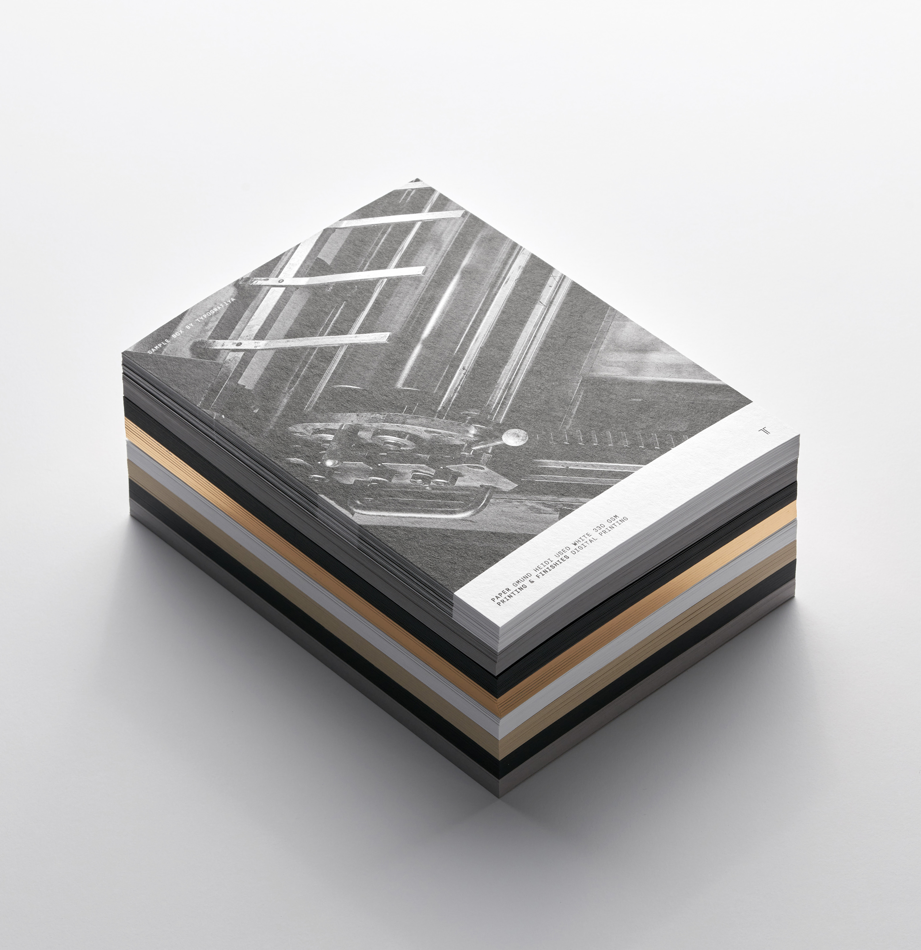
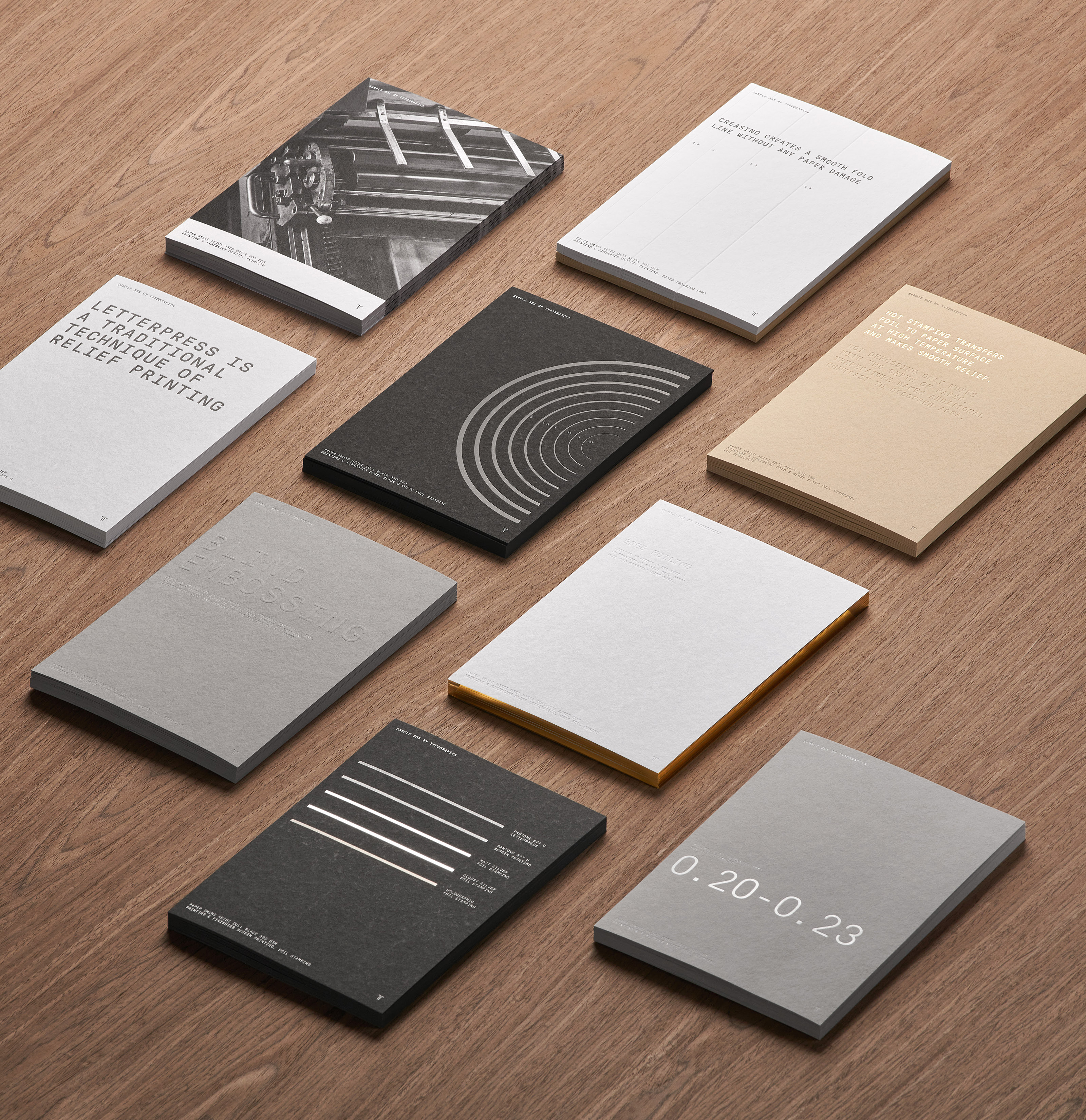
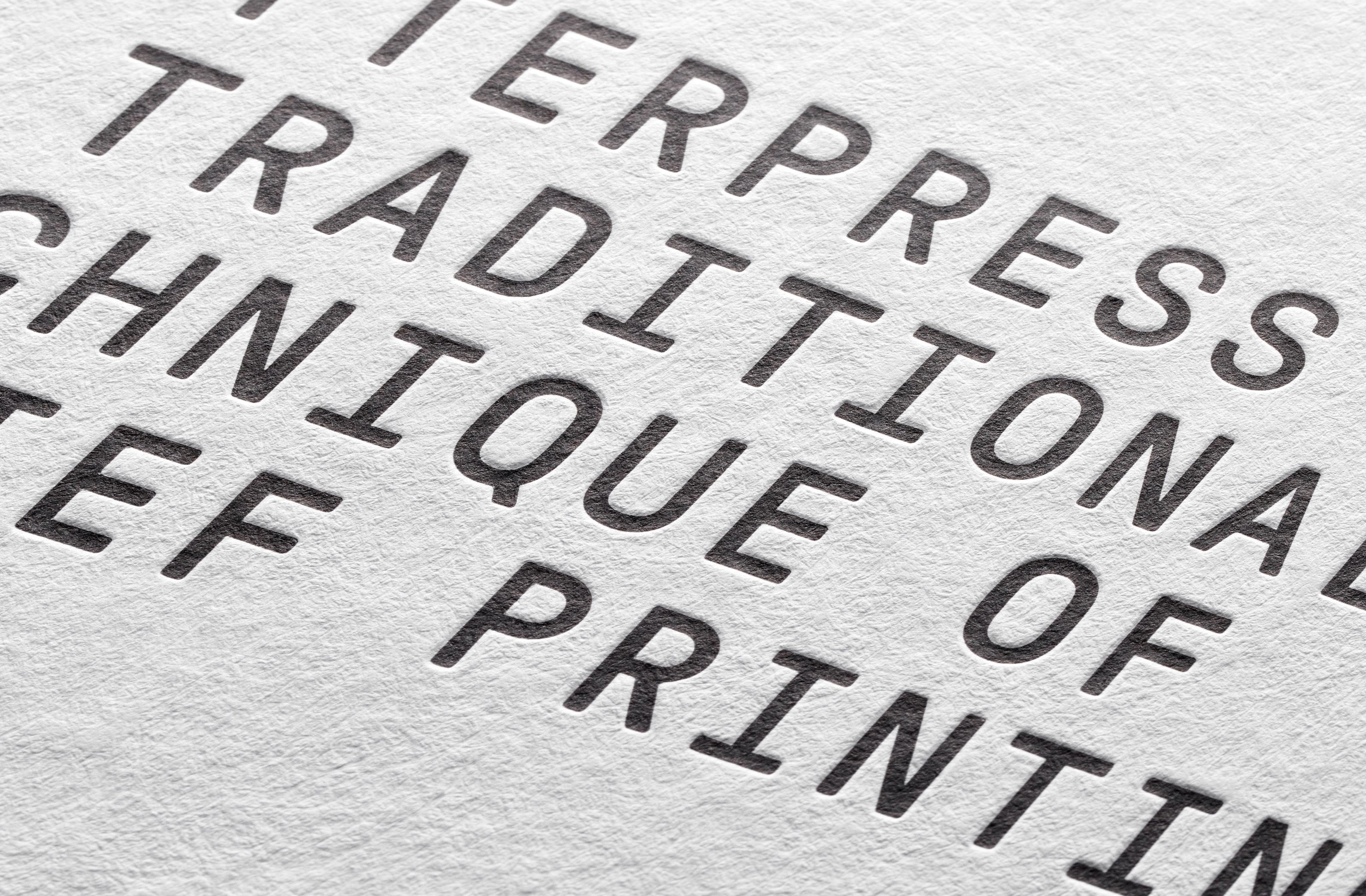
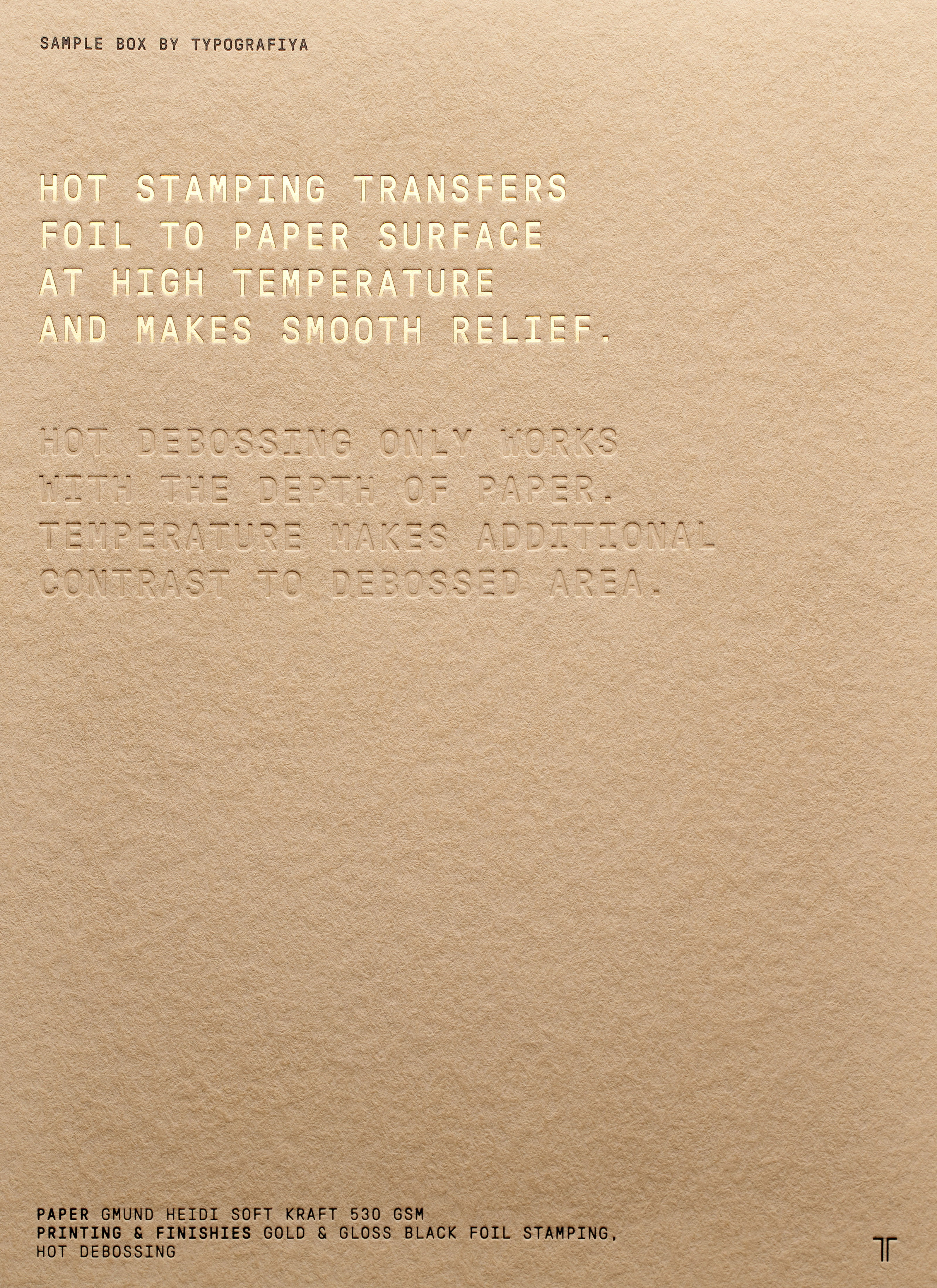
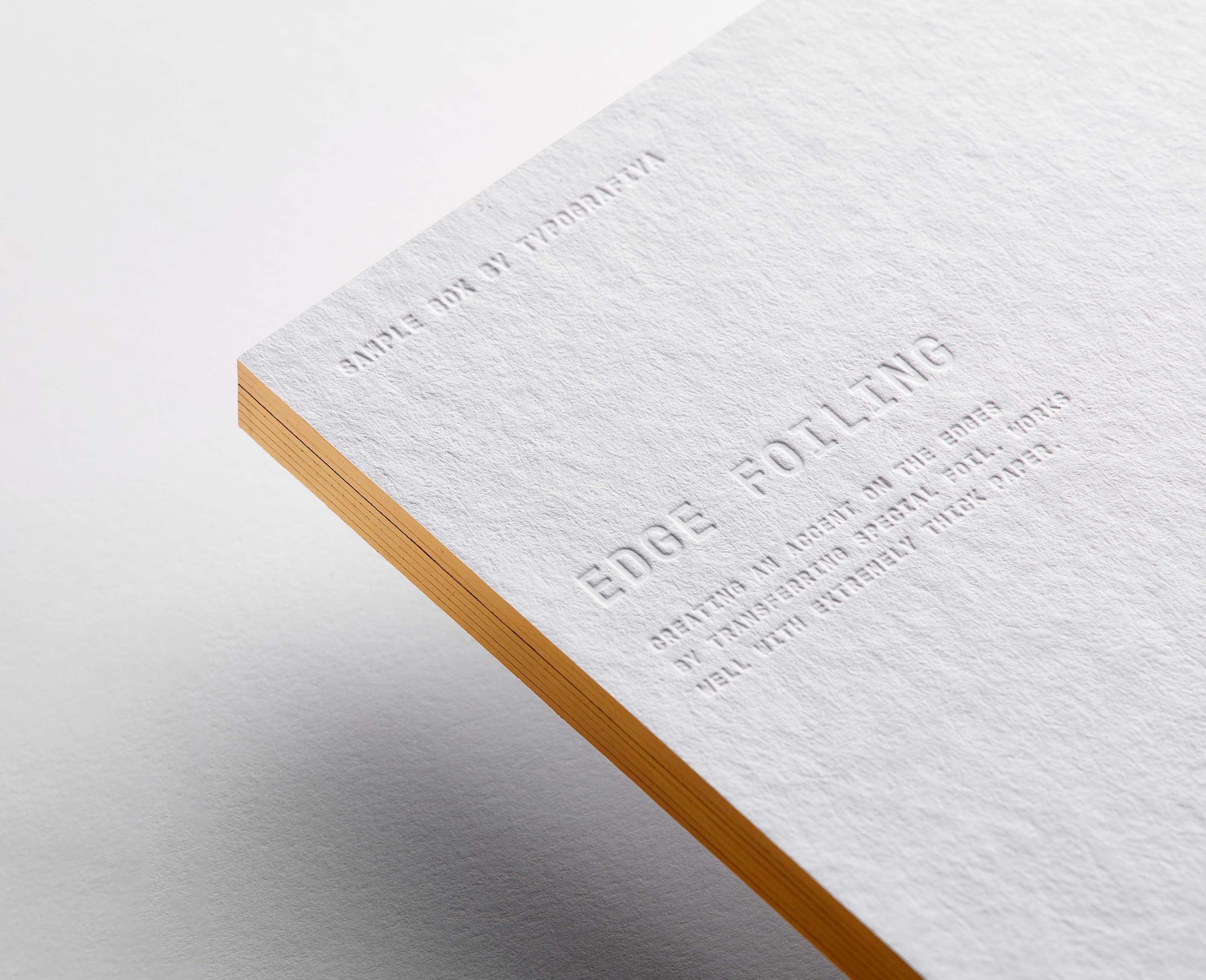
Custom logotype is inspired by the technical character of logos and designations of classic printing machines. The logo mark (letter ‘T’) is formed from two crop printing marks that are used in printing daily. The information block uses a monospace font and includes a set of custom icons. Special attention is paid to the choice of materials, the quality of printing and assembly. Sample box by Tipografiya consists of 9 unique cards with the most popular techniques of analogue printing. Typografiya clients can use this set as a visual guide for selection of printing techniques.
Credits:
Art direction, design: Comence
Animation: Comence
Print production: Typografiya
Photography: Daniil Zherdev
Video: Philipp Kurepin (Cinematography), Liz Lipski (director), Maxim Simanovich (idea), Alexey Shlykov (Sound design)
Special thanks: Typografiya team
https://typografiya.com/


next project
Logos Collection 2023