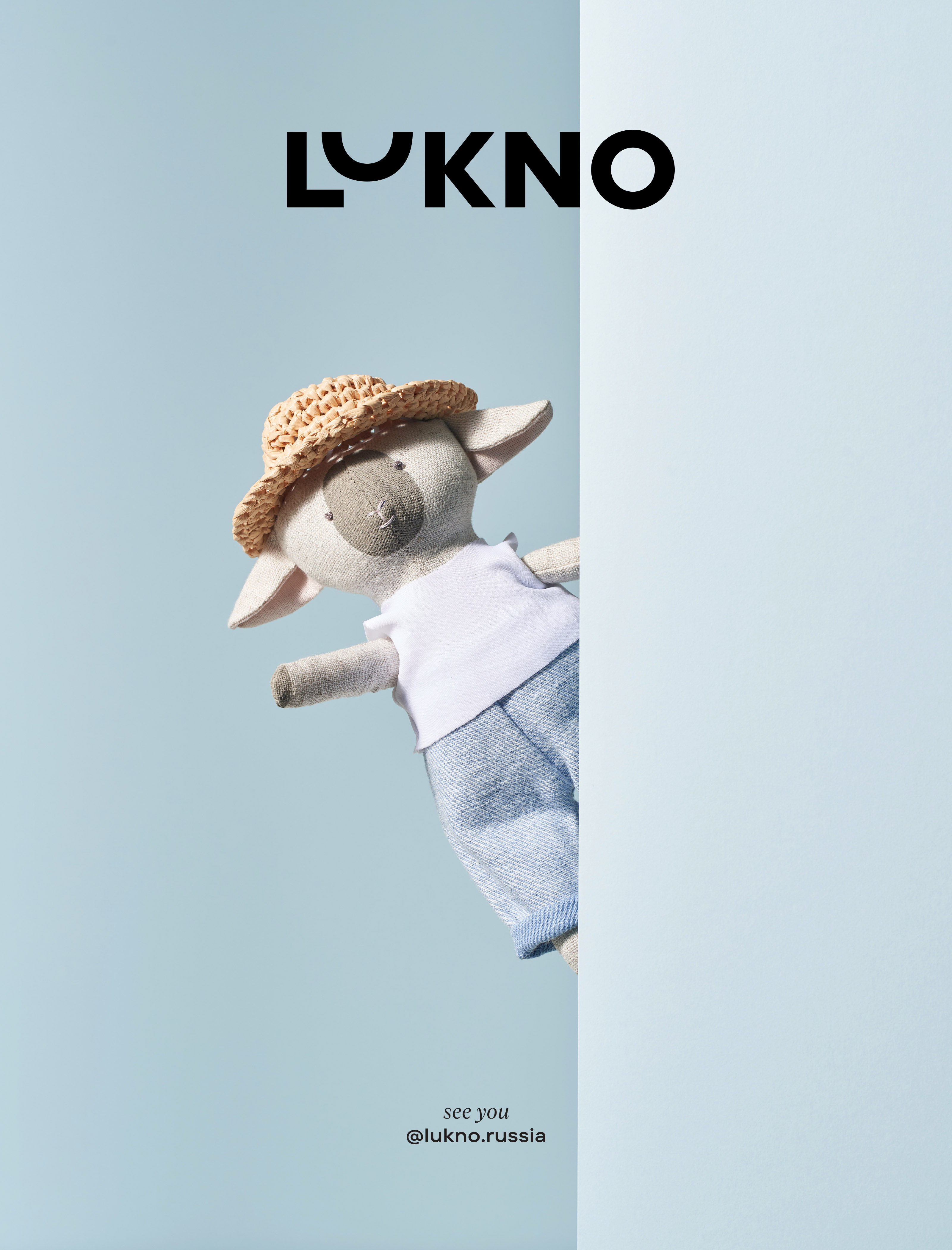
Lukno
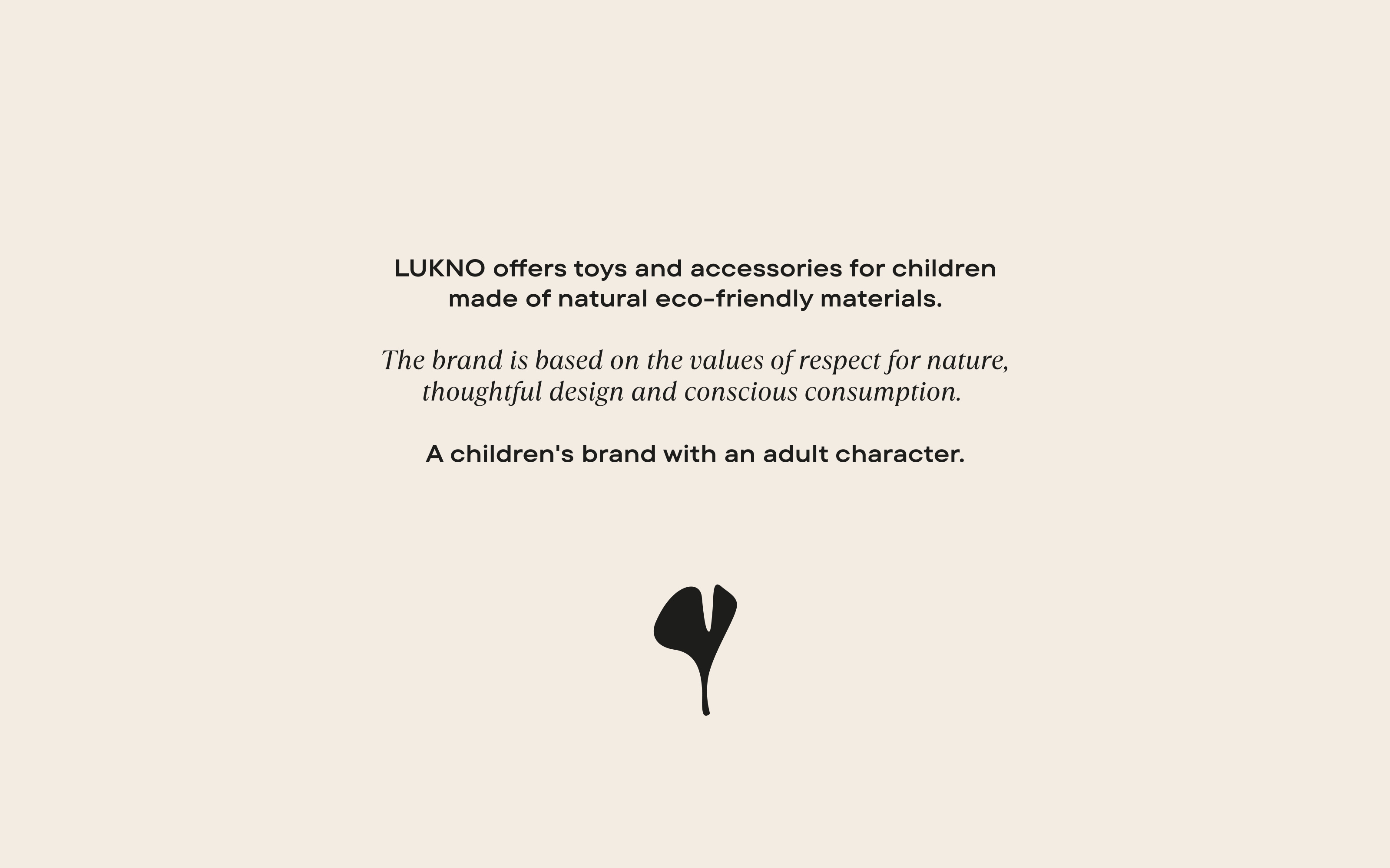
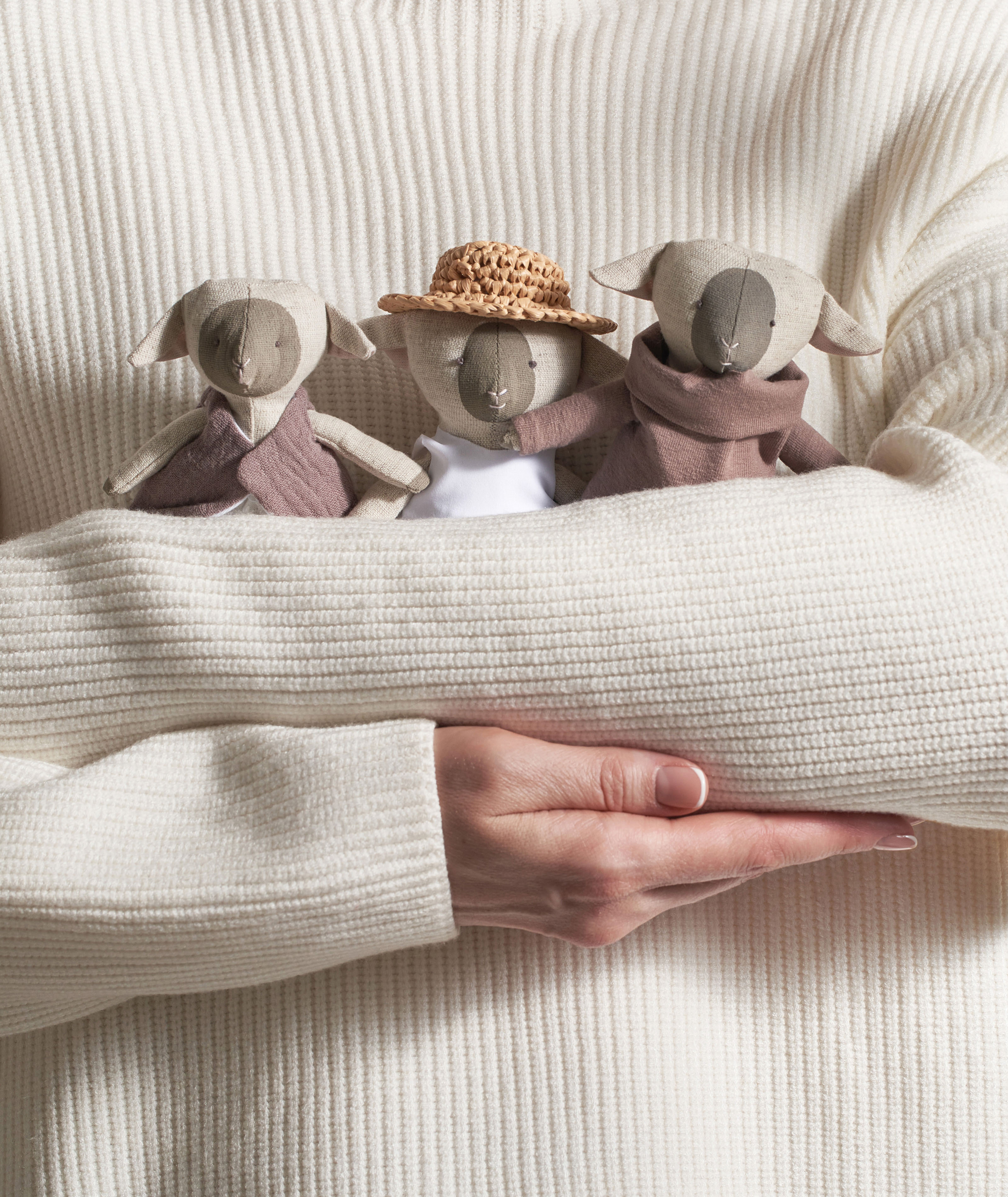
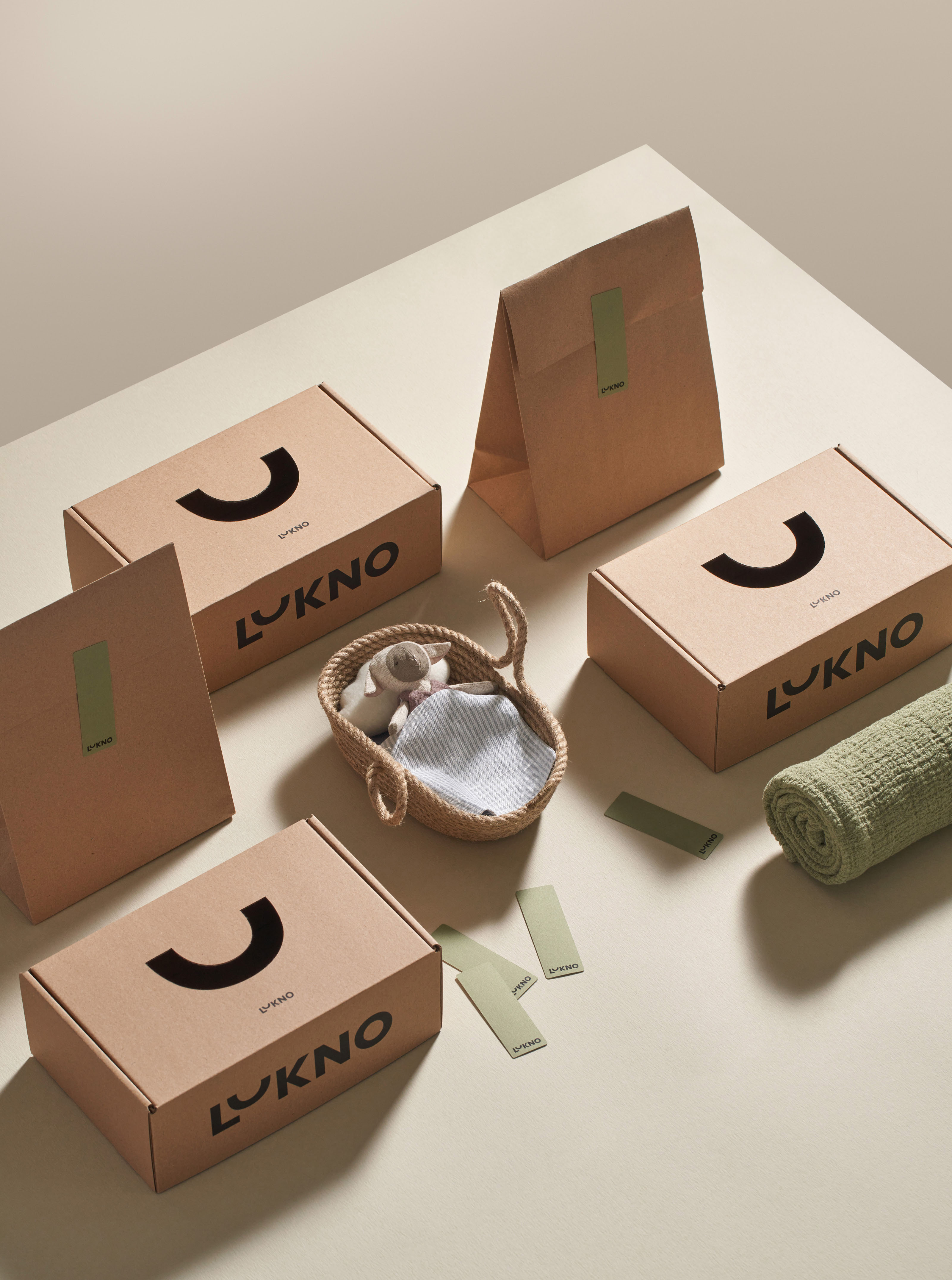
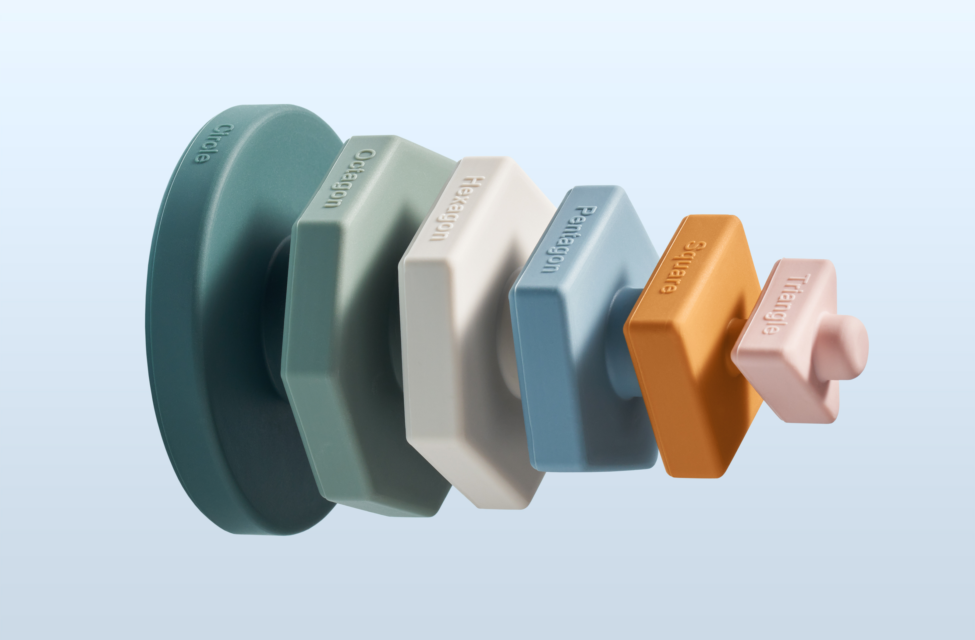
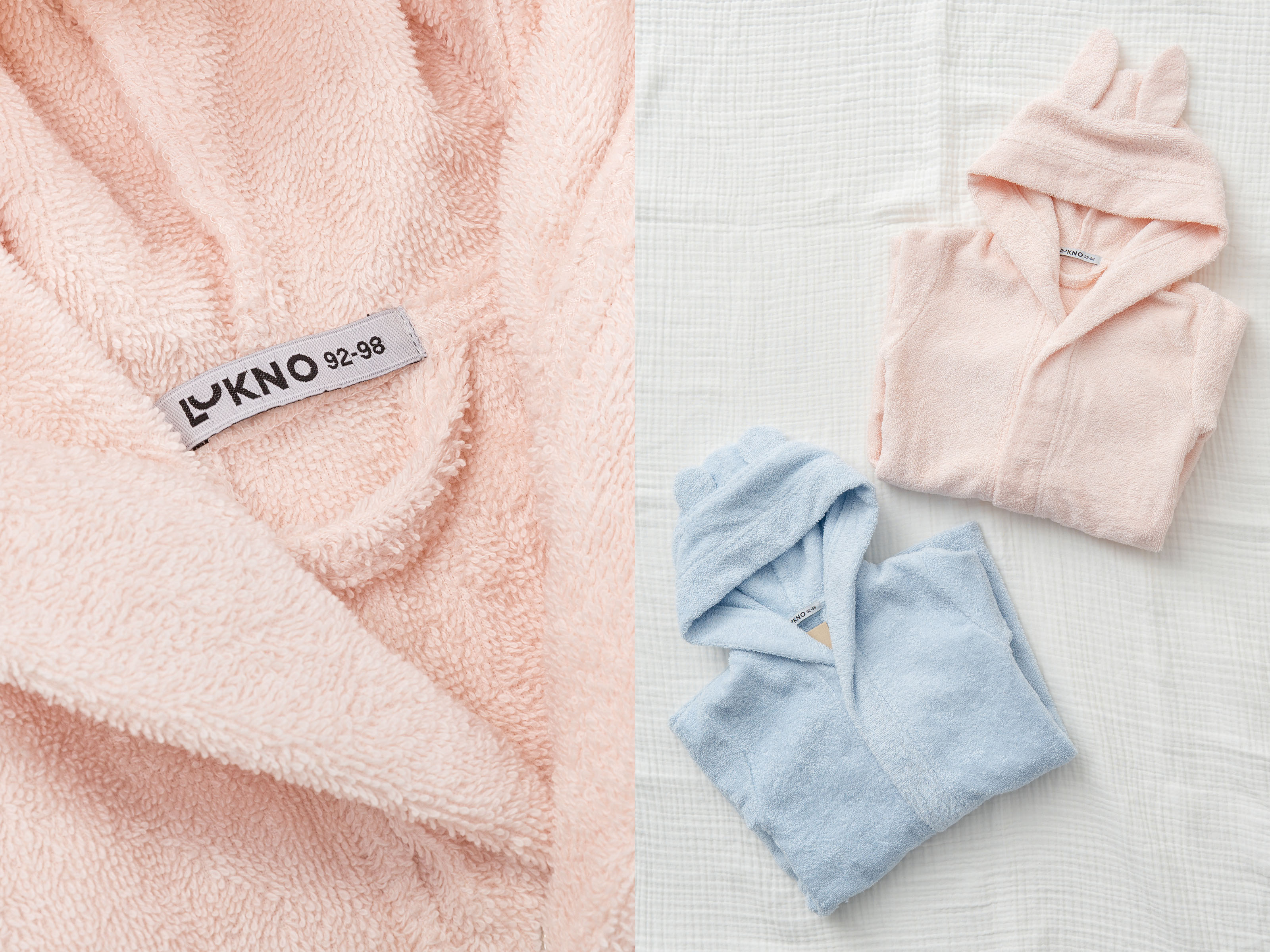
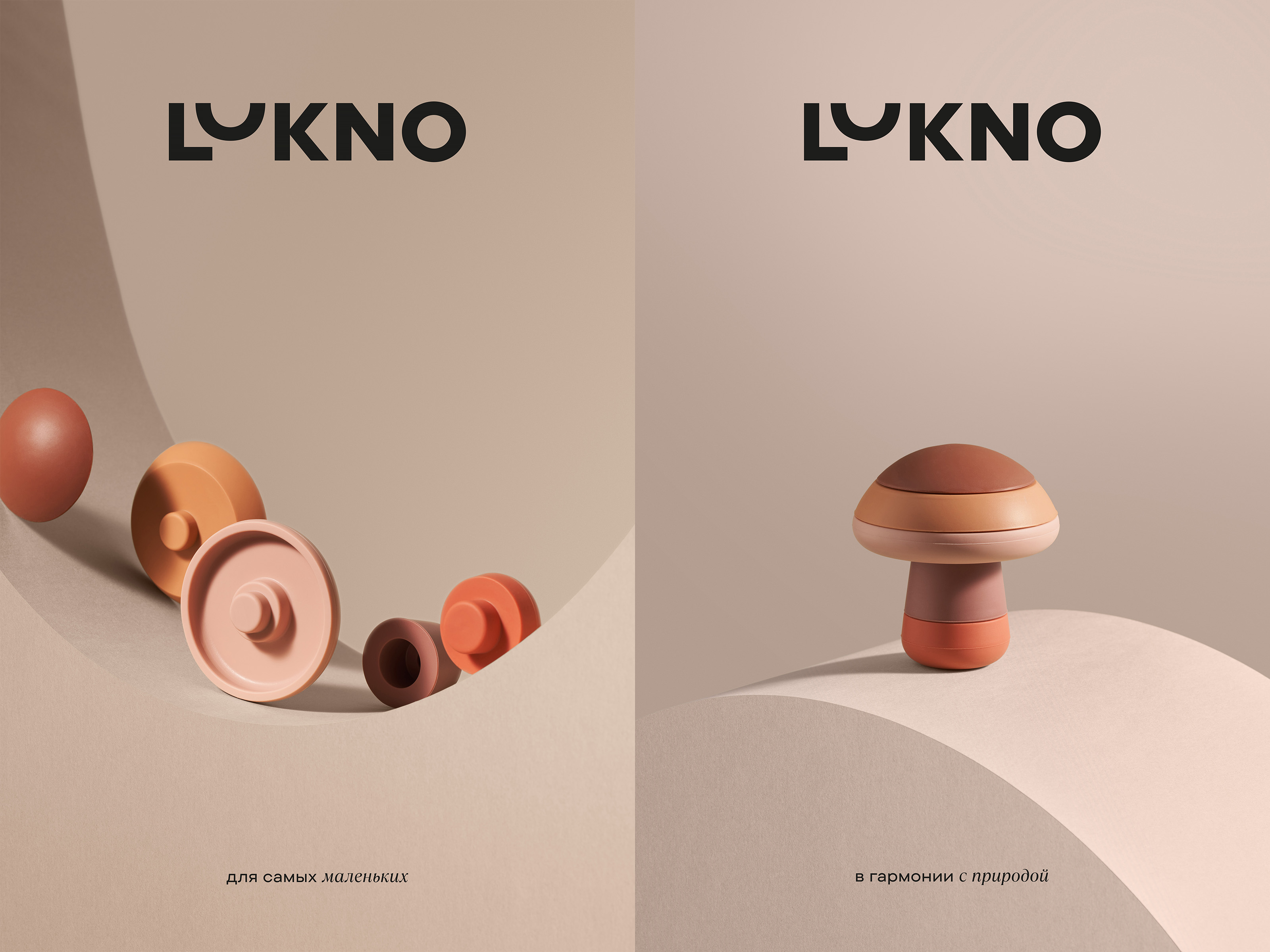
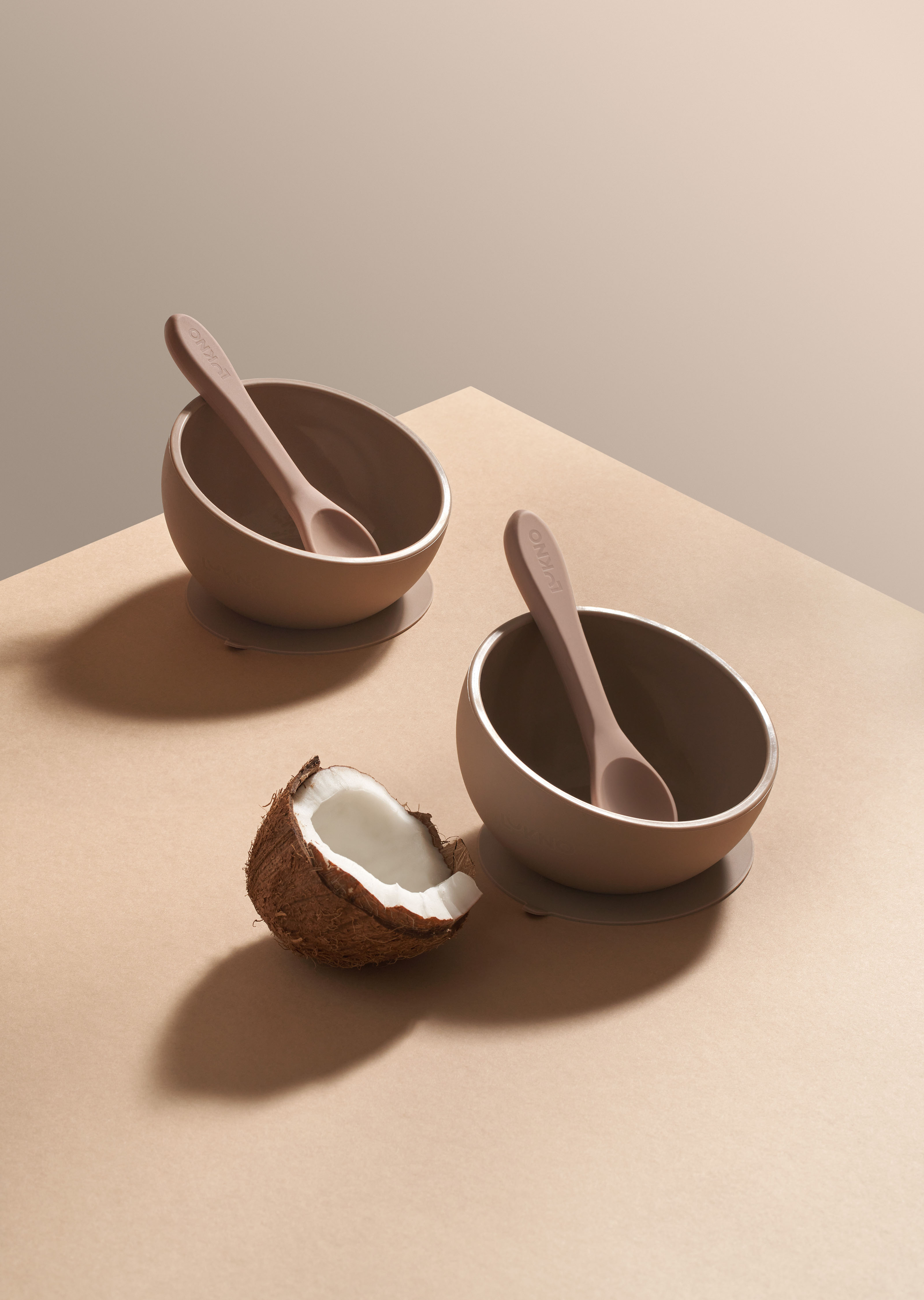
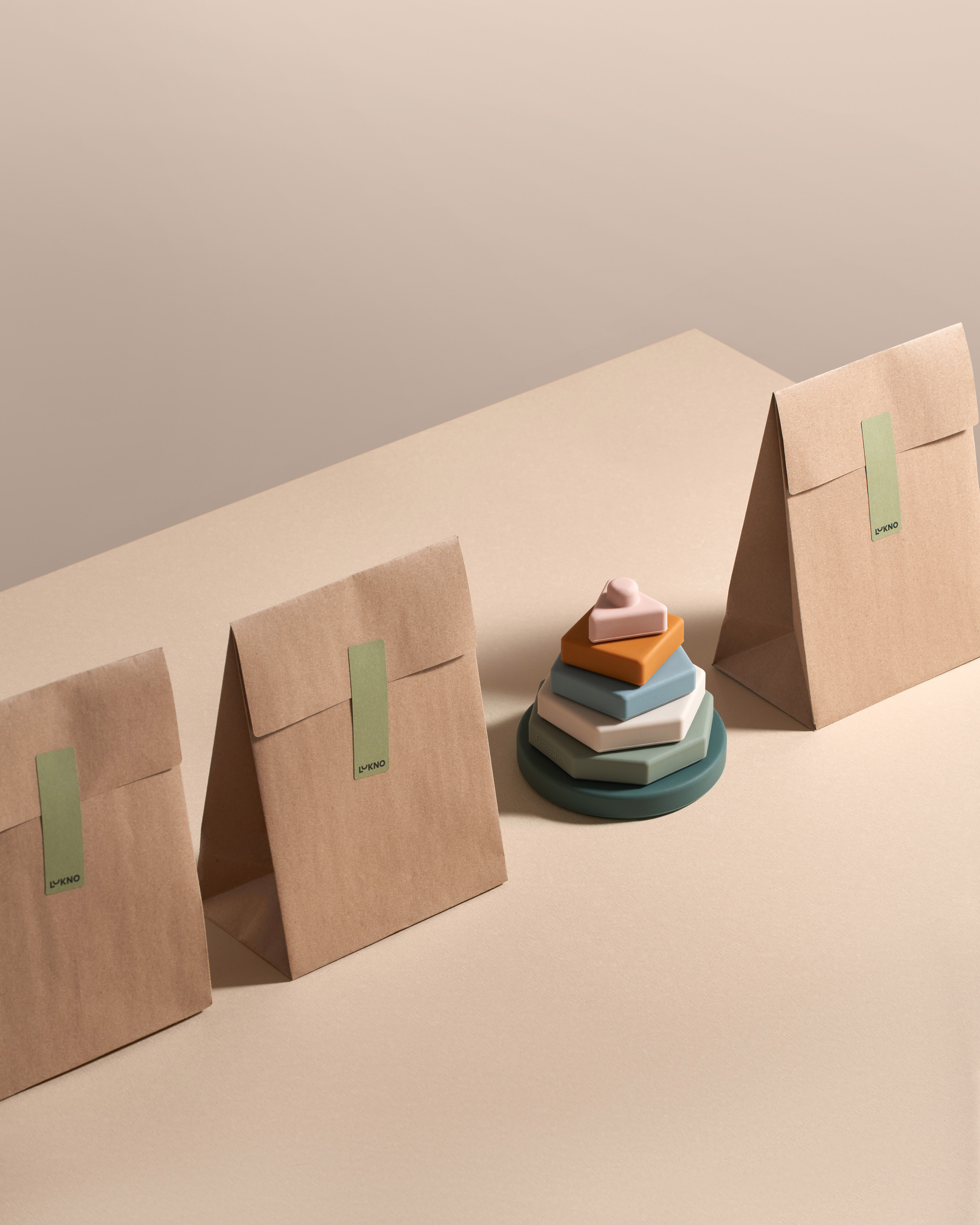
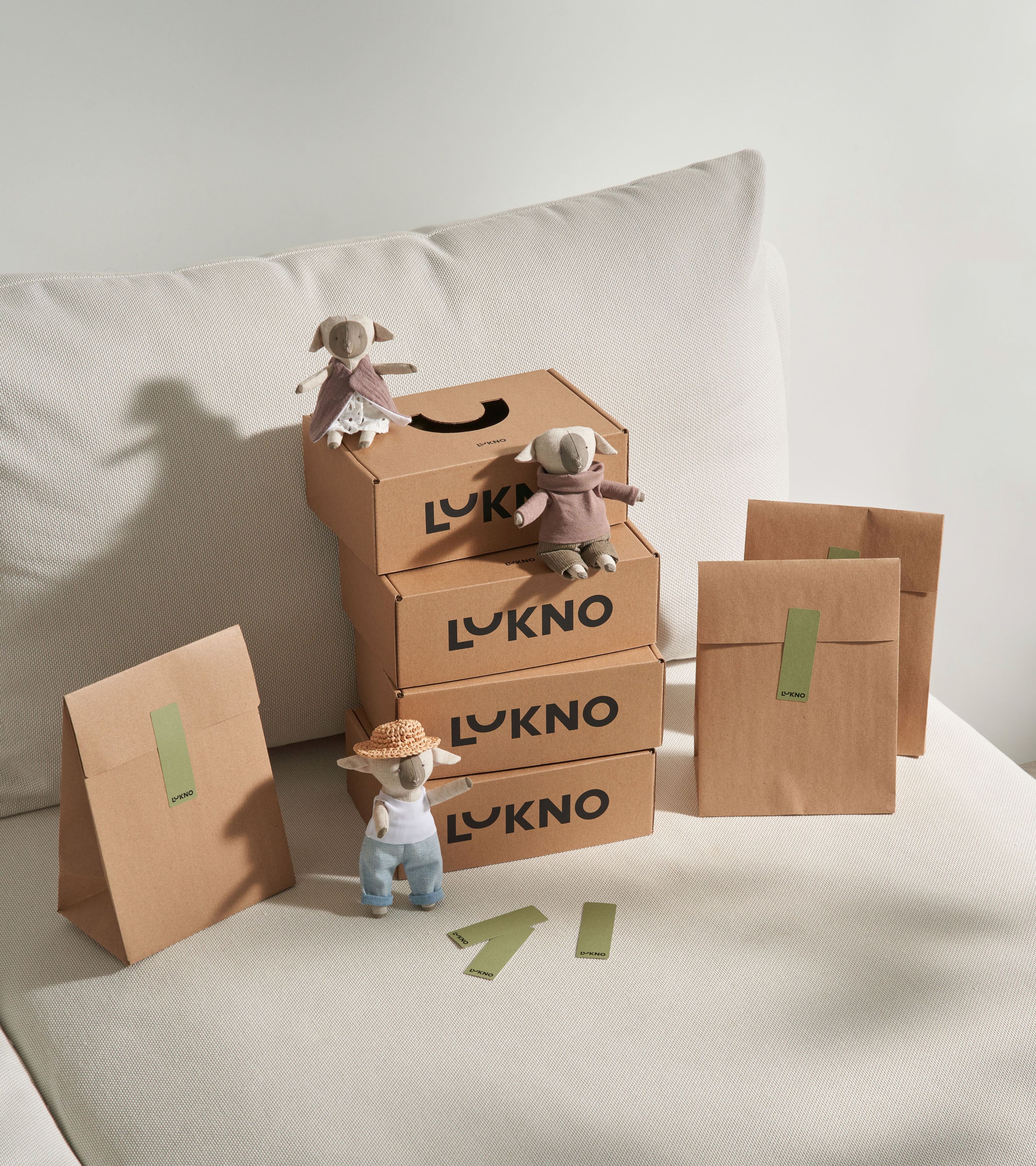
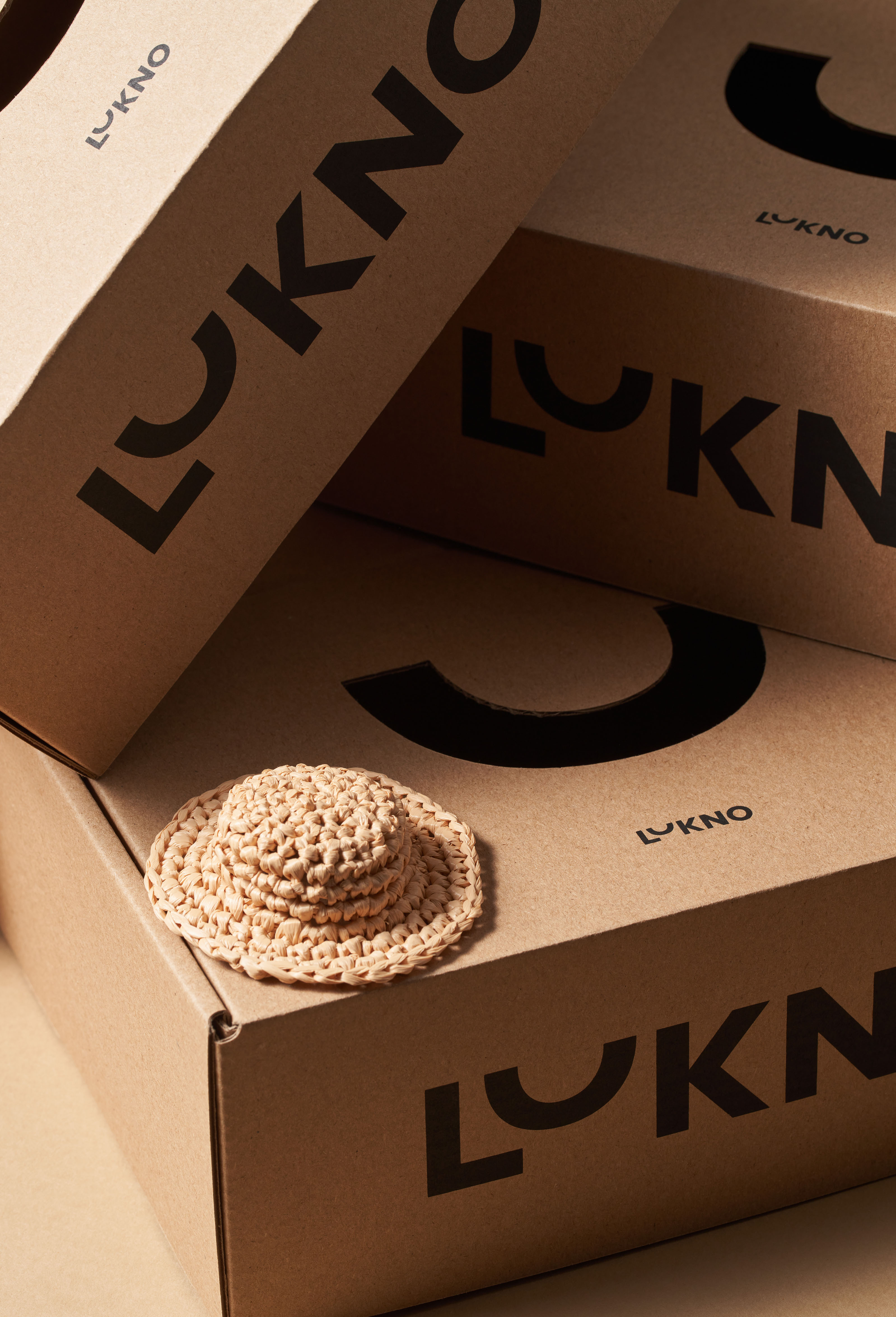
Branding, Art Direction, PackagingLUKNO offers toys and accessories for children made of natural eco-friendly materials. The brand is based on the values of respect for nature, thoughtful design and conscious consumption.
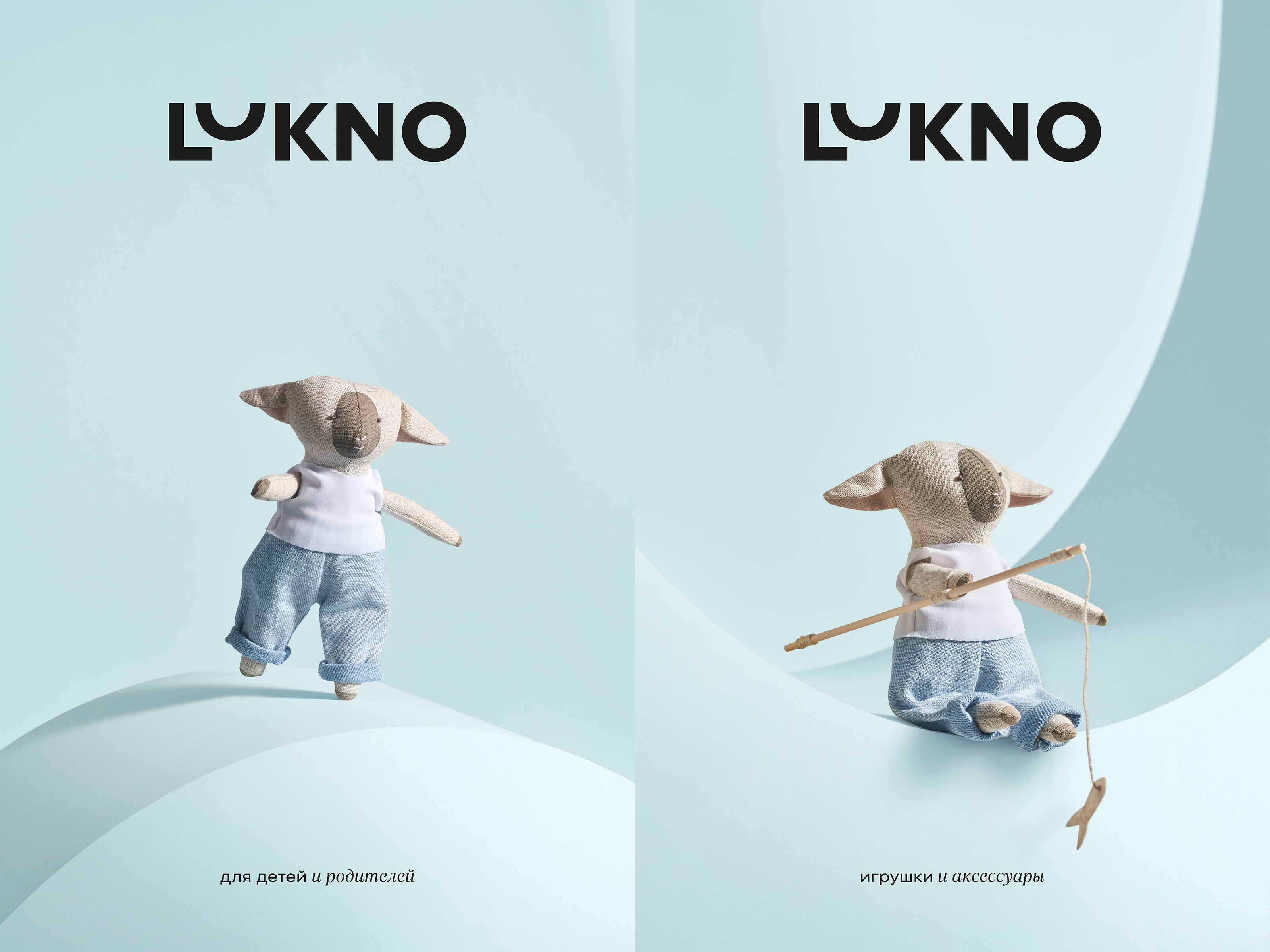
Our task was to create a corporate identity defining LUKNO as a conceptual project for children and parents — a children's brand with an adult character.
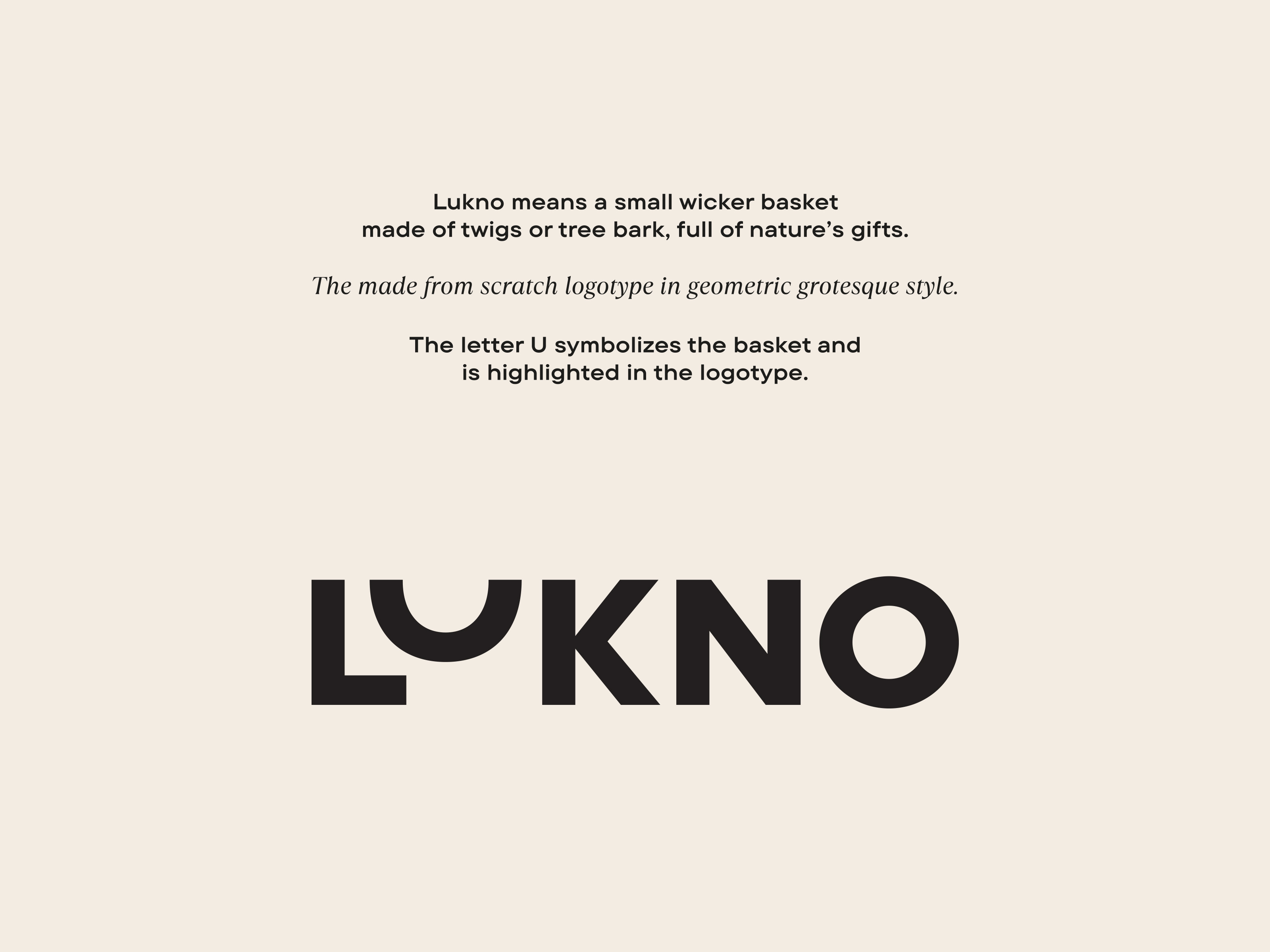
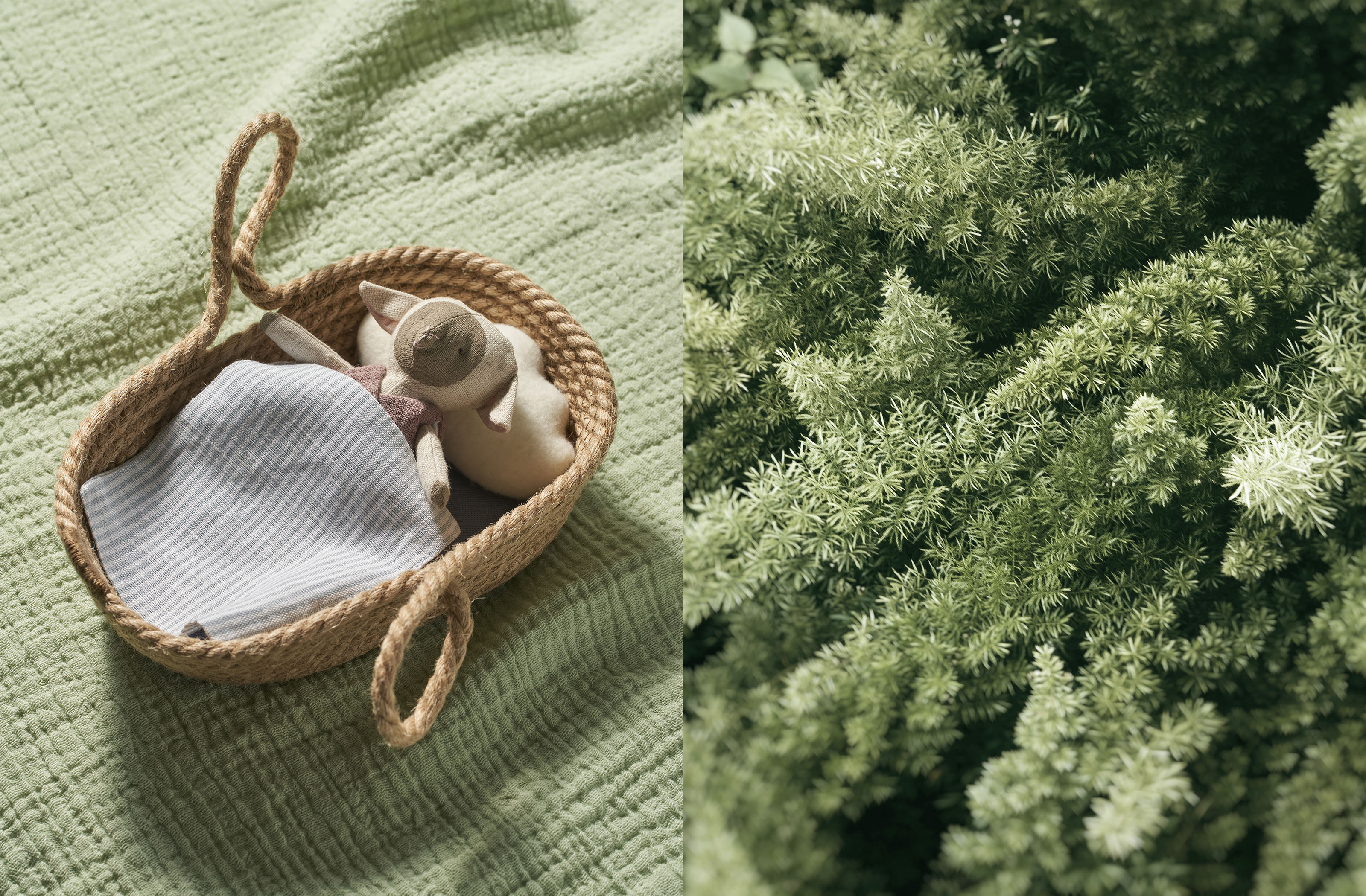
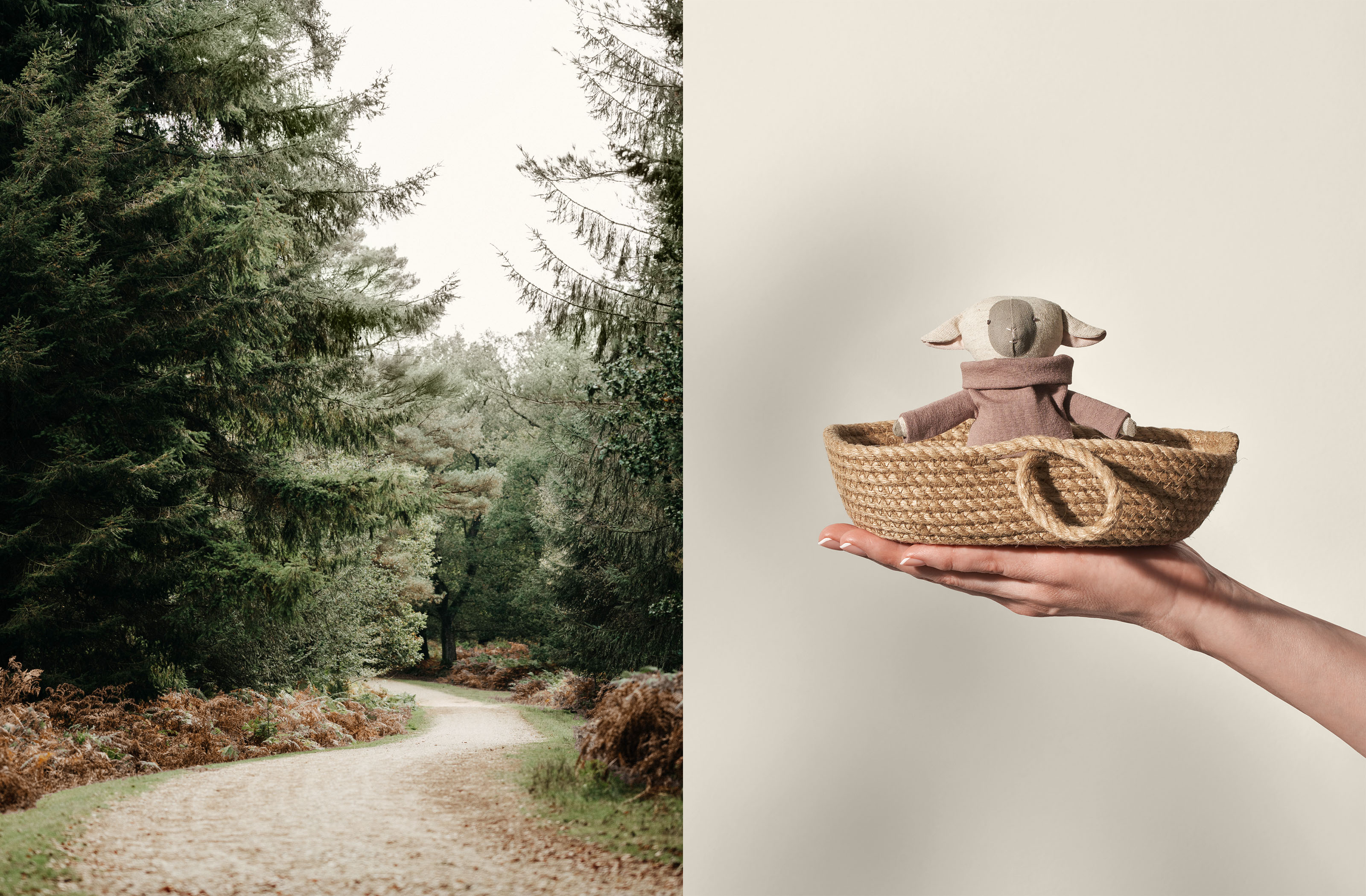
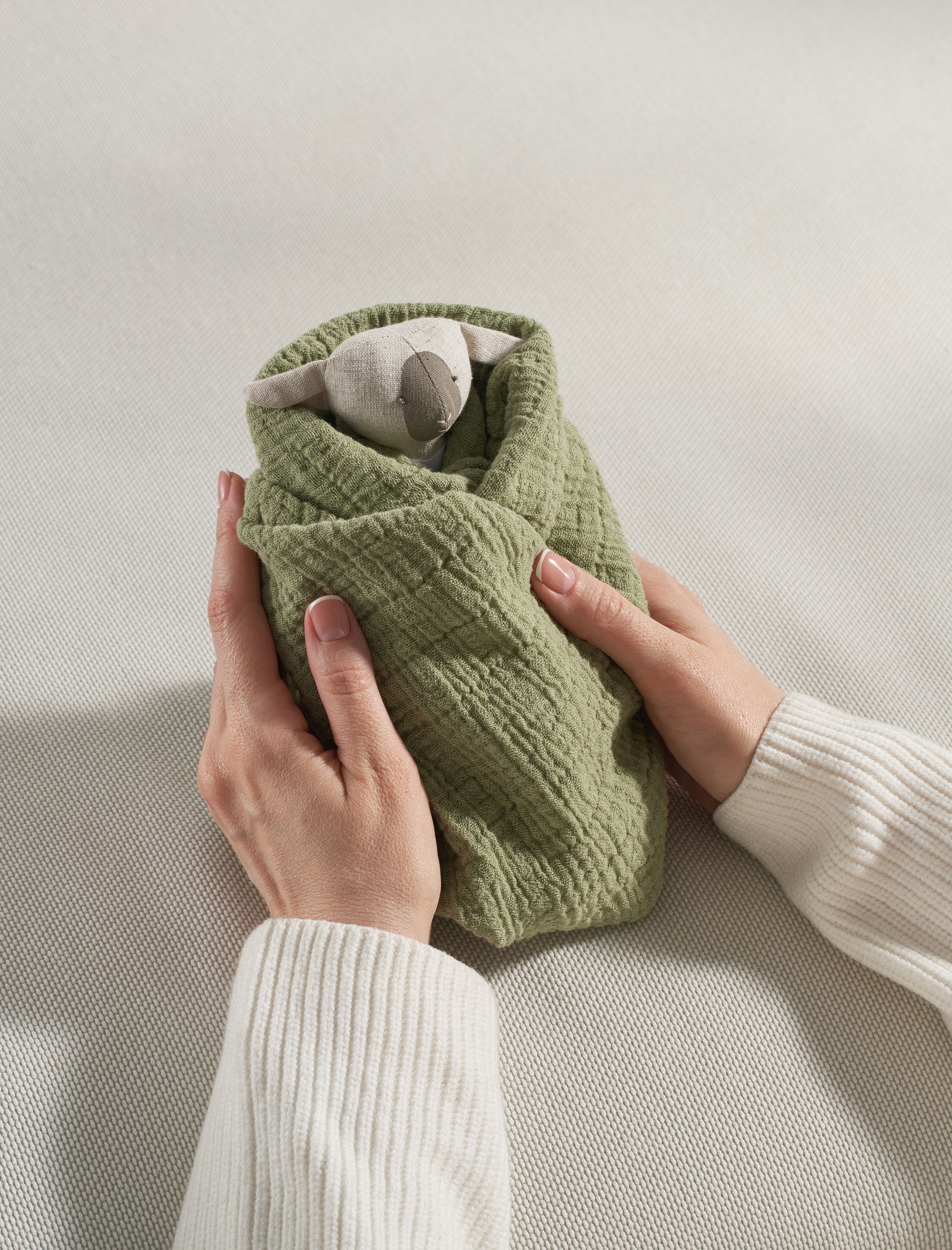
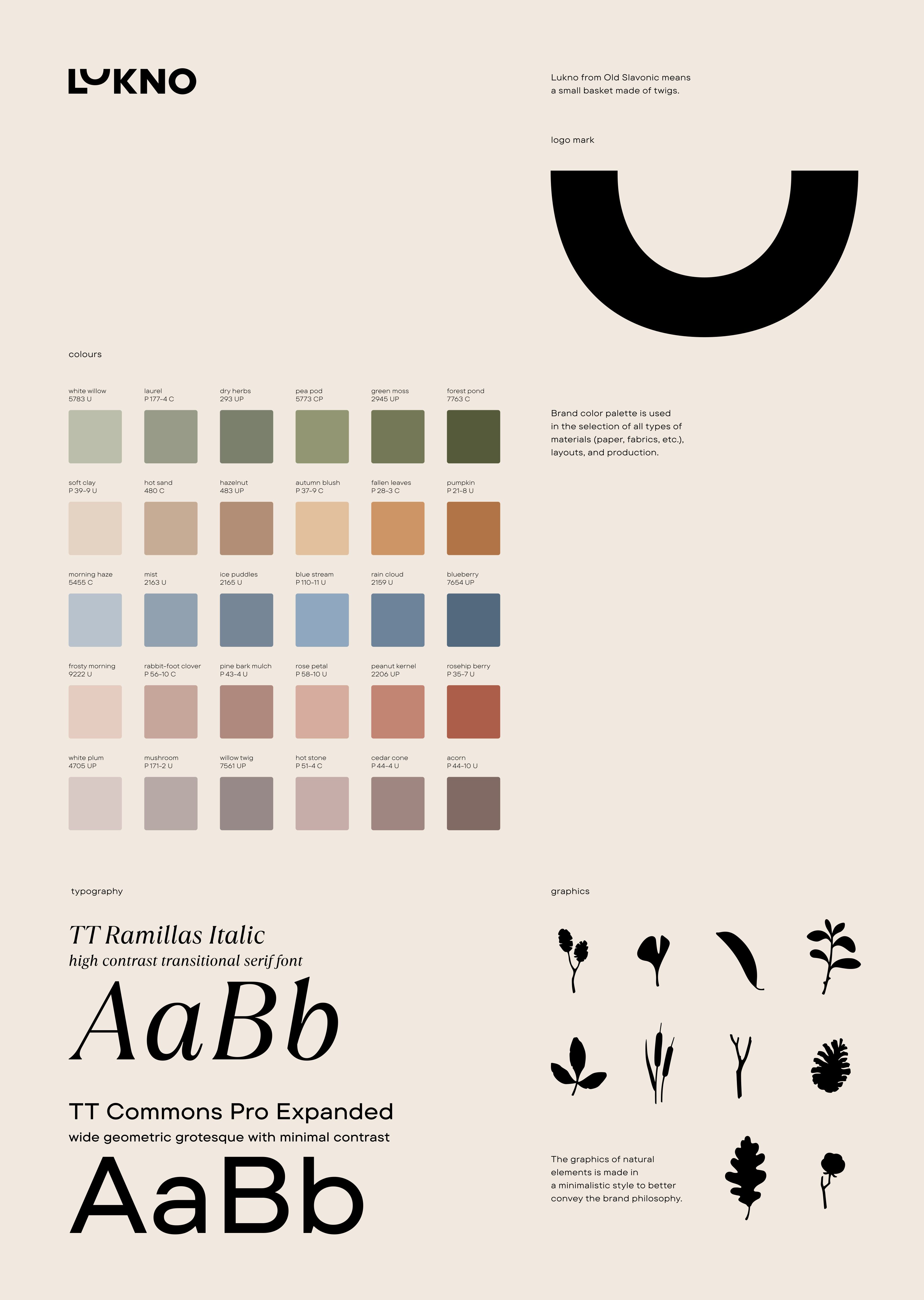
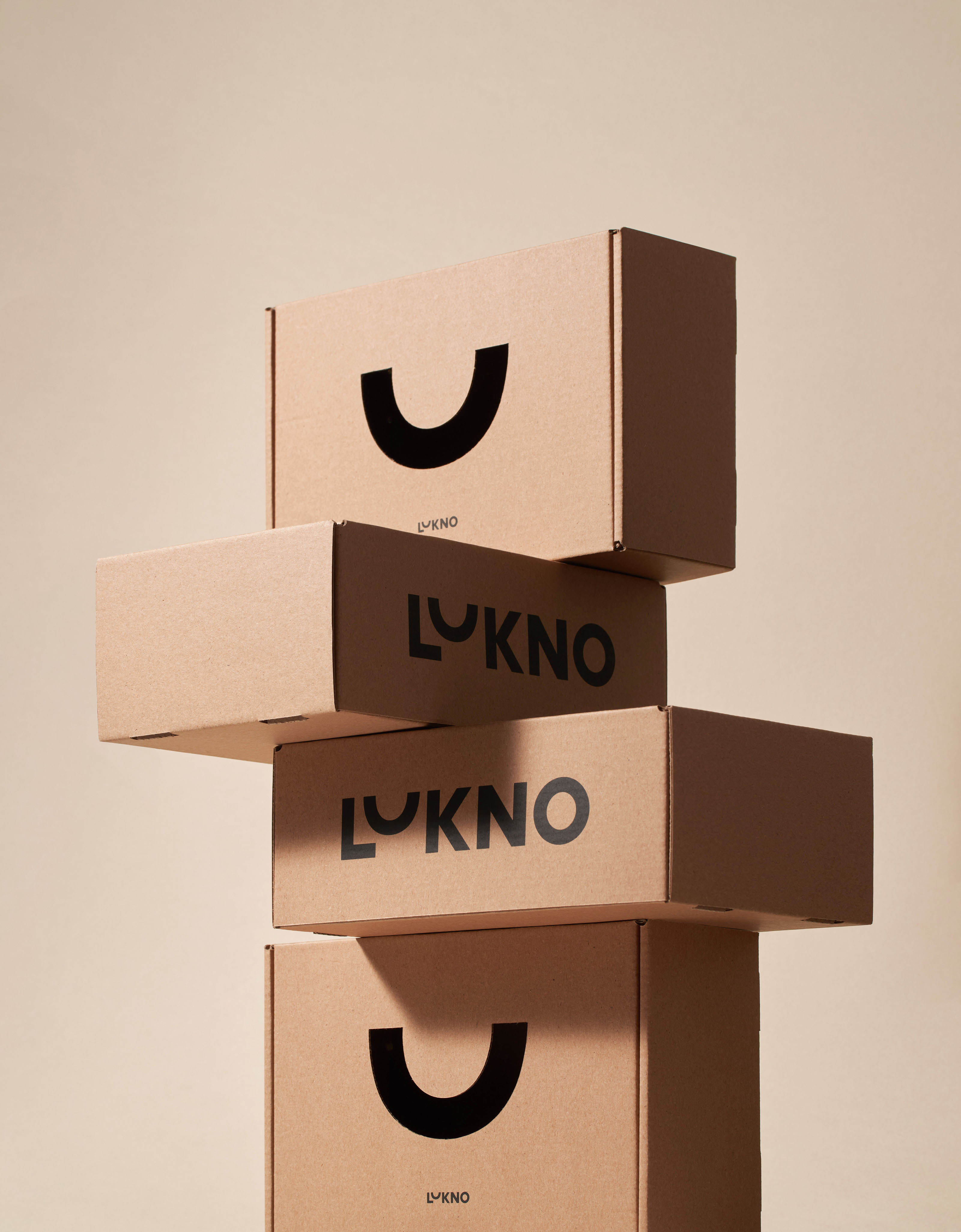
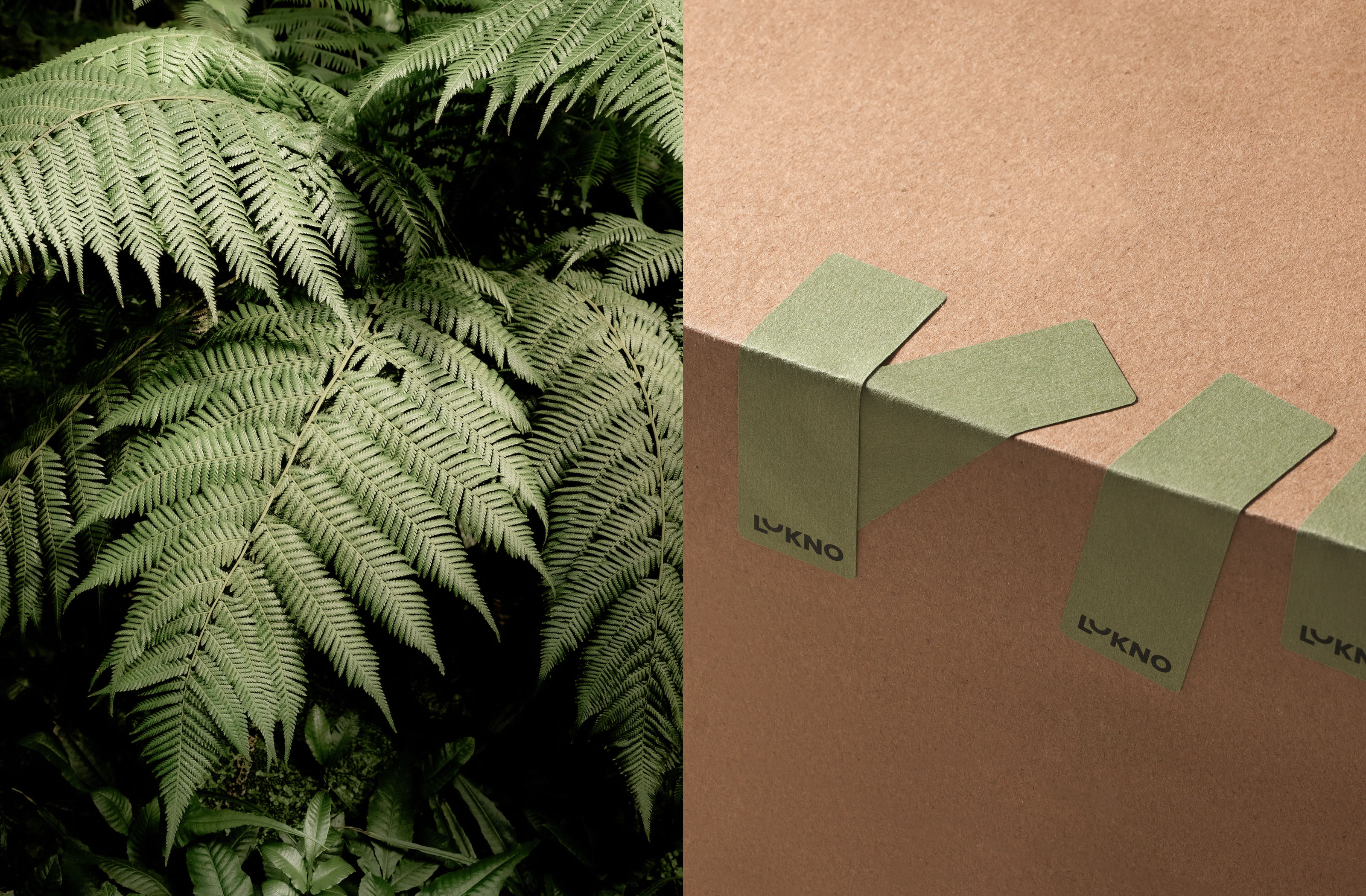
Lukno means a small basket (a wicker basket) made of twigs or tree bark, full of nature’s gifts. The made from scratch logotype in geometric grotesque style. The letter U symbolizes the basket and is highlighted in the logotype. Additional graphics of plant elements convey the LUKNO’s philosophy ‘In harmony with nature.’ The combination of soft and deep dark tones, calm natural colors (wood, moss, foliage, clay) create a connection between human and nature.
Credits:
Client: LUKNO
Art direction, design: Comence
Animation: Comence
Photography: Daniil Zherdev, LUKNO
Unsplash images: Fernando Osorto, Vladyslav Melnyk, Annie Spratt


next project
TT Fors Font & Specimen
